If you’ve never been to Sutton’s Drug Store, you’re missing out on one of the greatest traditions in Chapel Hill. Photos of customers cover the walls, and Carolina basketball jerseys hang from above – you become immersed in a sea of Carolina blue the moment you walk in.
It’s gaaaame day! And we’re open til 9, so you have plenty of time to come see us ☺🐏💙 #GoHeels #BeatSDSU #StripeOut pic.twitter.com/FQ34iueO3s
— Sutton’s Drug Store (@Suttons_Drug) September 6, 2014
I formed my first impression of Sutton’s on its 90th anniversary, a fateful day in 2013 when Sutton’s offered hot dogs at its original 1923 price. Sutton’s closed its drug store a year and a half ago due to corporate competition, but its restaurant is the more widely known facet of the business and continues to thrive.
Although the drug store is gone, the restaurant’s official name remains Sutton’s Drug Store. For an incoming student or visitor, the name might appear misleading or ill-fitting, but Sutton’s is grounded in history. Changing the name might erase some of its historical prominence, and I tend to refer to the restaurant simply as “Sutton’s” anyway.
LOGO

An oval filled with an orange gradient sits in the back of the Sutton’s logo, creating a vintage diner feel. A similar characteristic is found in the Al’s logo, which possesses a somewhat similar restaurant style. The next layer of the logo is what appears to be a milkshake, a favorite item sold at Sutton’s that has earned top ratings. If a milkshake is what the graphic is portraying (if you can confirm that, comment below!), I would say it is stretched too horizontally. Moreover, the utensil sticking out isn’t clearly distinguishable – is it a spoon or a straw?
The typography is what shines in this logo – horizontal lines fill the letters, which certainly fits with an older style and dovetails with the stroked lines that border the oval and the milkshake graphic.
BUILDING SIGNAGE
Outside the store hangs a building sign that faces pedestrians directly as they walk by. The shape of the sign and its black border further emphasize the classic style. Sutton’s also features all-caps classic serif letters, though their beige color sometimes becomes hard to read against the white background, especially in this subpar photo that I snapped.
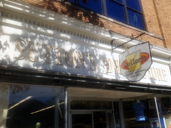
Sutton’s used to feature a striped white and red awning that stood out, and without it, the roofing feels a little empty. I’m unsure of when or why the awning was removed, so leave a comment if you have an explanation.
WEB DESIGN
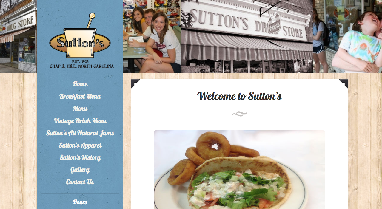
The history of Sutton’s is what sets it apart from competitors, so I was disappointed to see that Sutton’s didn’t include it on its website, even though it leads website visitors into thinking there’s a story waiting for them. The following is listed on the homepage of Sutton’s.
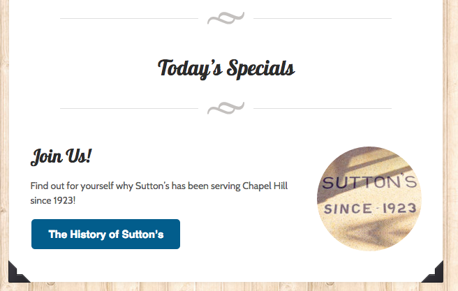
But clicking the link leads to a sad, blank page.
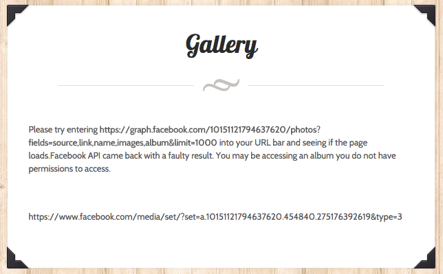
Skeleton pages appear to be rampant on the Sutton’s site. Since Sutton’s is filled with photos in store, I expected a vast gallery on its site. The gallery page leads to its Facebook gallery, which felt like a cop-out to me. Granted, its Facebook gallery does house an abundance of group photos, but Sutton’s should consider featuring at least a few on its website.
Aside from the blank pages, the design of the website is organized and readable, though a little outdated and generic. I’m not sure I like the background of wood planks. Unless you’re Sup Dogs and have a wooden outside patio, wooden planks don’t quite relate, but that’s just my opinion. The main font being used appears to be Lobster, which contributes to the retro style.
SOCIAL MEDIA
Facebook – 5,146 likes
Twitter – 568 followers
Google+ – 3 followers
By far the most popular social media account for Sutton’s is Facebook, but that doesn’t mean the account is active. Sutton’s hasn’t posted to its Facebook account since August 2015, and it’s been offline Twitter since January 2015.
For smaller and more traditional restaurants, social media can be too big of a time investment for its worth, especially if the restaurant caters to an older demographic. But Sutton’s along with every shop on Franklin Street can leverage the hunger pangs of thousands of UNC students, a population that isn’t going anywhere and will never age. If Sutton’s can find the time to create a social media strategy and schedule social media posts, it could resonate with younger college students and pay off.
THE BOTTOM LINE
Sutton’s is an old-time favorite on Franklin, and though the drug store closed down, the restaurant won’t be going anywhere any time soon. To boost awareness and popularity, Sutton’s should update its website to include its famous history and photos, and it should consider becoming more active on social media. After all, don’t we all want to be reminded of hot dogs every once in a while?
