
Its burgers are so tasty they earned Yelp’s No. 1 rating in Chapel Hill. It’s committed to providing local and organic food. Its employees are charming and hospitable. It’s conveniently located at the crossroads of Chapel Hill and Carrboro. Al’s Burger Shack might claim any and all of these reasons to explain its wild success since opening in 2013. Does its branding contribute?
Al’s is my go-to restaurant when I’m craving a burger, and I’ll admit it has nothing to do with advertising. For me, the juicy burgers and unique flavors are what keeps me coming back. But I suspect that branding plays a part in getting people into the doors for the first time.
LOGO
A winged oval colored black with Carolina blue lettering comprises the logo for Al’s. It’s simple and easy to read, and its style seems to feel of a local burger joint. But there are a few minor details that irk me, like the logo’s use of what appears to be Myriad Pro (Adobe’s default typeface) and the overall treatment of the lettering. The curve of “Burger Shack” doesn’t seem to perfectly follow the curve of the oval. The upper wings aren’t vertically aligned, creating uneven spacing between the wings on either side.

I’m unsure of the reasoning for the winged shape (and if you know, leave a comment with the explanation). Many carmakers use wings in their logos to express speed, so perhaps this logo alludes to Al’s quick-service restaurant model. Overall, the logo for Al’s is minimalist but a little rough around the edges. It isn’t particularly memorable for me, but it also doesn’t detract from the overall brand.
BUILDING SIGNAGE
Outside the shack hangs a sign that matches the logo but drops its wings and is squished vertically. The sign’s use of part of the logo ingrains that graphic into people’s minds as they walk by, though the different height-to-width ratio diminishes that consistent branding.
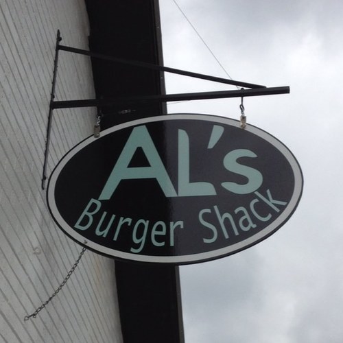
Placing the sign perpendicular to the street puts it in plain sight, forcing passersby to sneak a peek. The sign’s Carolina blue lettering fits well into the sea of blue you’ll see walking down Franklin Street.
WEB DESIGN
Al’s Burger Shack’s website is simple and clean, placing all focus on crisp photos that capture the burgers and the culture.
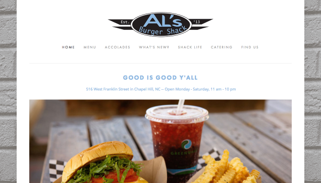
The web design is modern and responsive to different browser widths, allowing for easy viewing on mobile platforms.
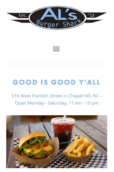
As for content, all the essentials are there: hours, contact information and the menu. But what gives the site more personality is its insight into “Shack Life,” describing Al’s commitment to sustainability and displaying videos like one created by a customer and one showing Al’s employees participating in the ALS Ice Bucket Challenge. What could be improved is the icon displayed on the browser tab, which when sized down becomes unreadable.

SOCIAL MEDIA
Facebook: 2,638 likes
Twitter: 1,023 followers
Instagram: 1,014 followers
Al’s posts to its social media accounts frequently and with consistent content and style. On Twitter, Al’s posts once a day and sometimes more, often with links to Facebook posts featuring the daily burger special. Al’s also retweets news coverage and updates its followers with special hours. On Facebook and Instagram, posts contain similar content but offer more visuals. Each daily special post is accompanied by a well-framed photo of the delectable burger.
Along with consistent branding via similar images and posts across platforms, Al’s social media handles are the same and match its website domain name. Consistency on different media improves brand recall and avoids confusion.
THE BOTTOM LINE
Al’s visual branding is clean and fits the style of the atmosphere. What particularly stood out to me is the pristine photography and consistent social media upkeep. With Al’s being the No. 1 hit on Google when searching “burger Chapel Hill,” the shack has clearly proved success that takes more than crafting the perfect burger (though Al’s is pretty damn good at that).
Do you pay attention to its branding efforts, or is it all about the food quality? Leave a comment with your thoughts.