Mediterranean Deli, Bakery and Catering has served Chapel Hill residents fresh and authentic food from the Mediterranean and Middle East since Jamil Kadoura opened up the restaurant in 1992. Hailed for its wide array of healthy, vegan, gluten-free and organic options, Med Deli has certainly made a name for itself in Chapel Hill. It even opened up a second website to sell its gluten-free pita bread, which Kadoura said took one and a half years to perfect. My friends and I have a healthy obsession with Med Deli (yasmeen chicken salad anyone?), and I’ve often wondered to what extent the deli’s visual and online branding contributes to its success.
LOGO
Med Deli’s logo is a combination mark, meaning it spells out the name of the restaurant while also associating it with a symbol or illustration. But the logo’s illustration is clipped within an oval, which somewhat resembles a badge or emblem-style logo such as Starbucks. The illustration takes on a classic style and uses saturated yellow, teal and blue colors.

Generally, I’m not a big fan of unconnected casual script fonts such as the one being used here (hint: it’s Forte). This typeface reminds me of one you’d find on a list of standard Microsoft Word fonts. I’m not convinced it’s the best choice for the logo, but the heavier typography and bold color scheme translate very well onto Med Deli’s packaging, such as its pita bread.
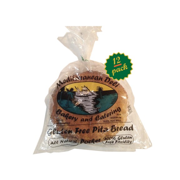
What provokes me about the logo’s lettering, though, is the text’s lack of alignment to the oval (something I noted about Al’s as well). While “Mediterranean Deli” follows the oval’s curve perfectly, the same cannot be said about “Bakery and Catering.” Though the misalignment is subtle, once I noticed that “Catering” frays out, I couldn’t unsee it. Overall, though, Med Deli’s logo is versatile and accentuates its commitment to authentic Mediterranean cuisine.
BUILDING SIGNAGE
Like many restaurants on Franklin Street, Med Deli’s building signage relies on an awning. White letters contrast against black fabric, producing a minimalist style.
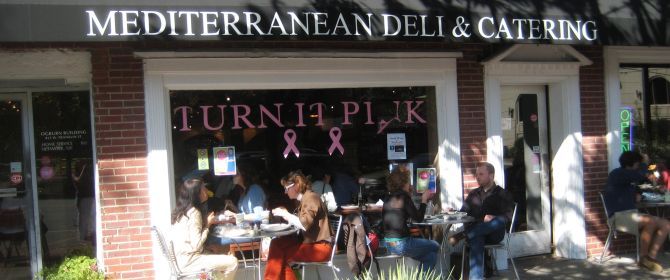
What’s missing from exterior signage is Med Deli’s logo. Producing a black or white transparent version of the logo (i.e. removing all color fills) might bridge the gap between Med Deli’s building signage and logo without becoming overwhelming.
WEB DESIGN
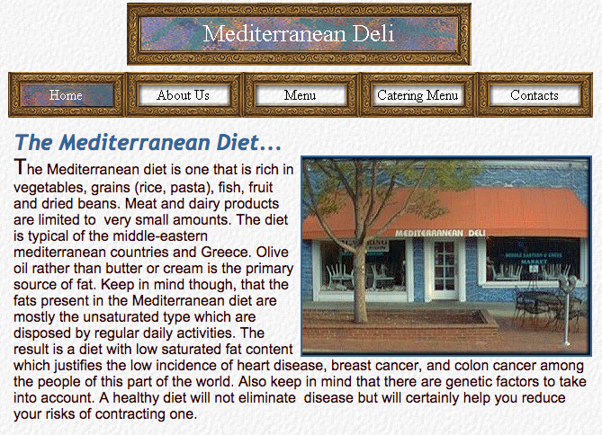
From 2001 to about 2009, Med Deli’s web design looked like this:
Now it looks like this:
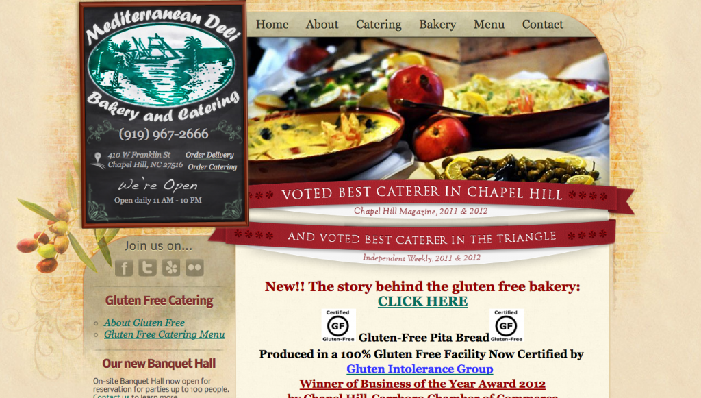
Needless to say, the restaurant’s website has come a long way. Still though, something about the current web design is reminiscent of an older and outdated style (likely because hasn’t been revamped since 2009). It doesn’t adjust to varying browser widths nor does it offer a mobile-friendly version. On phones, smaller text becomes unreadable.
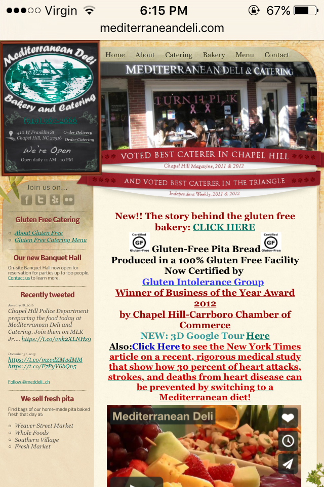
The logo displayed on the website differs from that displayed on social media. On the website, Med Deli’s logo appears in all green. It isn’t clear which logo is preferred by Med Deli or what the reason behind using two versions might be. Neither the green version nor the tri-color version blend well with the website’s beige/red color scheme. Perhaps a subdued yellow-green treatment of the logo (instead of the current Irish green) would better match the web design.
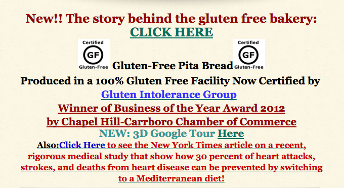
Another issue that appears on several pages is the overuse of signals to make text stand out. Most body text on the web is much larger than printed text (a font size of about 16 pixels is recommended), but Med Deli’s website packs on too many treatments in attempt to catch the reader’s eye. When everything on the homepage is bolded, underlined, in bright colors and centered, viewers will become overwhelmed and not know where to look.
Despite being guilty of a few design faux pas, Med Deli’s website does provide bright, high-resolution photos of its delicious cuisine.
SOCIAL MEDIA
Facebook – 3,253 likes
Twitter – 357 followers
Flickr– 0 followers
Instagram – 118 followers
Of its social media platforms, Med Deli has by far garnered its largest following on Facebook. The deli posts infrequently and inconsistently, but when it does post, it links to merchandise, reposts news coverage, uploads photos or offers support for a cause. Because of its sizeable audience already established on Facebook, Med Deli has the means to continue growing on social media if it posted more frequently and engaged with its customers.
I was surprised to find that Med Deli doesn’t keep up with its Instagram account (its last post was two years ago!). With such vibrant food options ranging from yellow rice to roasted red pepper hummus to tabouli, it has a great opportunity to leverage the platform’s photo-sharing abilities. Instagram is considered to be the most important social network by teenagers, so Med Deli should consider becoming active on Instagram to connect with its younger consumers.
A visual issue I took with Med Deli’s social media accounts is that the square dimensions of profile pictures on Facebook and Twitter crop the edges of its logo.
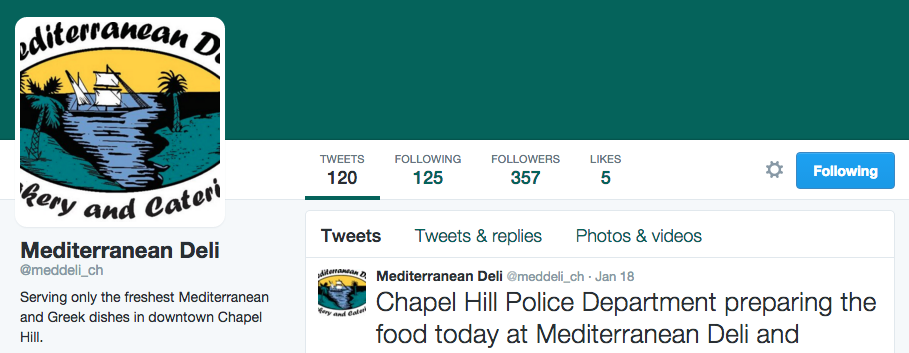
To fix the cropping, Med Deli should add whitespace to the top and bottom of the logo image so that the entire logo is visible.
THE BOTTOM LINE
Med Deli serves exquisite authentic cuisine and deserves recognition for it. It can continue promoting brand recognition and growing its customer base by updating its website to become responsive to any browser width or viewing platform. Med Deli should also post to social media more frequently and take advantage of Instagram’s visual platform and young audience. Next time you go to Med Deli, share a photo on Twitter or Instagram, mention Med Deli’s account and urge the restaurant to become more active on social media!
