As the daughter of two avid bikers, I couldn’t resist delving into Chapel Hill’s sports shop scene. The Bicycle Chain sells a variety of bikes for different purposes and offers a wealth of helpful tips on its website. Its communications strategy is on the right path (bike path, that is) but could make a few changes to further promote itself as a useful resource for bicyclists, experts and newbies alike.
BRAND NAME
The Bicycle Chain brand began with the opening of Carrboro’s The Clean Machine in 1972. The Chapel Hill store opened in 1992 as Franklin Street Cycles. Two more stores opened in the decade following: Cycle Center in Durham and The Bike Rack in Raleigh. In 2007, current owners Doug Venema and Scott Smith opened a fifth store in Apex and rebranded all stores except Carrboro’s to become The Bicycle Chain.
The Clean Machine in Carrboro remains as such, which fragments the brand and creates confusion, especially considering all stores share one website: http://thebicyclechain.com. Though it may be hard to let go of an old name, maintaining two names for the same business hurts recognition of both stores.
LOGO

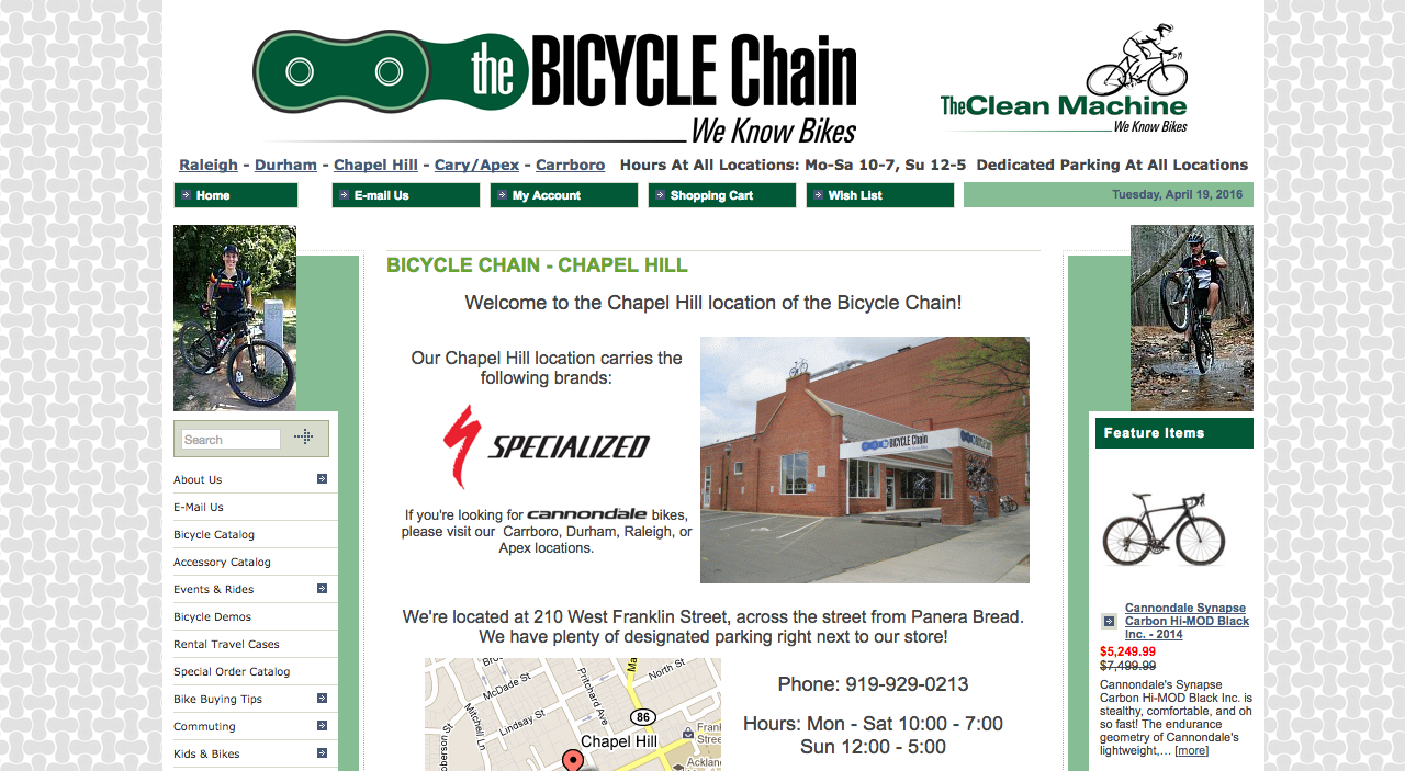
The Bicycle Chain’s logo comprises a shape familiar to any bike lover – a link from a bike chain. The graphic is minimalist and clearly connects to the brand’s name, though after staring at it for too long, I began picturing a frog mask…

The logo uses an extremely condensed sans serif font. Written in all caps and in bold, “Bicycle” is fairly legible. However, the lowercase letters that spell out “the” and “chain” are cramped with little space between already narrow letters. Condensed fonts are notorious for poor readability, and this text is a bit hard to read. That being said, the shop’s simple and short name saves the logo from being completely illegible.
The Bicycle Chain’s logo doesn’t always catch my eye when I pass by the store, but it communicates the essence of the business.
BUILDING SIGNAGE
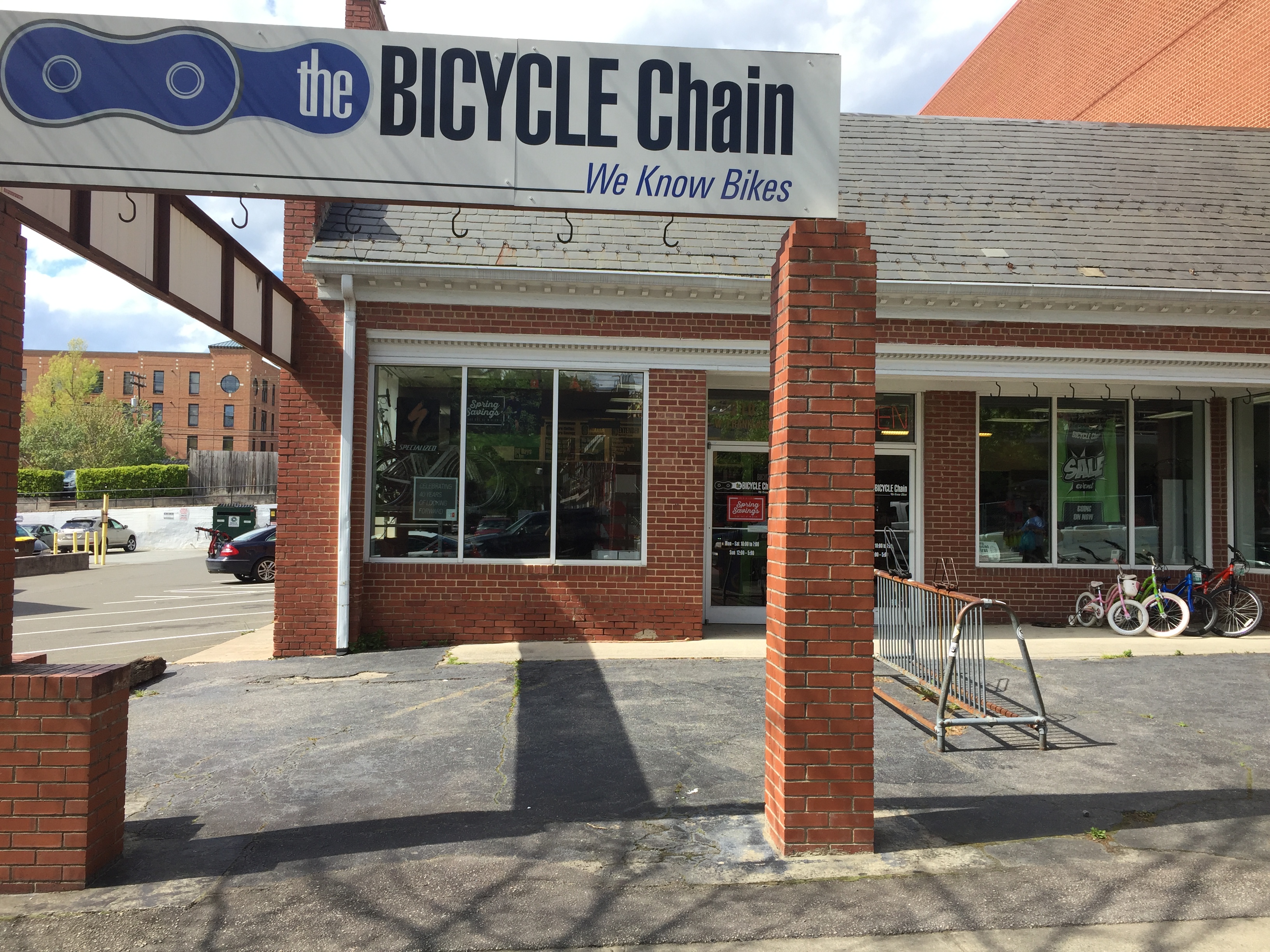
The Bicycle Chain’s building sign is an exact print of its logo but in blue rather than green. Perhaps it’s to signify support for Carolina, though the blue isn’t quite UNC-Chapel Hill’s Pantone® 542. Aside from the color inconsistency, The Bicycle Chain’s building signage aligns closely with its online branding, which is important for building a cohesive image.

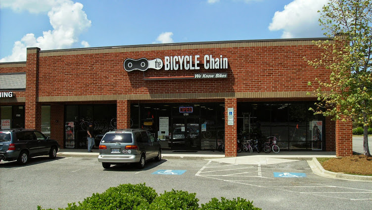
Overall, the sign is lackluster. Since the logo is simplistic, I would’ve liked to see some dimension in the lettering. For example, the Bicycle Chain in Cary offers a sign that stands out against a brick wall.

WEB DESIGN AND CONTENT
The Bicycle Chain’s web design is free from distracting animations and is fairly easy to navigate. One issue with the navigation, though, is poor organization of useful resources. The store offers a wealth of helpful information ranging from how to pick the best bike, how to stay safe on the road, how to maintain a bike, and more, but these articles are split into menus titled “Bike Buying Tips,” “Commuting,” “Kids & Bikes,” “Help With Your New Bicycle,” “Service Department,” “Accessories and Apparel” and “Reading Room.” Instead of displaying all of these categories in the side navigation, The Bicycle Chain should consider condensing them into one tab titled “Helpful Information” or “Important Tips,” and offering a filter-by-category option.

SOCIAL MEDIA
Facebook – 3,461 likes
Twitter – 874 followers
Instagram – 21 followers
The Bicycle Chain has attracted a sizable following on Facebook and Twitter, though it posts rarely. It experimented with Instagram for a few weeks about a year and a half ago but has since abandoned the platform – should it have? As I’ve mentioned in previous posts, Instagram skews toward Millenials, whereas bicyclists tend to be older. A 2013 study found the average age of a bicyclist to be 37 years old, though that number is down from 43 percent in 2008.
While the average age of bicyclists is older than the average age of Instagram users, the gap is decreasing. Since the fastest growing demographic on Instagram is 40-to-60 year olds, the Bicycle Chain should consider leveraging the changing media landscape by appealing to older Instagram users – not to mention college bicyclists.
Sharing valuable and timely content on social media will boost engagement, and The Bicycle Chain already has a comprehensive collection of how-to articles and tips. It should continue building that collection and start sharing it on social media.
THE BOTTOM LINE
It’s clear that The Bicycle Chain is operated and supported by knowledgeable and enthusiastic bike lovers – reorganizing and sharing relevant information with consumers via social media will further propel the store toward success.
What’s your take on The Bicycle Chain’s branding? Do you like its logo? Does it remind you of a frog mask, too? Share your thoughts in a comment below.
