Truth be told, I never truly understood how Top of the Hill became known as TOPO. Is it the “o” from “of?” As in, “TOPO is located on top o’ the hill?” Comment below if you can confirm. Regardless, TOPO is an inspirational local brand that has experienced enormous success since its conception in 1994.
LOGO
TOPO falls under the list of many local businesses that have redesigned their logos. The original logo, pictured below, integrates typography with an iconic illustration of… wait, is it the Morehead-Patterson Bell Tower or the University United Methodist Church? The illustration doesn’t perfectly match either tower. In fact, both have conical roofs, unlike the mystery tower featured in both of TOPO’s logos.

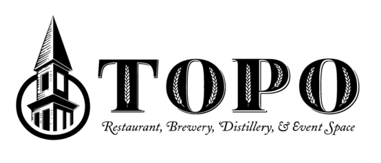
Tower confusion aside, TOPO’s new logo features a beautifully detailed and high-contrast illustration. TOPO embraced its abbreviation and tossed “Top of the Hill,” giving way to bolder and more stylized letters. Grains of wheat embellish each embossed letter, alluding to TOPO’s spirit distillery, which opened in 2012. Overall, TOPO’s high-contrast and stylized logo contributes to the business’s elegant style.

BUILDING SIGNAGE
TOPO’s building signage hasn’t been updated since the logo change, but its metal lettering produces a subdued sheen and fits well regardless of the redesign.
WEB DESIGN
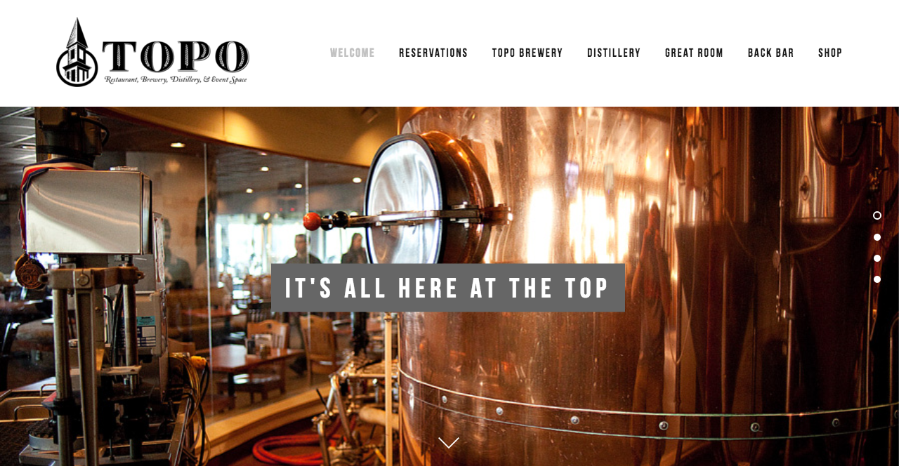
TOPO’s website is minimalist and free of distractions, but its navigation system isn’t the most user friendly. With three of the top navigation tabs linking to the brewery, distillery and Back Bar, TOPO places too much emphasis on its alcoholic offerings. Scrolling down on the homepage leads to TOPO’s food menu, but considering the main image is of the brewery, that fact it isn’t obvious. TOPO’s food menu deserves a spot on its website navigation menu, even if the link simply directs visitors halfway down the homepage.

SOCIAL MEDIA
Facebook – 10,179 likes
Twitter – 5,533 followers
Instagram – 1,020 followers
TOPO has leveraged social media by understanding its target audience and by tailoring messages to that audience. Whether it be families, alumni, students or what-have-you, TOPO lovers are likely diehard Carolina fans. Seated in the heart of downtown Chapel Hill, TOPO has embraced its customer base by posting about all things Carolina: the first day of classes, Tar Heel basketball, student a capella groups and snow days.
TOPO also posts stunning photos, retweets media coverage, and publicizes daily specials and events. Overall, TOPO’s frequent and consistent social media strategy pays off.
THE BOTTOM LINE
TOPO’s visuals and social media work well together to form a comprehensive branding strategy, all of which targets Carolina fans. Perhaps the tower will forever remain a mystery – leave a comment if you can clarify.
