In high school I obsessed over finding hole-in-the-wall restaurants in Chapel Hill – Joe’s Joint, Caffe Driade, this one cupcake shop that used to sit behind the building Kipos now occupies. Thinking back on it, though, I never magically stumbled upon these places (as much as I’d like to say I did). Someone always referred me to them.
Fast forward to college, and my favorite hidden gem (if you can even call it that) is by far Cosmic Cantina. Whether it’s 2 p.m. or 2 a.m., I’ll be chomping down on a mini veggie deluxe. Considering I usually notice several other patrons when I’m there, I imagine Cosmic, which opened in 1999, does pretty well for itself. Yet it has no clear logo. Its website primarily serves the Durham store. It’s absent from social media. How does Cosmic survive without any obvious branding strategy?
LOGO
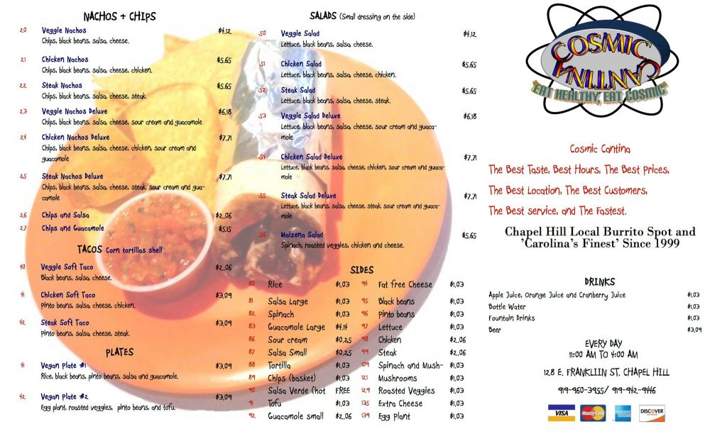
It wasn’t easy to find a logo for Chapel Hill’s Cosmic. Logos shouldn’t be hard to find. But behold Cosmic’s logo!

I almost wonder if the logo was designed ironically. It evokes a style comparable to Space Jam. I could pick apart this logo and explain in technical detail where it went wrong (e.g. the text’s antiquated drop shadow/stroke/rainbow fill reminiscent of WordArt). But all that truly needs to be said is this logo is stuck in 1999 and should probably catch up, though I do appreciate the thought behind mimicking an atom structure.
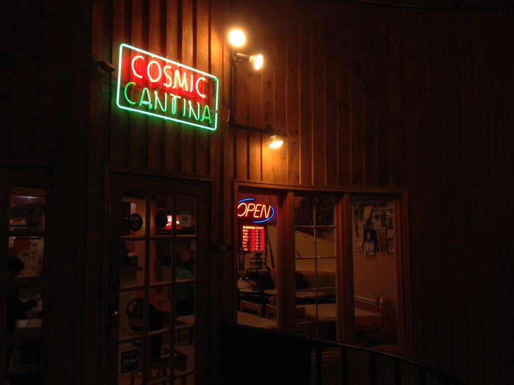
What is most troubling to me is the only place I found this logo is within the menu posted to Cosmic’s Facebook page, which hasn’t been updated since mid-2014. Instead of picturing a logo when I think about Cosmic (and I think about it often), the only image I can conjure up is the neon sign hung above its door.
BUILDING SIGNAGE
Cosmic’s neon sign is quite appealing to me. It’s simple and well-placed, and it isn’t overwhelmed by a sea of other neon signs (though I wouldn’t mind a burrito-shaped one).

Perhaps Cosmic was just lucky to settle into this location, but I’ve also always loved the wood paneling and windows. Turning the corner into what might otherwise be a poorly lit alley, I find relief in Cosmic’s neon sign.
WEB DESIGN / SOCIAL MEDIA
Cosmic Cantina in Chapel Hill seems to have struggled developing its own identity outside of the Durham store, which opened four years earlier. The Durham store dominates the current website, though it’s fairly outdated regardless.
The website links to the Durham Facebook and Twitter pages, stifling potential consumers who might click from the website through to social media in hopes of finding the social presence of Chapel Hill’s Cosmic. But there isn’t much of an online presence for it – just one lonely Facebook page with three total posts.
Facebook
• 256 likes
• 404 check-ins
• 30 reviews
• 4.8 of 5 stars
Despite the inactivity on Cosmic’s behalf, a surprising amount of people have liked, checked in with or reviewed the restaurant. Likewise, Instagram users regularly post photos and tag their location at Cosmic even though it doesn’t have an account.
WORD OF MOUTH
Lucky for Cosmic, the most credible form of advertising is a friend’s recommendation. According to a 2015 Nielsen study, 83 percent of people said they trust the recommendations of friends and family. I discovered some of my favorite places in Chapel Hill through friends and family, and I imagine Cosmic benefits from recommendations as well.
THE BOTTOM LINE
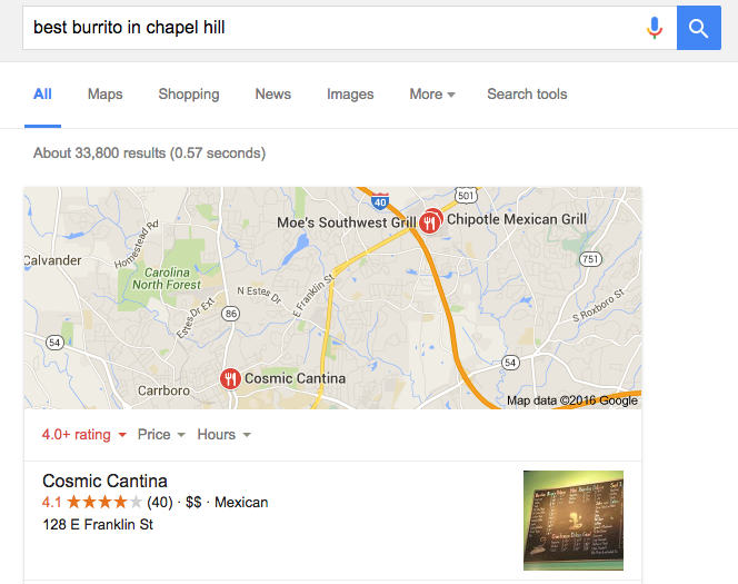
One might argue that Cosmic should continue its indifference to branding. After all, it’s rated the Best Burrito in Chapel Hill by Yelp, and Google searching for “best burrito in Chapel Hill” also brings up Cosmic as a first choice.

Consumers seem to flock to the restaurant and even engage on social media to mention Cosmic. Clearly something is going right, and I don’t doubt that good prices, quality food and word-of-mouth spreading contribute to Cosmic’s success. But with such a strong base already active on social media, why not maximize potential reach and promote recognition through visual and online branding?
Comment below with your thoughts! Do you think it would be worth it for Cosmic to engage in a more active branding strategy?
