It’s a place where community members can prepare food to sell, grow their businesses, teach classes, host events, learn cooking skills and gather to eat good meals. Midway Community Kitchen is among other things a tool for local food businesses looking to grow – let’s look at how it fares in branding itself.
LOGO
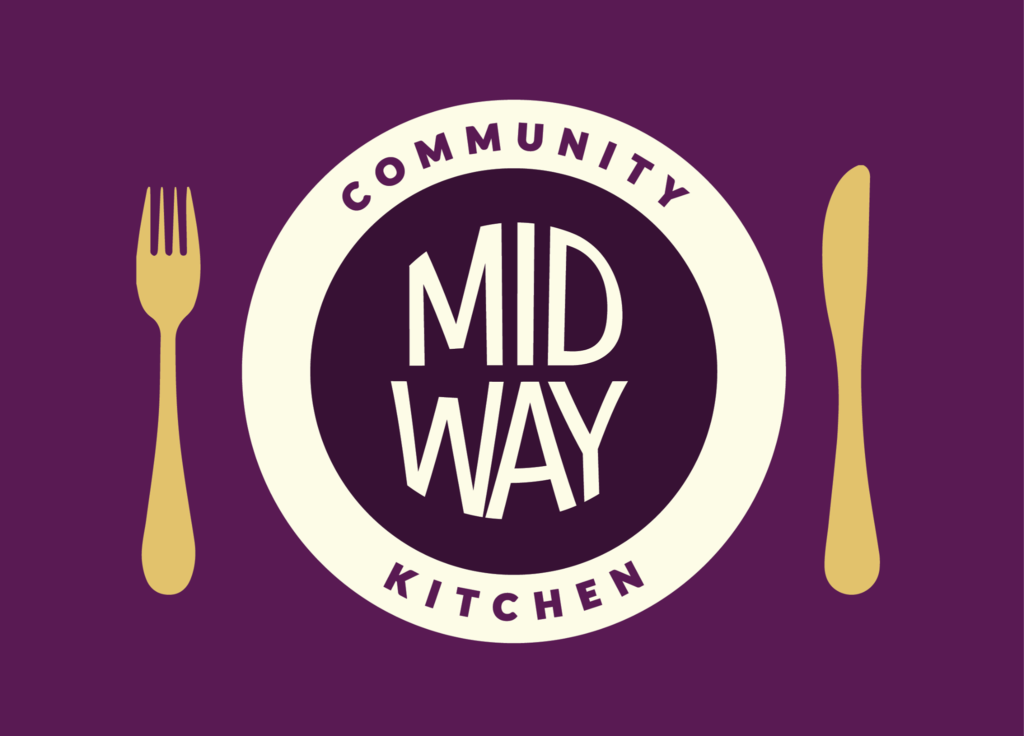
With its bright colors and playful sans serif font, Midway’s logo is eye-catching. The logo is a unique spin-off of an emblem, a typo of logo in which text is placed inside a symbol. Midway is indeed placed inside a circle – a good choice since round shapes imply inclusion, community, commitment and love.
Midways logo extends beyond your basic emblem, though. The circle doubles as a plate, and a fork and knife complete the image. This creative symbolism boosts the logo’s meaning and makes it more memorable.
BUILDING SIGNAGE
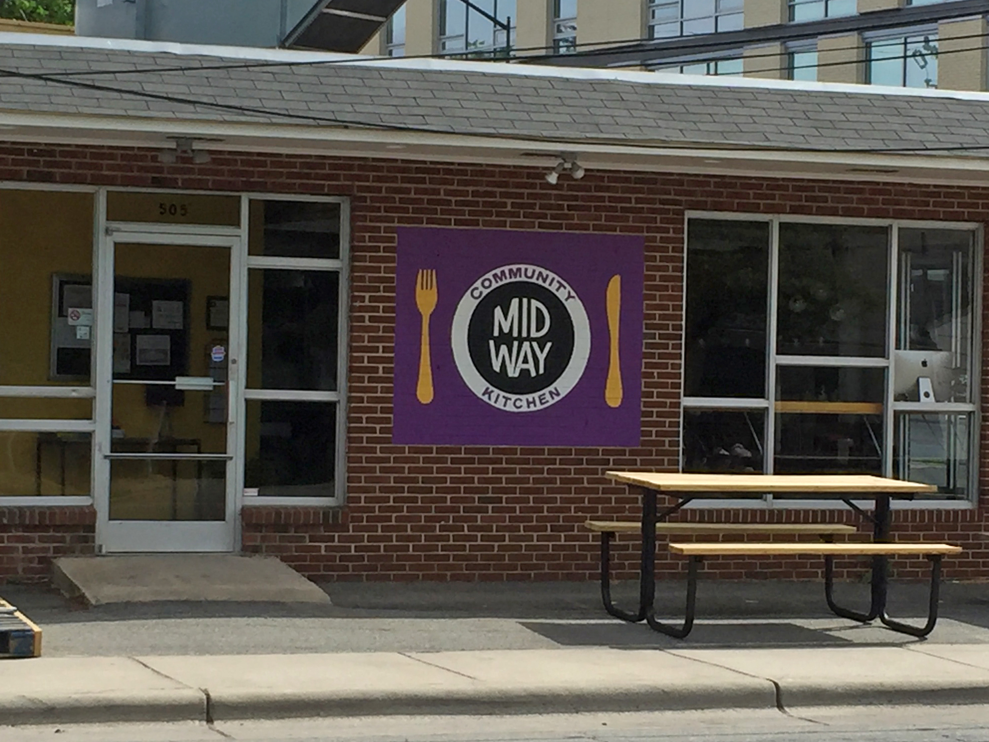
A hand-painted replica of the logo, Midway’s building signage promotes recognition through consistency. Though subtle, the colors on the sign differ slightly from online versions of the logo. For an even more seamless brand, Midway might consider adjusting the colors, either outside or online.
WEB DESIGN
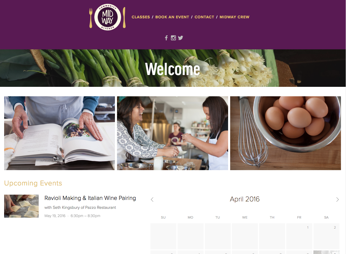
Midway’s web design is smooth and straightforward. It features high-quality photos and promotes its events – an important part of its brand – on the homepage.
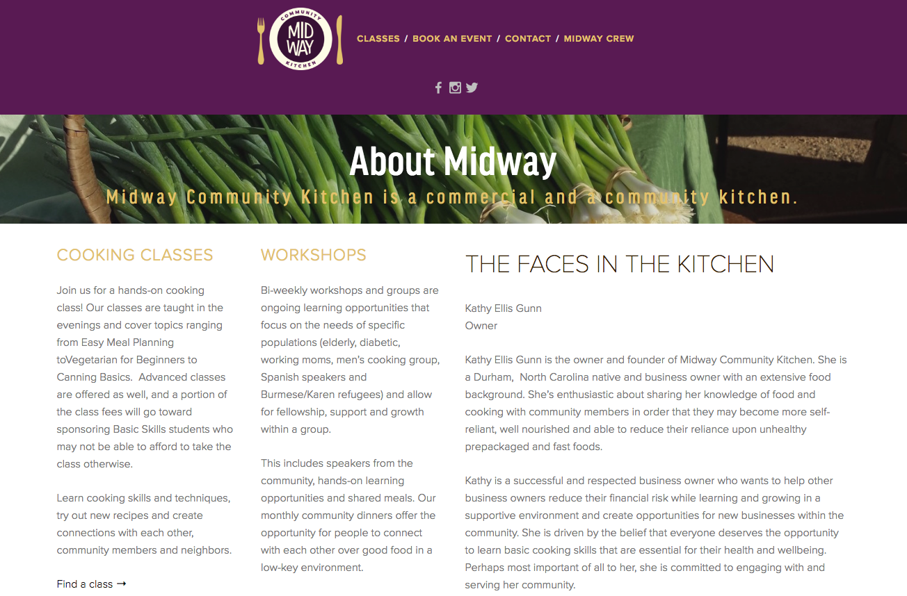
What’s missing from Midway’s navigation menu is a link to its “About Midway” page, which I found by Googling “Midway Community Kitchen.” The page explains the mission of Midway, but without providing a link in the navigation, most people won’t see this vital information.
A quick Google search reveals other pages missing from the navigation menu, such as a page of recipes.
![]() One last note on web design – the design for Midways tab icon (located on the left-hand side of your browser tab) is a bit too complex for maximum legibility. When sized down, the icon is hard to see; details like the utensils and “M” disappear.
One last note on web design – the design for Midways tab icon (located on the left-hand side of your browser tab) is a bit too complex for maximum legibility. When sized down, the icon is hard to see; details like the utensils and “M” disappear.
SOCIAL MEDIA
Facebook – 643 likes
Twitter – 19 followers
Instagram – 92 followers
On social media, Midway focuses on publicizing its events, but it also posts useful information like improving knife skills and shares third-party articles like food business marketing tips.
On Instagram, Midway does a great job of alternating between captivating foodies and authentic photos from cooking classes. Below is a snapshot of Midway’s Instagram posts.
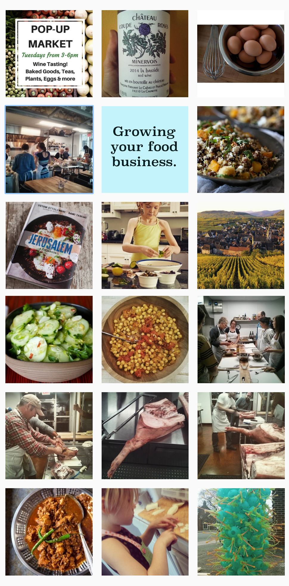
Instagram is the least active of Midway’s three social media accounts, so my only recommendation is that it post a daily photo to Instagram from inside its walls.
THE BOTTOM LINE
Midway’s mission is unique and backed by authentic and loving community members. Its visual branding is consistent, and it posts a variety of content to social media. To continue down the road to a powerful branding strategy, Midway should update its website to include hidden pages in the navigation menu.
