Few things are as satisfying as eating a burrito in Carrboro, and Carrburritos provides just that (with a catchy name to go along with it). Its quirky logo has always caught my eye, which prompted me to examine the rest of its branding.
LOGO
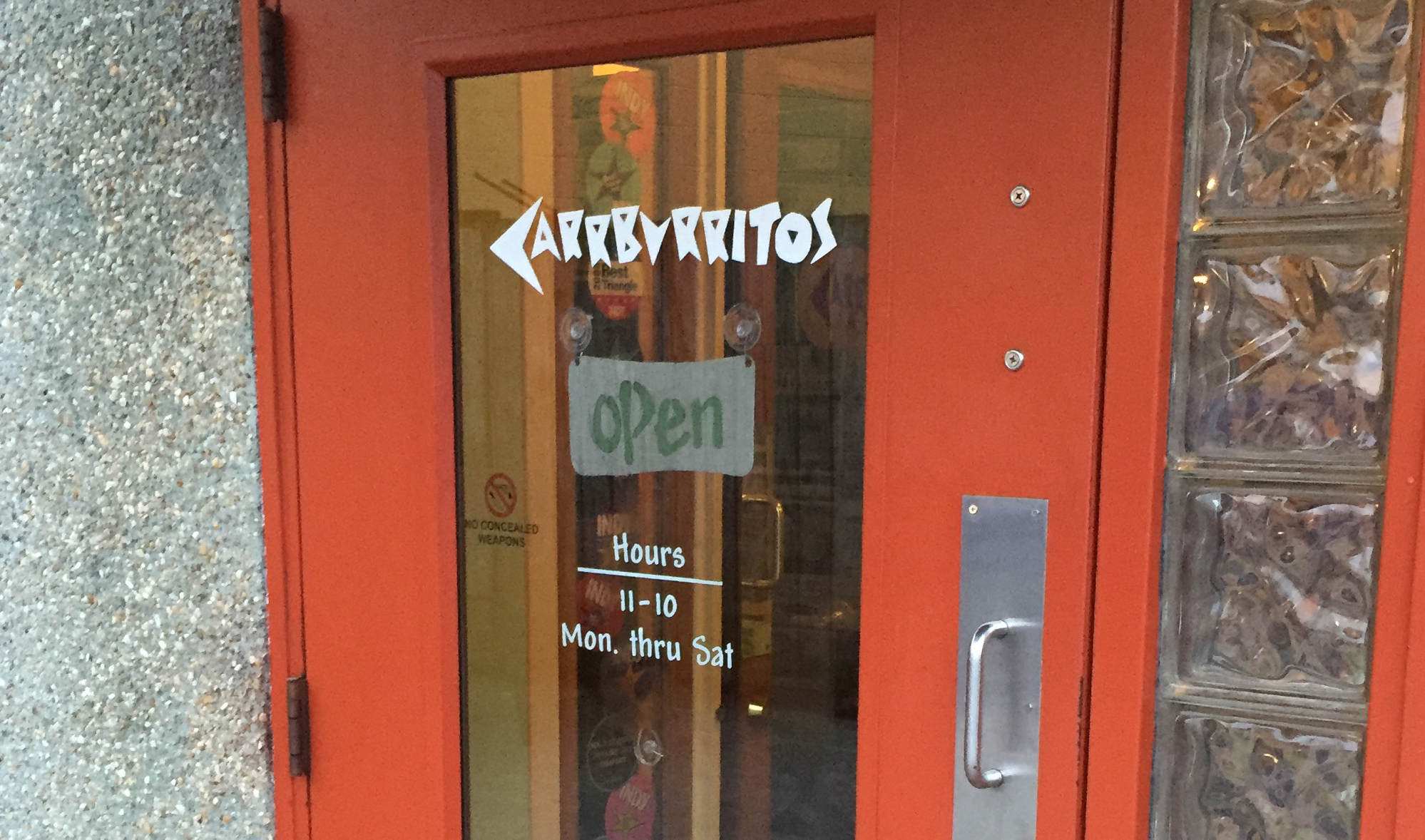
Carrburritos uses bold letters in its logo that bear resemblance to many Greek-style fonts such as Dalek or Pirho Herakles. Another font, Surfboard, also possesses similar characteristics. The enclosed spaces (often called counters) within the letters A, R, B and O all take triangular shapes. Except for the O, each letter is only made up of straight lines. The style is reminiscent of Greek or perhaps Mexican culture, but I wouldn’t automatically draw the connection. Carrburritos’ style thus avoids the cliche, and the result is a unique logo I can only associate with the taqueria.

BUILDING SIGNAGE
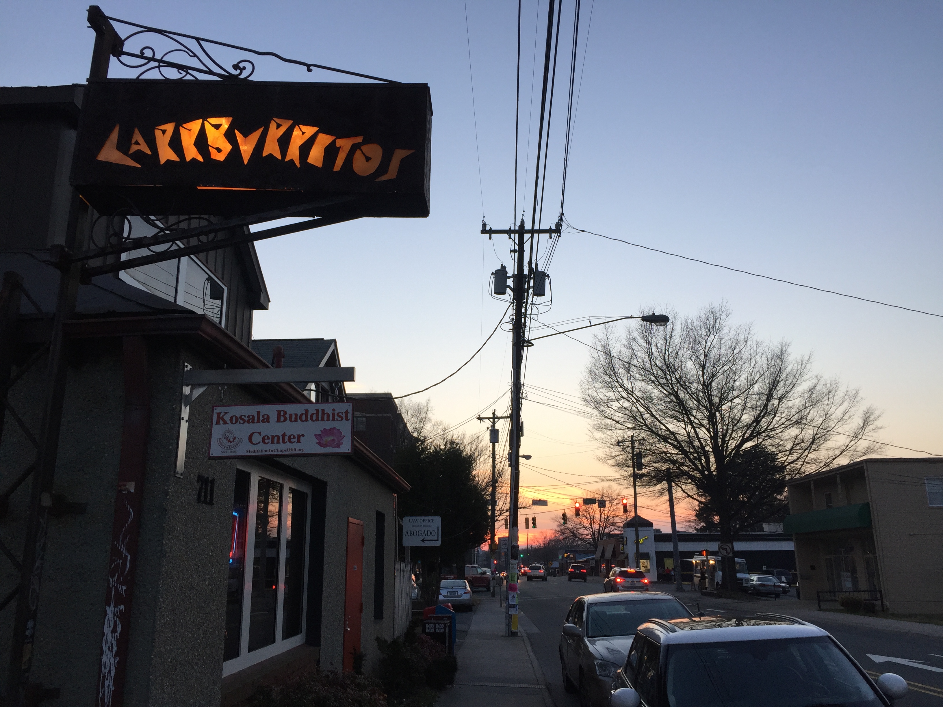
Carrburritos’ sign outside enhances and adds spice to the logo. A warm and lively orange color shines through the rectangular sign, illuminating Carrburritos’ easily discernible letters. The light is soft and subdued, resulting in a sign that is less obnoxious and easier to read than neon.

WEB DESIGN
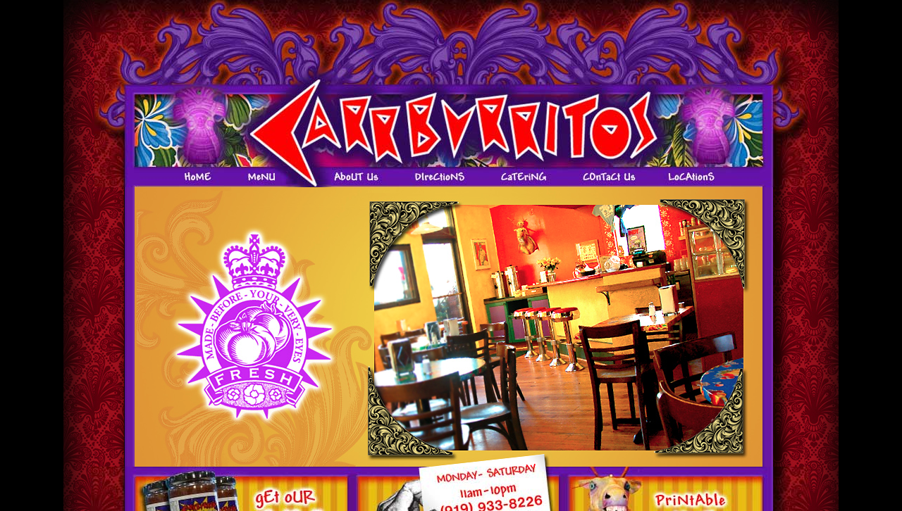
Contrary to the subdued nature of Carrburritos’ building signage, its website is far from subtle. Vivid red, purple and orange colors overwhelm every page. Gaudy glow effects are rampant, and ill-fitted fonts make for an unpleasant experience. The colors clash, as do the fonts (clicking through each page, I think I counted six unique typefaces – most designers recommend sticking to two or three). The website’s flashy design simply doesn’t align with the down-to-earth vibe I get from Carrburritos’ building signage and restaurant culture in general.

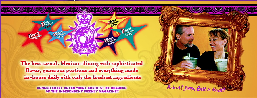
On Carrburritos’ “about” page, those same tacky colors and fonts detract from what might otherwise paint an authentic picture. The photo of owners Bill and Gail is candid and heartwarming, but the frame commands too much attention.

SOCIAL MEDIA
Facebook – 1,518 likes
Carrburritos owns a shell of a Facebook page – it hasn’t posted since 2010, it lacks a profile picture and cover photo, and it offers minimal amounts of information regarding its food and culture. Carrburritos is absent from Twitter and Instagram, though like many great restaurants, Insta users still tag its location regularly. If Carrburritos were to create an account on Instagram, it would already have access to an abundance of user-generated content for the restaurant to monitor and engage.
Carrburritos opened a second store in Davidson (contrary to its name fitting so perfectly to Carrboro). The Davidson store is much more active on social media and has garnered 3,322 likes on Facebook and 243 followers on Twitter. Carrburritos of Carrboro might benefit from monitoring Davidson’s social media to gather ideas for its own social media campaign.
THE BOTTOM LINE
Carrburritos has established a unique culture that its logo and building signage reflect perfectly. However, its web design clashes – Carrburritos should consider revamping its website to complement rather than detract from its brand. Its absence from social media is a missed opportunity. Carrburritos would greatly benefit from engaging with users on Instagram and adding photos and content to Facebook.
What do you think of Carrburritos’ branding?
