Restaurant Branding

How does a hole in the wall like Cosmic Cantina thrive?

In high school I obsessed over finding hole-in-the-wall restaurants in Chapel Hill – Joe’s Joint, Caffe Driade, this one cupcake shop that used to sit behind the building Kipos now occupies. Thinking back on it, though, I never magically stumbled upon these places (as much as I’d like to say I did). Someone always referred me to them.

Fast forward to college, and my favorite hidden gem (if you can even call it that) is by far Cosmic Cantina. Whether it’s 2 p.m. or 2 a.m., I’ll be chomping down on a mini veggie deluxe. Considering I usually notice several other patrons when I’m there, I imagine Cosmic, which opened in 1999, does pretty well for itself. Yet it has no clear logo. Its website primarily serves the Durham store. It’s absent from social media. How does Cosmic survive without any obvious branding strategy?


LOGO

It wasn’t easy to find a logo for Chapel Hill’s Cosmic. Logos shouldn’t be hard to find. But behold Cosmic’s logo!


Cosmic's logo is located in the top right corner of this menu, which was posted to its Facebook page.
Cosmic’s logo is located in the top right corner of this menu, which was posted to its Facebook page.


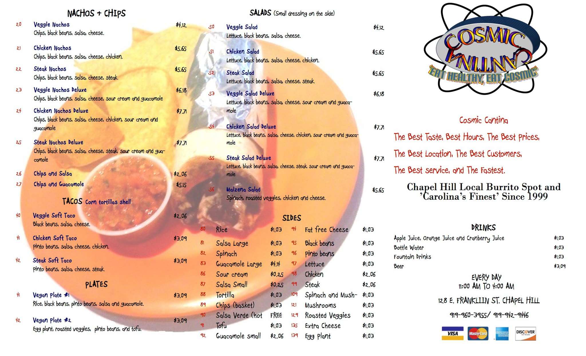
I almost wonder if the logo was designed ironically. It evokes a style comparable to Space Jam. I could pick apart this logo and explain in technical detail where it went wrong (e.g. the text’s antiquated drop shadow/stroke/rainbow fill reminiscent of WordArt). But all that truly needs to be said is this logo is stuck in 1999 and should probably catch up, though I do appreciate the thought behind mimicking an atom structure.

What is most troubling to me is the only place I found this logo is within the menu posted to Cosmic’s Facebook page, which hasn’t been updated since mid-2014. Instead of picturing a logo when I think about Cosmic (and I think about it often), the only image I can conjure up is the neon sign hung above its door.


BUILDING SIGNAGE

Cosmic’s neon sign is quite appealing to me. It’s simple and well-placed, and it isn’t overwhelmed by a sea of other neon signs (though I wouldn’t mind a burrito-shaped one).


IMG_9776
My happy place.


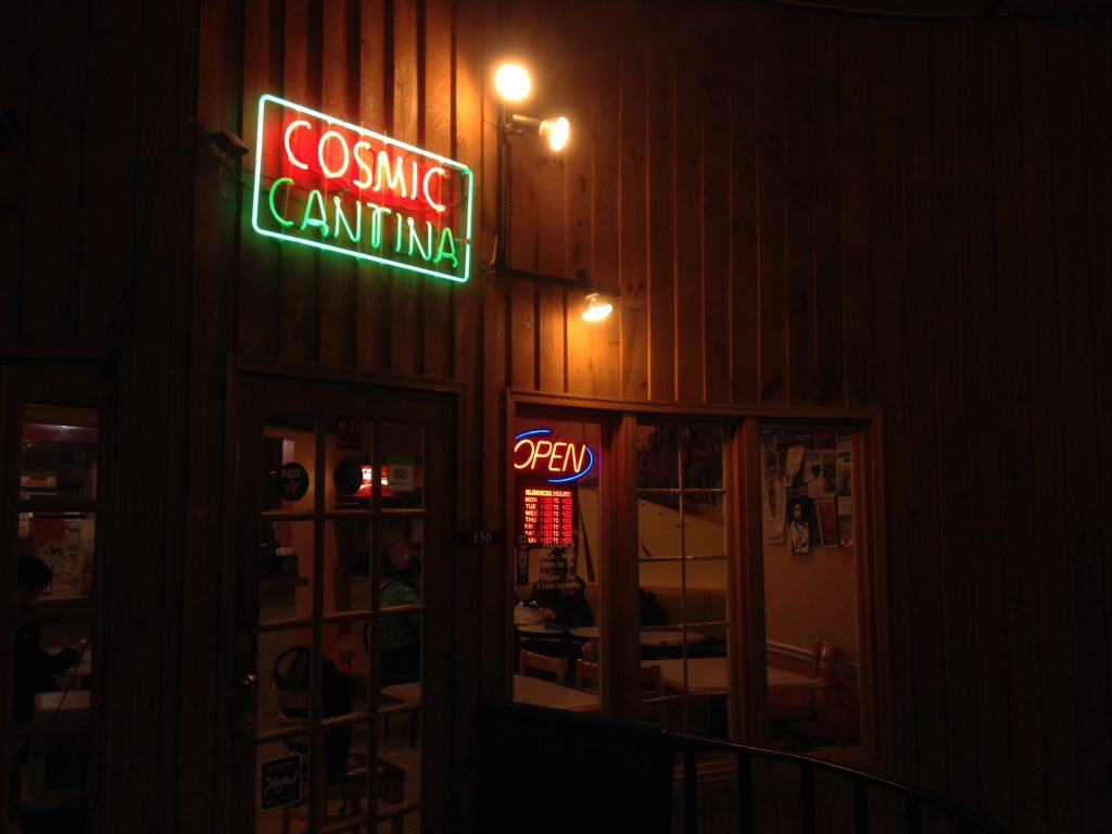
Perhaps Cosmic was just lucky to settle into this location, but I’ve also always loved the wood paneling and windows. Turning the corner into what might otherwise be a poorly lit alley, I find relief in Cosmic’s neon sign.


WEB DESIGN / SOCIAL MEDIA

Cosmic Cantina in Chapel Hill seems to have struggled developing its own identity outside of the Durham store, which opened four years earlier. The Durham store dominates the current website, though it’s fairly outdated regardless.

The website links to the Durham Facebook and Twitter pages, stifling potential consumers who might click from the website through to social media in hopes of finding the social presence of Chapel Hill’s Cosmic. But there isn’t much of an online presence for it – just one lonely Facebook page with three total posts.

Facebook
• 256 likes
• 404 check-ins
• 30 reviews
• 4.8 of 5 stars

Despite the inactivity on Cosmic’s behalf, a surprising amount of people have liked, checked in with or reviewed the restaurant. Likewise, Instagram users regularly post photos and tag their location at Cosmic even though it doesn’t have an account.


WORD OF MOUTH

Lucky for Cosmic, the most credible form of advertising is a friend’s recommendation. According to a 2015 Nielsen study, 83 percent of people said they trust the recommendations of friends and family. I discovered some of my favorite places in Chapel Hill through friends and family, and I imagine Cosmic benefits from recommendations as well.


THE BOTTOM LINE

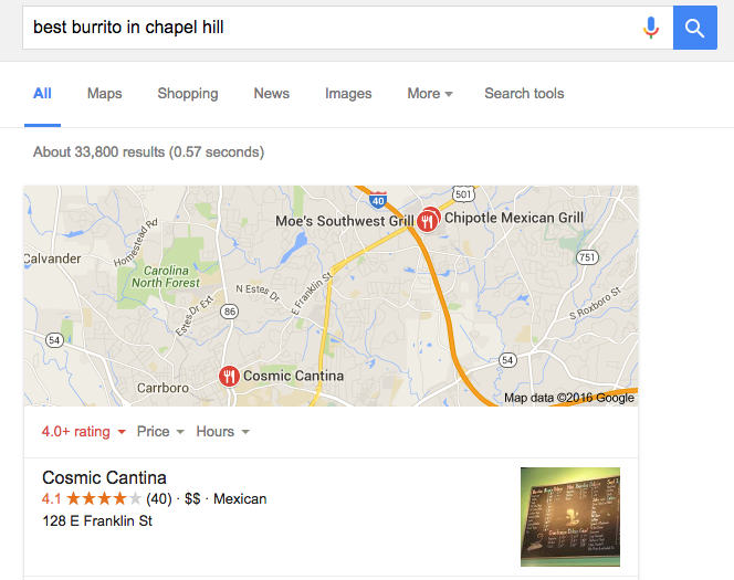
One might argue that Cosmic should continue its indifference to branding. After all, it’s rated the Best Burrito in Chapel Hill by Yelp, and Google searching for “best burrito in Chapel Hill” also brings up Cosmic as a first choice.


Screen Shot 2016-02-11 at 1.30.44 AM


Consumers seem to flock to the restaurant and even engage on social media to mention Cosmic. Clearly something is going right, and I don’t doubt that good prices, quality food and word-of-mouth spreading contribute to Cosmic’s success. But with such a strong base already active on social media, why not maximize potential reach and promote recognition through visual and online branding?

Comment below with your thoughts! Do you think it would be worth it for Cosmic to engage in a more active branding strategy?

Mediterranean Deli: A missed social media opportunity

Mediterranean Deli, Bakery and Catering has served Chapel Hill residents fresh and authentic food from the Mediterranean and Middle East since Jamil Kadoura opened up the restaurant in 1992. Hailed for its wide array of healthy, vegan, gluten-free and organic options, Med Deli has certainly made a name for itself in Chapel Hill. It even opened up a second website to sell its gluten-free pita bread, which Kadoura said took one and a half years to perfect. My friends and I have a healthy obsession with Med Deli (yasmeen chicken salad anyone?), and I’ve often wondered to what extent the deli’s visual and online branding contributes to its success.


LOGO

Med Deli’s logo is a combination mark, meaning it spells out the name of the restaurant while also associating it with a symbol or illustration. But the logo’s illustration is clipped within an oval, which somewhat resembles a badge or emblem-style logo such as Starbucks. The illustration takes on a classic style and uses saturated yellow, teal and blue colors.


330852_10151312677674375_278515941_o


Generally, I’m not a big fan of unconnected casual script fonts such as the one being used here (hint: it’s Forte). This typeface reminds me of one you’d find on a list of standard Microsoft Word fonts. I’m not convinced it’s the best choice for the logo, but the heavier typography and bold color scheme translate very well onto Med Deli’s packaging, such as its pita bread.

Shop-for-Gluten-Free-Mediterranean-Deli-Pita-576x576
Photo courtesy of Mediterranean Deli, Bakery and Catering


What provokes me about the logo’s lettering, though, is the text’s lack of alignment to the oval (something I noted about Al’s as well). While “Mediterranean Deli” follows the oval’s curve perfectly, the same cannot be said about “Bakery and Catering.” Though the misalignment is subtle, once I noticed that “Catering” frays out, I couldn’t unsee it. Overall, though, Med Deli’s logo is versatile and accentuates its commitment to authentic Mediterranean cuisine.


BUILDING SIGNAGE

Like many restaurants on Franklin Street, Med Deli’s building signage relies on an awning. White letters contrast against black fabric, producing a minimalist style.


Courtesy of Mediterranean Deli, Bakery and Catering
Photo courtesy of Mediterranean Deli, Bakery and Catering


What’s missing from exterior signage is Med Deli’s logo. Producing a black or white transparent version of the logo (i.e. removing all color fills) might bridge the gap between Med Deli’s building signage and logo without becoming overwhelming.


WEB DESIGN

From 2001 to about 2009, Med Deli’s web design looked like this:


Screen Shot 2016-02-08 at 9.18.38 PM


Now it looks like this:


Screen Shot 2016-02-09 at 1.08.53 AM


Needless to say, the restaurant’s website has come a long way. Still though, something about the current web design is reminiscent of an older and outdated style (likely because hasn’t been revamped since 2009). It doesn’t adjust to varying browser widths nor does it offer a mobile-friendly version. On phones, smaller text becomes unreadable.


On my phone, I can't read smaller text unless I zoom in.
On my phone, I can’t read smaller text unless I zoom in.


The logo displayed on the website differs from that displayed on social media. On the website, Med Deli’s logo appears in all green. It isn’t clear which logo is preferred by Med Deli or what the reason behind using two versions might be. Neither the green version nor the tri-color version blend well with the website’s beige/red color scheme. Perhaps a subdued yellow-green treatment of the logo (instead of the current Irish green) would better match the web design.

Another issue that appears on several pages is the overuse of signals to make text stand out. Most body text on the web is much larger than printed text (a font size of about 16 pixels is recommended), but Med Deli’s website packs on too many treatments in attempt to catch the reader’s eye. When everything on the homepage is bolded, underlined, in bright colors and centered, viewers will become overwhelmed and not know where to look.


What am I supposed to focus on?!?!?


Despite being guilty of a few design faux pas, Med Deli’s website does provide bright, high-resolution photos of its delicious cuisine.


SOCIAL MEDIA

Facebook – 3,253 likes
Twitter – 357 followers
Flickr– 0 followers
Instagram – 118 followers

Of its social media platforms, Med Deli has by far garnered its largest following on Facebook. The deli posts infrequently and inconsistently, but when it does post, it links to merchandise, reposts news coverage, uploads photos or offers support for a cause. Because of its sizeable audience already established on Facebook, Med Deli has the means to continue growing on social media if it posted more frequently and engaged with its customers.

I was surprised to find that Med Deli doesn’t keep up with its Instagram account (its last post was two years ago!). With such vibrant food options ranging from yellow rice to roasted red pepper hummus to tabouli, it has a great opportunity to leverage the platform’s photo-sharing abilities. Instagram is considered to be the most important social network by teenagers, so Med Deli should consider becoming active on Instagram to connect with its younger consumers.

A visual issue I took with Med Deli’s social media accounts is that the square dimensions of profile pictures on Facebook and Twitter crop the edges of its logo.


Screen Shot 2016-02-05 at 8.25.04 PM
A cropped logo on Twitter looks messy and unprofessional.


To fix the cropping, Med Deli should add whitespace to the top and bottom of the logo image so that the entire logo is visible.


THE BOTTOM LINE

Med Deli serves exquisite authentic cuisine and deserves recognition for it. It can continue promoting brand recognition and growing its customer base by updating its website to become responsive to any browser width or viewing platform. Med Deli should also post to social media more frequently and take advantage of Instagram’s visual platform and young audience. Next time you go to Med Deli, share a photo on Twitter or Instagram, mention Med Deli’s account and urge the restaurant to become more active on social media!

The Root Cellar: A new brand rooted in an old mission

For whatever reason, one of my strongest memories as a child is the interior of what used to be Foster’s Market. Its tall yellow walls are forever ingrained into my mind and along with them, the name Foster’s Market. Although the cafe rebranded in 2014 under the name The Root Cellar Cafe & Catering, I can’t seem to break the habit of calling it Foster’s.

Sara Foster originally opened the Chapel Hill store in 1998 as an expansion of the Foster’s Market of Durham, which is alive and well today. But Sera Cuni, who became a kitchen manager in 2006, purchased the market in January 2013 along with her partner, Susan White. With the help of local brand development firm The Splinter Group, the pair pulled off a brand overhaul. Have a look at the results below.


LOGO

Cuni and White explain that one of their goals in rebranding is to place greater emphasis on the cafe’s commitment to serving local and freshly made food. The new logo directly conceptualizes the trendy slogan “farm to fork” with an illustration of a fork stabbing into a fresh root (presumably a carrot). If that’s not an effective visual that captures the essence of Cuni and White’s mission, I don’t know what is.


fosters2rootcellar


Aside from the illustration itself, The Root Cellar’s logo conveys a commitment to scratch-made food through its vintage style and color scheme. The fine line sketch is reminiscent of an engraving or woodcut printing technique, which leaves an organic or natural impression. The main typeface, which appears to be a condensed version of Abraham Lincoln, also contributes to the vintage style. As for coloring, reddish brown colors are often associated with autumn, when farmers harvest their fresh produce.

The concept and execution of this logo fulfill how Cuni and White sought to portray their new brand – a cafe rooted in its commitment to serving local and organic food.


BUILDING SIGNAGE

The building signage bridges the gap between the old and the new. All exterior signs of course say “The Root Cellar,” but those familiar white letters are here to stay. Below is a photo of the old signage just before being taken down.


Changing the final sign! #rootcellarchapelhill #changeisgood

A photo posted by @rootcellarchapelhill on


While this lettering is inconsistent with typefaces used in the logo, online and on menus, I appreciate its nod to the former brand. I can also imagine that the choice was made to maintain consistency with the signs of other stores in the mini plaza. The old “Foster’s” letters are now displayed inside the cafe. Below is the new setup.


To new beginnings! #rootcellarchapelhill #chapelhill #newbeginings

A photo posted by @rootcellarchapelhill on


The new logo is printed in white on the entrance, a treatment that really lets the fine lines of the illustration shine.


A photo posted by @rootcellarchapelhill on


WEB DESIGN

The Root Cellar’s website is modern and easy to read, highlighting the logo and red-grey color scheme. Photos are of high quality and are well-framed.


websiteroot


The website is responsive to different browser widths and therefore looks great on a computer or a phone, though at certain browser sizes, the menu becomes awkward. Overall though, the website contributes to a uniform image.


If your browser width is smaller but not small enough to trigger a tablet or mobile layout, the organization of information at the top creates an awkward space between it and the navigation links.
If your browser width is smaller but not small enough to trigger a tablet or mobile layout, the information at the top creates an awkward space between it and the navigation links.


Aside from the clean and professional style, the site also makes clear the history of The Root Cellar. It includes “Formerly Foster’s Market” in its web title, which is useful for when someone searches for Foster’s Market on Google. At the bottom of every page, the website links to an explanation of the rebranding with the following verbiage: “The Root Cellar was formerly Foster’s Market Chapel Hill. Read more about our name change →.”


SOCIAL MEDIA

Facebook – 1,856 likes
Twitter – 207 followers
Instagram – 409 followers

The Root Cellar has significantly more likes on Facebook than it does followers on Twitter and Instagram because the Twitter and Instagram accounts needed to be created from scratch. The Root Cellar’s social media efforts consist largely of publicizing food specials and farm events, a monthly occasion in which the cafe partners with a farm to put on a meal made with tasty local ingredients. In other posts, The Root Cellar will highlight a specific fresh or local ingredient it uses or sells. Although the cafe is still working on gaining followers on Twitter and Instagram, its frequent and consistent messaging aligns with its mission of providing fresh and organic food.


COMMUNITY RELATIONS

Cuni and White aren’t just interested in selling fresh and local food. They also believe it’s important to give back to the community, and their interests lie specifically in ending child hunger and supporting LGBT rights. Some of the organizations The Root Cellar partners with include TABLE, the Arc of Orange County, Extraordinary Ventures and the LGBT Senior Group of Chapel Hill.

While Cuni and White’s involvement in nonprofits is true and relevant to their trade, there is little news coverage regarding The Root Cellar’s investment in the community. Publicity may not be the main priority or reason for giving back, but perhaps The Root Cellar would benefit from reaching out to its nonprofit partners and asking them to issue news releases on their behalf. For example, The Root Cellar hosted a dinner and silent auction to benefit TABLE, but TABLE did not issue a news release to publicize the event (though the nonprofit did mention it on social media).


THE BOTTOM LINE

The Root Cellar’s rebranding efforts refocused and emphasized its farm-to-fork mission through strong visual branding, social media and community relations. Yet I still refer to the cafe as “Foster’s.” Do you call this restaurant by its former name? Or has the rebranding imprinted “The Root Cellar” into your brain? Comment below with your thoughts!

A taste of Al’s Burger Shack’s branding

Its burgers are so tasty they earned Yelp’s No. 1 rating in Chapel Hill. It’s committed to providing local and organic food. Its employees are charming and hospitable. It’s conveniently located at the crossroads of Chapel Hill and Carrboro. Al’s Burger Shack might claim any and all of these reasons to explain its wild success since opening in 2013. Does its branding contribute?

Al’s is my go-to restaurant when I’m craving a burger, and I’ll admit it has nothing to do with advertising. For me, the juicy burgers and unique flavors are what keeps me coming back. But I suspect that branding plays a part in getting people into the doors for the first time.


LOGO

A winged oval colored black with Carolina blue lettering comprises the logo for Al’s. It’s simple and easy to read, and its style seems to feel of a local burger joint. But there are a few minor details that irk me, like the logo’s use of what appears to be Myriad Pro (Adobe’s default typeface) and the overall treatment of the lettering. The curve of “Burger Shack” doesn’t seem to perfectly follow the curve of the oval. The upper wings aren’t vertically aligned, creating uneven spacing between the wings on either side.


alslogo


I’m unsure of the reasoning for the winged shape (and if you know, leave a comment with the explanation). Many carmakers use wings in their logos to express speed, so perhaps this logo alludes to Al’s quick-service restaurant model. Overall, the logo for Al’s is minimalist but a little rough around the edges. It isn’t particularly memorable for me, but it also doesn’t detract from the overall brand.


BUILDING SIGNAGE

Outside the shack hangs a sign that matches the logo but drops its wings and is squished vertically. The sign’s use of part of the logo ingrains that graphic into people’s minds as they walk by, though the different height-to-width ratio diminishes that consistent branding.


Photo courtesy of Al's Burger Shack
Photo courtesy of Al’s Burger Shack


Placing the sign perpendicular to the street puts it in plain sight, forcing passersby to sneak a peek. The sign’s Carolina blue lettering fits well into the sea of blue you’ll see walking down Franklin Street.


WEB DESIGN

Al’s Burger Shack’s website is simple and clean, placing all focus on crisp photos that capture the burgers and the culture.


Screen Shot 2016-01-30 at 3.39.16 PM


The web design is modern and responsive to different browser widths, allowing for easy viewing on mobile platforms.


Mobile version of Al's website
Mobile version of Al’s website


As for content, all the essentials are there: hours, contact information and the menu. But what gives the site more personality is its insight into “Shack Life,” describing Al’s commitment to sustainability and displaying videos like one created by a customer and one showing Al’s employees participating in the ALS Ice Bucket Challenge. What could be improved is the icon displayed on the browser tab, which when sized down becomes unreadable.


The lettering in the tab icon is unreadable when sized down.


SOCIAL MEDIA

Facebook: 2,638 likes
Twitter: 1,023 followers
Instagram: 1,014 followers

Al’s posts to its social media accounts frequently and with consistent content and style. On Twitter, Al’s posts once a day and sometimes more, often with links to Facebook posts featuring the daily burger special. Al’s also retweets news coverage and updates its followers with special hours. On Facebook and Instagram, posts contain similar content but offer more visuals. Each daily special post is accompanied by a well-framed photo of the delectable burger.

Along with consistent branding via similar images and posts across platforms, Al’s social media handles are the same and match its website domain name. Consistency on different media improves brand recall and avoids confusion.


THE BOTTOM LINE

Al’s visual branding is clean and fits the style of the atmosphere. What particularly stood out to me is the pristine photography and consistent social media upkeep. With Al’s being the No. 1 hit on Google when searching “burger Chapel Hill,” the shack has clearly proved success that takes more than crafting the perfect burger (though Al’s is pretty damn good at that).

Do you pay attention to its branding efforts, or is it all about the food quality? Leave a comment with your thoughts.