Restaurant Branding

An unclear visual identity at 411 West Italian Café

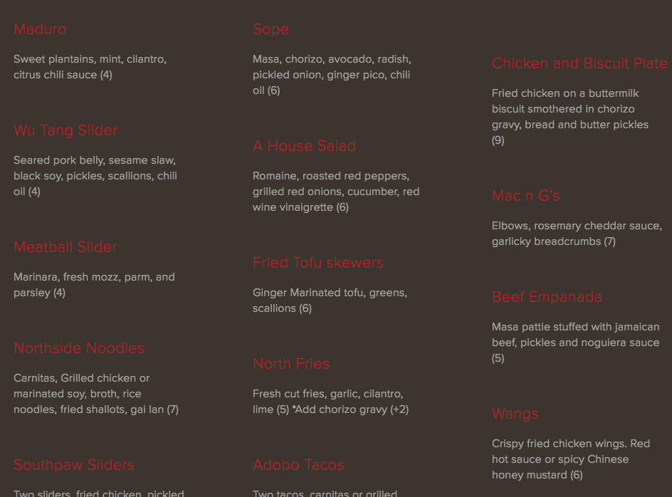
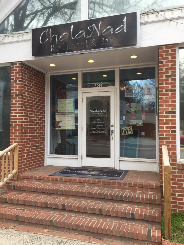
411 West Italian Café serves high-quality and tasty food, which keeps the restaurant busy. It’s always packed on weekend nights, and I always find myself satiated (albeit with a food baby) after eating there. Despite the success, 411’s fragmented and seemingly aimless visual branding prevent a consistent image.


LOGO

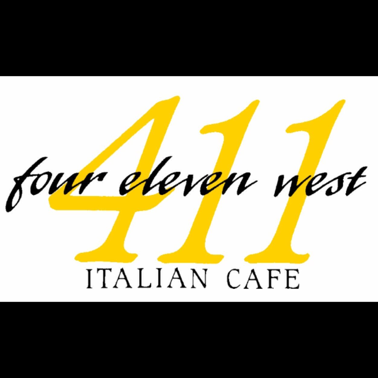
411’s disorder begins with its logo. Below are two variations, the first from the website, and the second from Twitter. Both include similar features: “four eleven west” spelled out in a lowercase script font, “Italian Cafe” spelled out in all caps with loose letter spacing, and “411” written in italic serif numerals.

Inconsistencies, even if subtle, detract from consistent branding. In this case, “411” is in front of “four eleven west” in one logo but behind it in another. One logo uses drop shadows, and the other doesn’t.

head-logo

3ypkNwIx
411 Logo: Version 2

The treatment of “Italian Cafe” is notably very different – in the second version, the letter spacing (also called tracking) is much tighter, and the letters appear to be somewhat condensed or squished vertically. The size is also much smaller in comparison to the remaining portion of the logo.

The second logo is more consistent with the exterior building signage, meaning the web design logo is what should change to reflect a cohesive brand. That being said, these two more similar logos aren’t identical. The colors are an obvious difference, but a close glance reveals a discrepancy in the sizing and placement of “four eleven west” over “411.”
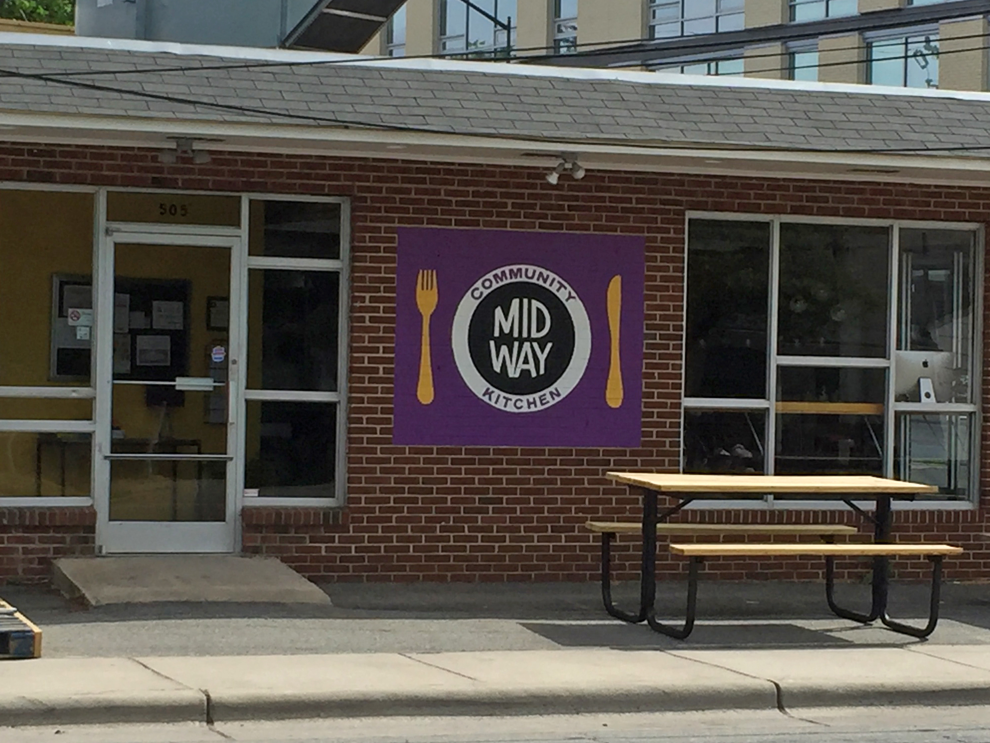
 

BUILDING SIGNAGE

Outside 411 is a flag that displays not only the logo but also a high-contrast sepia image of two people riding bicycles with dogs. I have no inkling of what this graphic could possibly mean. Is biking with dogs an Italian tradition? Designs that have meaning behind them are more impactful, so if there is reason behind 411’s sign, it should make that meaning more clear and use similar visuals on its website.

Despite the unclear meaning, the sign is visually interesting and unique. The sepia image seamlessly fades into white, allowing space for the logo.
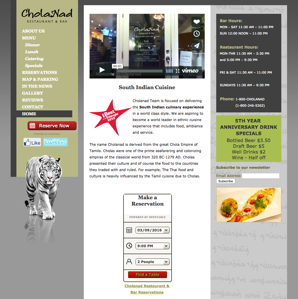
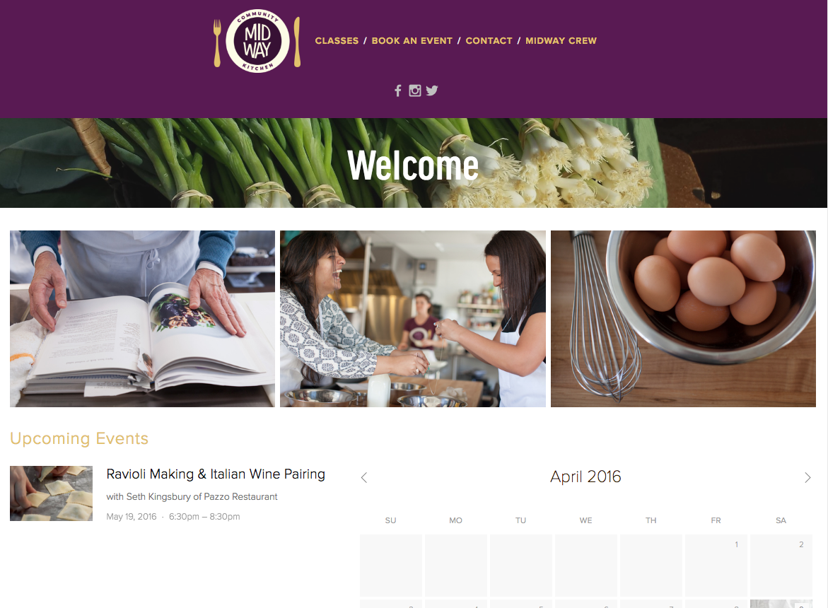
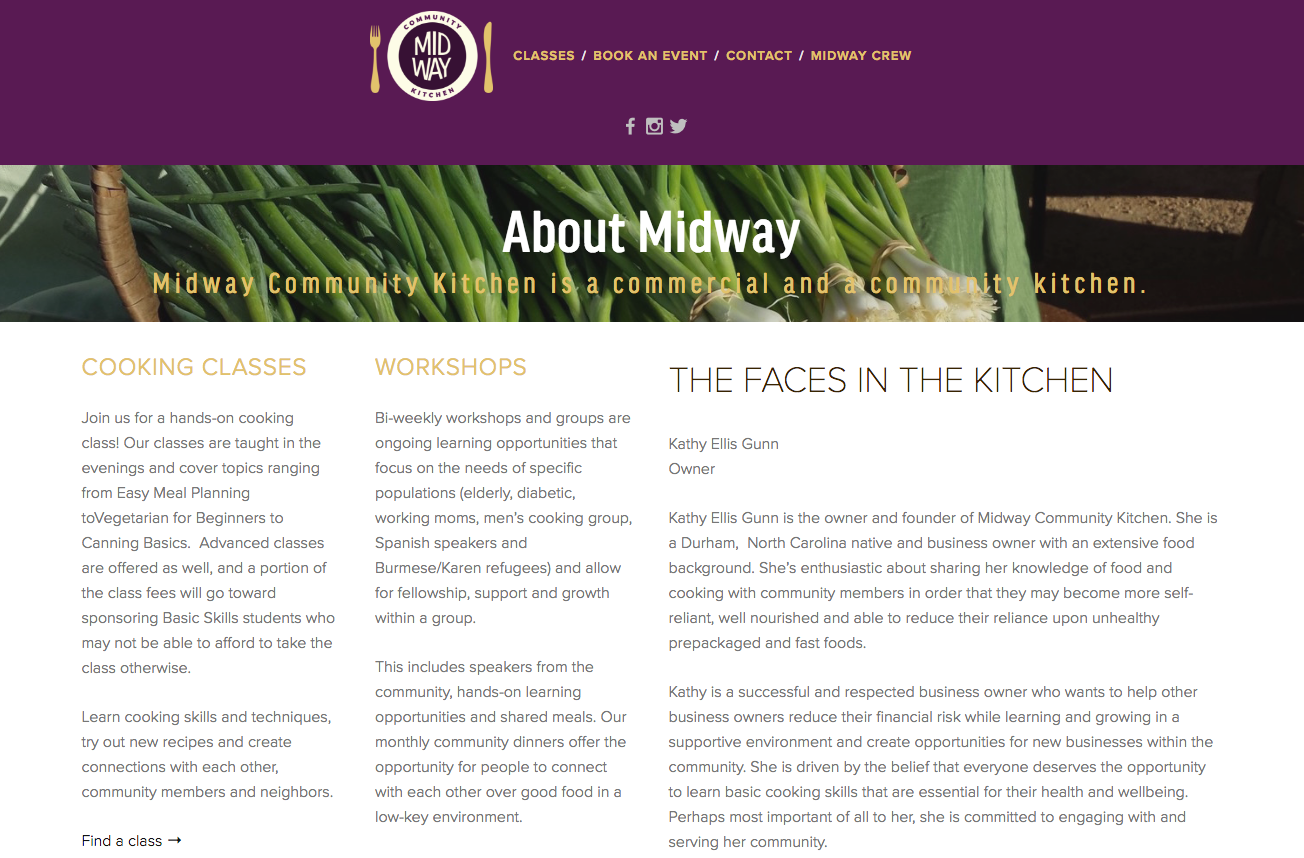
 

Our lovely azaleas keep us smiling even on cloudy days #Azaleas #411West #ChapelHill

A photo posted by 411 West Italian Cafe (@411_west) on


WEB DESIGN

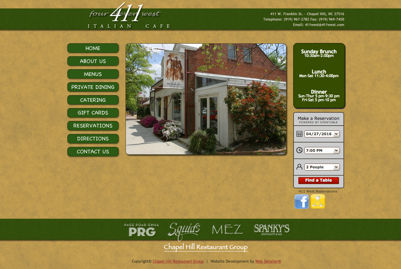
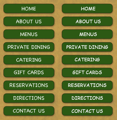
411’s mission is to provide a high-quality dining experience at an affordable price, but its outdated web design reflects something less than elegant. The green header, navigation buttons and sidebar overwhelm each page and command too much attention.

The style of the reservation widget and social media links are inconsistent with the rest of the site and also stick out too much.


Screen Shot 2016-04-27 at 12.33.08 AM


comicsans411At first glance, 411 appears to use two of the world’s most hated fonts: Papyrus and Comic Sans. But what looks like Comic Sans is in reality Chalkboard, Apple’s 2003-released alternative to Comic

Though similar, 411 uses Chalkboard (pictured left), which is the Macintosh alternative to Comic Sans (pictured right for comparison).

The two fonts are very similar, though Chalkboard is less widely criticized. Whether you think Comic Sans and Chalkboard deserve the notoriety, these fonts are fitting for playful, casual settings – everything 411 isn’t.

As for Papyrus, the font’s infamy disqualifies it from being taken seriously.

With its high-quality food and service, 411 should use elegant scripts, sophisticated serifs, or just about anything except Papyrus and Chalkboard. 411’s logo already uses two fitting fonts, one script and one serif, that would work well on the website.
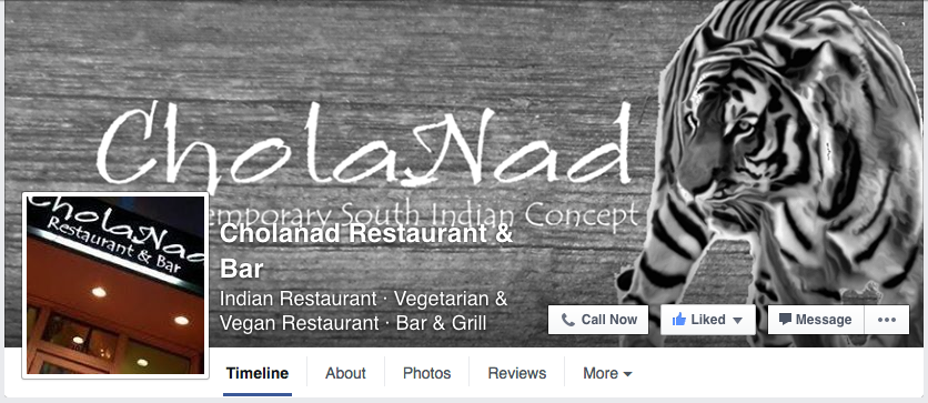
 

SOCIAL MEDIA

Facebook – 1,290 likes
Twitter – 99 followers
Instagram – 296 followers

On social media, 411 posts stunning photos of its food like meatball pizza or fresh strawberries, often with humorous captions like the one below.


411 posts about once a week on Facebook and Instagram but hasn’t tweeted since last July. With larger followings on Facebook and Instagram, it may have been a smart move to focus on two social media platforms, especially considering the visually oriented nature of Facebook and Instagram. 411’s content is engaging and of high quality; it should consider posting more often to boost its social media presence.


THE BOTTOM LINE

411’s disconnected, unexplained and sometimes downright tacky graphics left me confused and without a clear picture of what the restaurant’s visual identity is. Its food is delicious, and sharp photos on social media reflect that. 411 should bring its visual branding up to standard.


Buns’ branding boosts mission of flexibility

I love Buns because of the flexibility. Some days, I’m in the mood for one a pre-invented burger. Other days, I want to invent my own burger, and Buns makes it easy to do that. Through in-store visuals and an annual event, Buns reflects this mission through its branding strategy.


LOGO / BUILDING SIGNAGE

10414478_10152454158767934_2865240469502506214_n
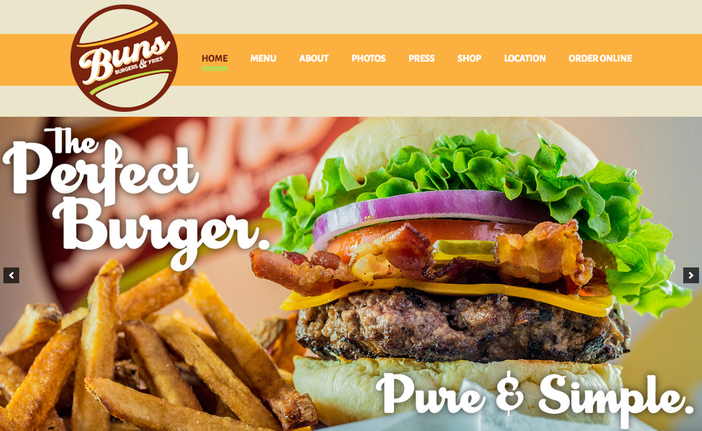
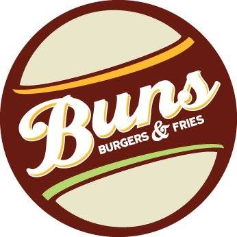
Buns’ logo is full of buns. Two buns surround “Buns” to form a burger. The style is retro, and “Buns” is written in a vintage script font reminiscent of a ’50s style diner. The brown, beige, orange and green color scheme is unique and pleasant.

Outside the restaurant you’ll find Buns’ logo pasted to the door and hanging perpendicular to the sidewalk. “Buns” protrudes from the hanging sign, adding interest and commanding the attention of pedestrians.


IMG_0333


MENU DESIGN

Inside the restaurant is a wall-sized menu that promotes Buns’ mission of providing flexibility in the burger creation process. Organized as a step-by-step process, the menu is easy to understand, and circular flat icons of each topping make for a unique and memorable experience.

burgers


ANNUAL BURGER CONTEST

Every year Buns hosts a Build a Burger Contest, the epitome of its goal of letting customers take charge of their burgers. The contest promotes interaction between Buns and its customers, and because the winner is chosen by a Facebook vote, it generates buzz on social media. Crisp photos of each glorious invention can be viewed on the contest webpage.

Screen Shot 2016-04-26 at 11.52.18 PM


WEB DESIGN

Buns’ website leverages its logo’s warm color scheme, which coincides with the colors of most of its photos. The website’s layout and categorization of pages make for a smooth user experience.

Screen Shot 2016-04-26 at 11.05.29 PM


The website is responsive to various browser widths, but the logo’s low resolution becomes more obvious on a mobile platform. Most (if not all) smartphones use HD screens that are capable of displaying more pixels on a screen, but if an image isn’t large enough, the screen will stretch the pixels it has to work with, creating a blurry photo.


image1


At smaller browser widths, the navigation menu is forced onto a second line, which looks disjointed and awkward.

Screen Shot 2016-04-26 at 11.55.15 PM


Despite these minor issues, Buns’ website looks professional and promotes the brand through consistent visuals and good content.


SOCIAL MEDIA

Facebook – 2,139 likes
Twitter – 133 followers
Instagram – 92 followers

On social media, Buns focuses on promoting specials, sharing media coverage and publicizing events like its burger contest.


Buns hasn’t posted to its Instagram in more than a year, and it only posts to Facebook and Twitter a few times a month. Maybe I’m a sucker for a good burger foodie, but with sharp images of unique burger creations, Buns has the material to post much more often to its social media accounts.


THE BOTTOM LINE

Buns’ brand centers around letting customers control their burger experience, and its logo, creative menu design and annual contest accurately reflect that mission. With a few website tweaks and a more active social media presence, Buns could take over Chapel Hill and turn everyone into a burger-loving fiend like yours truly,

Midway Community Kitchen on a path to success

It’s a place where community members can prepare food to sell, grow their businesses, teach classes, host events, learn cooking skills and gather to eat good meals. Midway Community Kitchen is among other things a tool for local food businesses looking to grow – let’s look at how it fares in branding itself.


LOGO

With its bright colors and playful sans serif font, Midway’s logo is eye-catching. The logo is a unique spin-off of an emblem, a typo of logo in which text is placed inside a symbol. Midway is indeed placed inside a circle – a good choice since round shapes imply inclusion, community, commitment and love.

Midways logo extends beyond your basic emblem, though. The circle doubles as a plate, and a fork and knife complete the image. This creative symbolism boosts the logo’s meaning and makes it more memorable.


12967301_1785290888368360_1796730369894273234_o


BUILDING SIGNAGE

A hand-painted replica of the logo, Midway’s building signage promotes recognition through consistency. Though subtle, the colors on the sign differ slightly from online versions of the logo. For an even more seamless brand, Midway might consider adjusting the colors, either outside or online.


midwaykitchen


WEB DESIGN

Midway’s web design is smooth and straightforward. It features high-quality photos and promotes its events – an important part of its brand – on the homepage.


Screen Shot 2016-04-26 at 9.04.04 PM


What’s missing from Midway’s navigation menu is a link to its “About Midway” page, which I found by Googling “Midway Community Kitchen.” The page explains the mission of Midway, but without providing a link in the navigation, most people won’t see this vital information.


Screen Shot 2016-04-26 at 9.07.29 PM


A quick Google search reveals other pages missing from the navigation menu, such as a page of recipes.

favicon
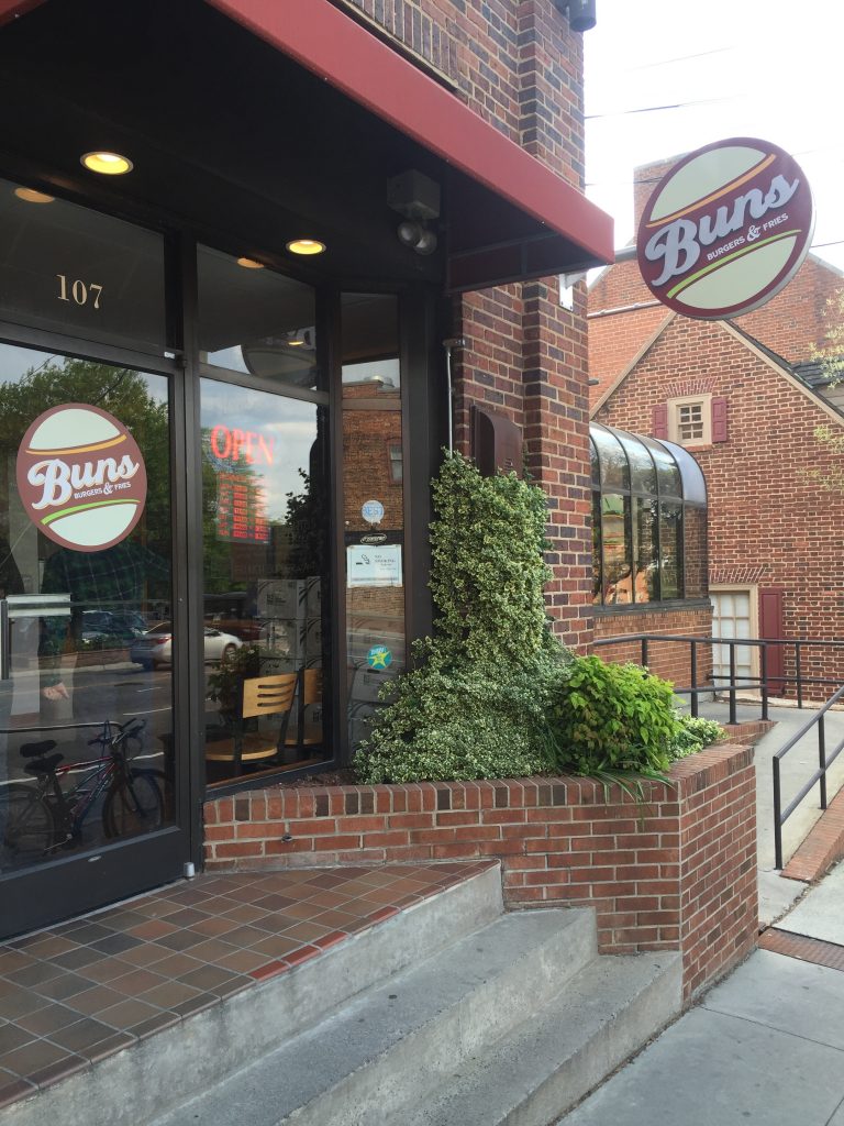
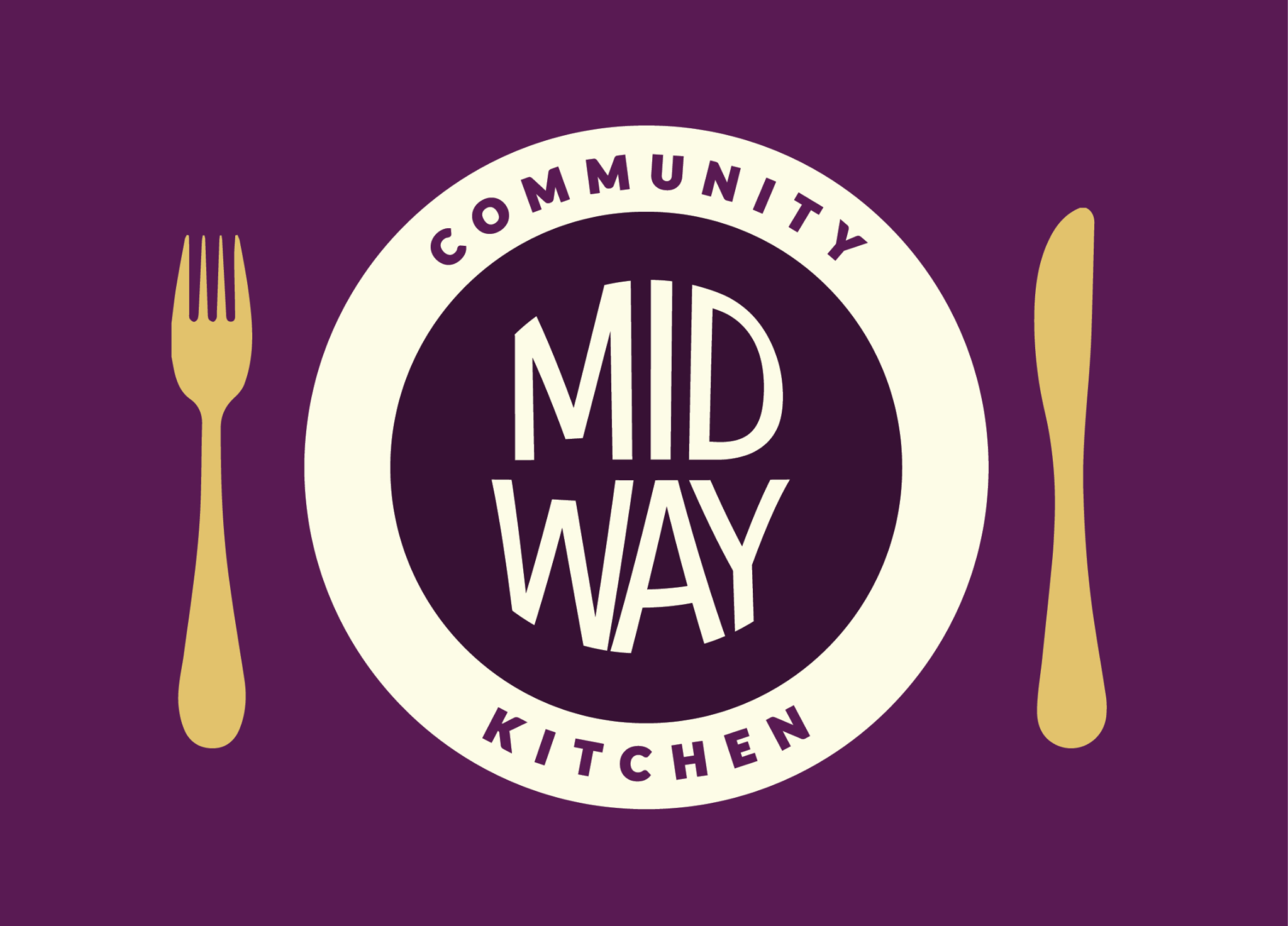
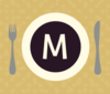
One last note on web design – the design for Midways tab icon (located on the left-hand side of your browser tab) is a bit too complex for maximum legibility. When sized down, the icon is hard to see; details like the utensils and “M” disappear.


SOCIAL MEDIA

Facebook – 643 likes
Twitter – 19 followers
Instagram – 92 followers

On social media, Midway focuses on publicizing its events, but it also posts useful information like improving knife skills and shares third-party articles like food business marketing tips.

On Instagram, Midway does a great job of alternating between captivating foodies and authentic photos from cooking classes. Below is a snapshot of Midway’s Instagram posts.


instamidway


Instagram is the least active of Midway’s three social media accounts, so my only recommendation is that it post a daily photo to Instagram from inside its walls.


THE BOTTOM LINE

Midway’s mission is unique and backed by authentic and loving community members. Its visual branding is consistent, and it posts a variety of content to social media. To continue down the road to a powerful branding strategy, Midway should update its website to include hidden pages in the navigation menu.

Disjointed visuals detract from Vespa’s brand

There are few foods I enjoy more than gnocchi from Vespa, but the store’s branding isn’t quite as satiating.


LOGO

I’m uncertain of Vespa’s official logo, and that’s a problem. The logo on its website doesn’t coincide with its current building sign, and its profile picture on social media is a generic glass of wine. Vespa should draw a better connection between branding platforms by using consistent visuals outside and online.

Below is the logo on Vespa’s website. If the “V” looks familiar, you might be thinking of the typeface used by Vogue. This particular type of serif font falls under the modern classification. Modern serif typefaces are characterized by a high contrast of strokes, resulting in one thick and one thin prong of the “V.” This look is very sleek and sophisticated, a good fit for a classy Italian restaurant. The scooter drawing, though a bit of an obvious choice, draws your eye from left to right, creating flow.


1363193862-vespa_logo
(Vespa’s logo is naturally transparent, so I placed it in front of a turquoise background for visibility purposes.)


BUILDING SIGNAGE

Vespa’s exterior signage has undergone a few changes in the past several years. It used to be a variation of the logo on its current website, as shown below.


Recently, Vespa simplified its building sign and brought in a new color. The updated font is neither a clear sans serif nor serif font. There are subtle rounded serifs on all letters except the “S.” Whatever you may call it, the new style is warm and friendly. The white letters stand out against the red background and always catch my eye as I pass by.


IMG_0047


WEB DESIGN

Vespa’s website has not gotten an upgrade, creating a rift between the restaurant’s branding on and offline. The header’s drastic blue gradient is outdated and jarring, and it doesn’t flow into the light gray background seen on the lower part of each page.


Screen Shot 2016-04-21 at 3.06.24 AM


What’s worse is a pop-up that announces a fixed menu for graduation weekend. Since it’s designed like an advertisement, I automatically reacted to it as if it were an advertisement by exiting out of it immediately (sorry, advertising friends). Vespa should rethink it strategy for promoting graduation weekend – perhaps it could include this information in a blog post and publicize it on social media.


Screen Shot 2016-04-21 at 3.06.49 AM


SOCIAL MEDIA

Facebook – 1,612 likes
Twitter – 49 followers

Vespa’s social media strategy is underwhelming. On Facebook and Twitter (its only active social media accounts), it posts frequent but low-quality content. Take, for example, this series of tweets.

 
Screen Shot 2016-04-21 at 3.12.40 AM


Vespa’s social media strategy serves as a good reminder that quality is more important that quantity. Posting several times in a row with surface-level advertisements will not attract customers on social media. Vespa should consider sharing useful content and engaging visuals that resonate with its customers.

Searching for Vespa’s Twitter, I came across a second inactive account under Vespa’s name. Though it has only tweeted seven times from that account, it has attracted 70 followers (1.4 times the amount of its active account). To avoid confusion, Vespa should delete its inactive account and alert those followers of the active account by following them from said active account.


THE BOTTOM LINE

Vespa’s new building signage is inviting and interesting yet simple. It should update its website and social media to reflect that upgrade, and it should rework its social media strategy to offer valuable information that engages followers.

The Northside District: A promising enigma

Living in Chapel Hill’s historic Northside neighborhood, I take particular interest in any business or organization whose name features Northside. The Northside District, aptly named for its location just across the street from the neighborhood, popped up some time last fall.


LOGO

Thin serif letters accompanied by symmetrical foliage make up the logo for the Northside District. A drop shadow overwhelms the frail letters. Perhaps if the shadow sat a bit closer to the letters, it wouldn’t be as distracting. Two branches of wispy, thin leaves create interest and surround the letters “R.B.” I’m uncertain of what R.B. stands for, but the leaves are certainly a nice touch.


static1.squarespace


BUILDING SIGNAGE

The Northside District’s building sign is what alerted me to the restaurant’s existence – it’s a hand-painted sign featuring bright bold colors that contrast well with the black background. Unlike the overwhelming drop shadow present on the online logo, the paints create subtle dimension without diminishing the sign’s readability.


IMG_0304


WEBSITE

The Northside District’s website is underdeveloped – visitors will find only a photo and the logo on the homepage. Considering Chapel Hill’s Northside neighborhood’s deep history, I was hoping to find a detailed description of the restaurant’s concept and an explanation behind its name.


Screen Shot 2016-04-21 at 6.37.07 AM


The website does offer a menu, though the red font color is hard to read against the slate gray background.


Screen Shot 2016-04-21 at 6.37.17 AM


When viewing on a mobile platform, however, the background becomes white and text becomes readable.


Screen Shot 2016-04-21 at 6.46.36 AM


SOCIAL MEDIA

Facebook – 600 likes | 5/5 stars of 22 reviews

The Northside District has garnered 600 likes on Facebook, but even more impressive is its stellar rating. All 22 reviewers rated the Northside District 5 out of 5, and many studies suggest good ratings can make a big impact on customer perception. One study found that 68 percent of respondents said that positive customer reviews made them trust a local business more.

As far as social media content goes, the Northside District publicizes events like karaoke and “Facebreaker,” a comedy mic night. The restaurant also posts photos of well-presented dishes and promotes daily specials.

For a new business especially, promoting a cohesive brand is vital. Currently, the Northside District’s profile picture is the Tar Heel symbol. It should replace it with its logo.


Screen Shot 2016-04-21 at 6.09.53 AM


THE BOTTOM LINE

With its superb reviews and eye-catching sign, the Northside District is off to a good start. To bolster its success, the restaurant should add depth to its website and upload its logo to Facebook.

Top + o(f the Hill) = TOPO?

Truth be told, I never truly understood how Top of the Hill became known as TOPO. Is it the “o” from “of?” As in, “TOPO is located on top o’ the hill?” Comment below if you can confirm. Regardless, TOPO is an inspirational local brand that has experienced enormous success since its conception in 1994.


LOGO

TOPO falls under the list of many local businesses that have redesigned their logos. The original logo, pictured below, integrates typography with an iconic illustration of… wait, is it the Morehead-Patterson Bell Tower or the University United Methodist Church? The illustration doesn’t perfectly match either tower. In fact, both have conical roofs, unlike the mystery tower featured in both of TOPO’s logos.


523110_368828723159229_277118553_n
TOPO’s old logo resembles a historical plaque.


Tower confusion aside, TOPO’s new logo features a beautifully detailed and high-contrast illustration. TOPO embraced its abbreviation and tossed “Top of the Hill,” giving way to bolder and more stylized letters. Grains of wheat embellish each embossed letter, alluding to TOPO’s spirit distillery, which opened in 2012. Overall, TOPO’s high-contrast and stylized logo contributes to the business’s elegant style.


Screen Shot 2016-04-21 at 4.13.22 AM


BUILDING SIGNAGE

TOPO’s building signage hasn’t been updated since the logo change, but its metal lettering produces a subdued sheen and fits well regardless of the redesign.


WEB DESIGN

TOPO’s website is minimalist and free of distractions, but its navigation system isn’t the most user friendly. With three of the top navigation tabs linking to the brewery, distillery and Back Bar, TOPO places too much emphasis on its alcoholic offerings. Scrolling down on the homepage leads to TOPO’s food menu, but considering the main image is of the brewery, that fact it isn’t obvious. TOPO’s food menu deserves a spot on its website navigation menu, even if the link simply directs visitors halfway down the homepage.


Screen Shot 2016-04-21 at 4.16.29 AM


SOCIAL MEDIA

Facebook – 10,179 likes
Twitter – 5,533 followers
Instagram – 1,020 followers

TOPO has leveraged social media by understanding its target audience and by tailoring messages to that audience. Whether it be families, alumni, students or what-have-you, TOPO lovers are likely diehard Carolina fans. Seated in the heart of downtown Chapel Hill, TOPO has embraced its customer base by posting about all things Carolina: the first day of classes, Tar Heel basketball, student a capella groups and snow days.

TOPO also posts stunning photos, retweets media coverage, and publicizes daily specials and events. Overall, TOPO’s frequent and consistent social media strategy pays off.


THE BOTTOM LINE

TOPO’s visuals and social media work well together to form a comprehensive branding strategy, all of which targets Carolina fans. Perhaps the tower will forever remain a mystery – leave a comment if you can clarify.


Carrburritos’ brand enhanced by building sign, fractured by website

Few things are as satisfying as eating a burrito in Carrboro, and Carrburritos provides just that (with a catchy name to go along with it). Its quirky logo has always caught my eye, which prompted me to examine the rest of its branding.


LOGO

Carrburritos uses bold letters in its logo that bear resemblance to many Greek-style fonts such as Dalek or Pirho Herakles. Another font, Surfboard, also possesses similar characteristics. The enclosed spaces (often called counters) within the letters A, R, B and O all take triangular shapes. Except for the O, each letter is only made up of straight lines. The style is reminiscent of Greek or perhaps Mexican culture, but I wouldn’t automatically draw the connection. Carrburritos’ style thus avoids the cliche, and the result is a unique logo I can only associate with the taqueria.


IMG_9878


BUILDING SIGNAGE

Carrburritos’ sign outside enhances and adds spice to the logo. A warm and lively orange color shines through the rectangular sign, illuminating Carrburritos’ easily discernible letters. The light is soft and subdued, resulting in a sign that is less obnoxious and easier to read than neon.


IMG_9876


WEB DESIGN

Contrary to the subdued nature of Carrburritos’ building signage, its website is far from subtle. Vivid red, purple and orange colors overwhelm every page. Gaudy glow effects are rampant, and ill-fitted fonts make for an unpleasant experience. The colors clash, as do the fonts (clicking through each page, I think I counted six unique typefaces – most designers recommend sticking to two or three). The website’s flashy design simply doesn’t align with the down-to-earth vibe I get from Carrburritos’ building signage and restaurant culture in general.


Screen Shot 2016-03-10 at 11.52.56 PM


On Carrburritos’ “about” page, those same tacky colors and fonts detract from what might otherwise paint an authentic picture. The photo of owners Bill and Gail is candid and heartwarming, but the frame commands too much attention.


Screen Shot 2016-03-10 at 11.54.42 PM


SOCIAL MEDIA

Facebook – 1,518 likes

Carrburritos owns a shell of a Facebook page – it hasn’t posted since 2010, it lacks a profile picture and cover photo, and it offers minimal amounts of information regarding its food and culture. Carrburritos is absent from Twitter and Instagram, though like many great restaurants, Insta users still tag its location regularly. If Carrburritos were to create an account on Instagram, it would already have access to an abundance of user-generated content for the restaurant to monitor and engage.

Carrburritos opened a second store in Davidson (contrary to its name fitting so perfectly to Carrboro). The Davidson store is much more active on social media and has garnered 3,322 likes on Facebook and 243 followers on Twitter. Carrburritos of Carrboro might benefit from monitoring Davidson’s social media to gather ideas for its own social media campaign.


THE BOTTOM LINE

Carrburritos has established a unique culture that its logo and building signage reflect perfectly. However, its web design clashes – Carrburritos should consider revamping its website to complement rather than detract from its brand. Its absence from social media is a missed opportunity. Carrburritos would greatly benefit from engaging with users on Instagram and adding photos and content to Facebook.

What do you think of Carrburritos’ branding?

Cholanad’s branding doesn’t live up to its fine cuisine

Cholanad’s South Indian cuisine scores around 4 out of 5 on every food review site. How does its visual branding score?


LOGO

You can find several variations of Cholanad’s logo floating around the restaurant’s website and social media accounts, and the common denominator is the choice of fonts for “Cholanad” and “Restaurant & Bar.” The former is set in Ruling Script, and the latter is set in Tempus Sans. Both of these fonts debuted in the early to mid-1990s, so they’re a bit dated.


621056_386544724771229_1866531296_o


The fonts may be too stylized to mesh well together. Ruling Script is calligraphic and thus takes on a distinct handwritten style. Tempus Sans is more toned down, but the quirks make for a playful style, especially when in lowercase. Take note of the “n,” for example. Its leg curves inward, giving the character a unique look. For me, the two fonts don’t make for a perfect combination. However, it could be worse. At least it’s not one of these fonts.


Logo_Short21


Aside from visual impact, Cholanad’s logo uses a capital “N,” but on the website, Cholanad is spelled with a lowercase “n.” While it may seem trivial, the inconsistency of capitalization comes off as careless and unprofessional.


BUILDING SIGNAGE

Perhaps the most confusing and illegible sign on Franklin Street, Cholanad’s flag puts forth too much information. On second thought, perhaps it isn’t the amount but rather the lack of clear organization. One of the most important rules of typography is establishing hierarchy – Cholanad’s misuse of vertical text, angled text, different font weights and different font sizes has me trying to read everything simultaneously, and it isn’t working.

People tend to read the biggest text first, which is often at the top of the design. Though “Cholanad” is the largest text, its vertical display and left alignment diminish its power and render it hard to read. Since the restaurant’s name is the most important text, it should be front and center.


Cholanad1


The next most important information on the sign is “A Contemporary South Indian Concept” because it tells passersby what type of cuisine to expect. While set in bold and located at the top of the sign, this text is overshadowed by the centered text and bold red graphic just above, which highlights awards Cholanad has received. The graphic that reads “Best of the Triangle 2012” is the only pop of color on the sign and thus commands far too much attention for what it’s worth.

The remaining text refers to affordable prices, the restaurant’s apparent mascot, specific menu items and contact information. Size and treatment of this text should reflect its subordinate value. Some information should be eliminated entirely or placed on a separate sign or pamphlet.

The Tamil script displayed in the background ties in the restaurant’s Indian theme, but it becomes distracting when trying to read information.

Fortunately, the sign directly above Cholanad’s entrance (see below) is simplified and much more legible. “Restaurant & Bar” is a bit hard to read because of the sign’s inverted style. Overall, though, the sign looks elegant.


IMG_9862


WEB DESIGN

Cholanad’s web design is outdated but easy to navigate. An issue that particularly stuck out to me includes the antiquated style of buttons like “Reserve Now” and the social media links. Replacing those graphics with flat, minimalist designs would be an easy place to begin updating Cholanad’s website to conform to contemporary trends.

Cholanad’s gray and jade green color scheme is soothing and subtle, but the green background behind “5th Year Anniversary Drink Specials” is brighter than the rest and should be altered to match the left sidebar.


Screen Shot 2016-03-09 at 10.15.13 PM


Cholanad teases website visitors by offering a gallery page with no photos. Its Facebook page offers a wealth of high quality photos that should be present on the website too.


Screen Shot 2016-03-09 at 8.44.52 PM
Where is the gallery?


USE OF BENGAL TIGER

On its building signage and website, Cholanad features different photos of a white Bengal tiger, a species native to India. Since Bengals are endangered, I associate them with terms like “rarity” and “value.” Perhaps Cholanad is drawing a connection with white tigers to assert itself as a rare food option? If you have more information regarding the tiger, comment below.


SOCIAL MEDIA

Facebook – 598 likes
Twitter – 70 followers

Cholanad uses its social media primarily to publicize awards that it has won – awards worth boasting! Cholanad doesn’t post often, however, and it could fill in those gaps with additional useful content. Because Cholanad offers authentic Indian cuisine, it could use social media to provide educational materials like recipes and traditions. Or perhaps it could forge a more interactive relationship by sharing stories of regular customers or featuring employees.

Cholanad’s visuals on Facebook could use some adjusting to fit the platform’s unique layout. For example, some of the text on its cover photo is unreadable due to its profile picture, name and description.


Screen Shot 2016-03-09 at 8.23.31 PM
There’s that tiger again!


THE BOTTOM LINE

Cholanad offers highly rated South Indian food and has proven its value by winning various awards. Its visual branding, however, is often confusing, unreadable, outdated and inconsistent. Cholanad should consider overhauling its building signage and updating its website so that its branding is as high quality as its food.

Conflicting visuals at Mama Dip’s, but a whole lot of authenticity

Mildred Cotton Council, or Mama Dip, has been serving up southern food since 1976. Mama Dip opened the restaurant with less than $100, but it quickly flourished and continues to offer country cooking as it enters its 40th year. The brand of Mama Dip’s leverages this charming backstory through its visuals and on social media, and that authenticity pays off. However, the disconnect between the restaurant’s online logo and its outside sign leads to confusion.


LOGO

It isn’t clear which graphic associated with Mama Dip’s is its true logo. One is green in color, oval in shape and features a grayscale headshot of Mama Dip. This logo is displayed on the Mama Dip’s website. Its checkered pattern and triangular jagged edge emulate craftsmanship, and Mama Dip is certainly skilled in her trade of cooking.


logo


Mama Dip’s uses another logo outside the restaurant and on social media. This inconsistency in visual branding is capable of stifling recognition in consumers. When I think of Mama Dip’s, I have trouble visualizing a concrete image because neither graphic is emphasized as the primary logo.

BUILDING SIGNAGE

The second graphic acts as the restaurant’s exterior signage. The sign takes the shape of a giant soup cauldron. The white lettering stands out against the black kettle, achieving high readability. Overall, the graphic is memorable and relevant to Mama Dip’s.

I imagine the bubbles in the soup aim to depict boiling temperature, but I find that they more closely resemble soap bubbles. What type of soup is brewing, I wonder.


FullSizeRender


WEB DESIGN/CONTENT

The Mama Dip’s website brings in subdued orange and green colors that complement each other and are soft on the eyes – no overwhelming or bright hues here. The cross hatch pattern on the logo and in the header and background are reminiscent of a picnic tablecloth, which symbolizes family and unity.


Screen Shot 2016-03-04 at 5.01.01 PM


As for web content, the site promotes authenticity by providing a brief history of the 40-year-old restaurant and by offering recipes. The website links to a blog, which would also contribute to the genuine character of Mama Dip’s. Unfortunately, there is only one blog post from 2013.


SOCIAL MEDIA

Facebook – 1,681 likes
Twitter – 120 followers
Pinterest – 123 followers

Posts by Mama Dip’s are neither frequent nor consistent. Sometimes posts come twice per day, and sometimes it there will be month-long gaps. But when Mama Dip’s does post, the content is meaningful and often involves an employee or customer. Take this post about a couple who visits every year to celebrate a special anniversary:


[facebook_post url=”https://www.facebook.com/mamadips/photos/a.175761845941072.1073741828.169784963205427/492976674219586/?type=3&theater” width=””]
 

It’s this type of authenticity over which big brands go crazy. Authentic social media marketing is often cited as one of the best online strategies, and it appears to pay off for Mama Dip’s. Each Facebook post yields about 50-100 likes, heaps more than what I have seen for other local restaurants.

On Twitter, Mama Dip’s is much less active and therefore less engaging. The restaurant is absent from Instagram entirely, but Insta users often tag their location at Mama Dip’s. These consumers have already begun spreading awareness via Instagram and have therefore created a unique opportunity. Mama Dip’s should get onto Instagram and interact with these users, which would further promote its authentic brand.


THE BOTTOM LINE

Conflicting visuals prevent consistent branding and reduce the likelihood of making a strong impression on newcomers. Mama Dip’s should consider addressing the discrepancy between its building signage and online visuals.

Authenticity naturally radiates from Mama Dip’s, and the restaurant has already begun to enrich its brand on social media. If the time and resources become available, Mama Dip’s should become active on Instagram to continue growing.

Artisan Pizza Kitchen gets new logo, dubs itself “APK”

I once heard a rumor that Artisan Pizza Kitchen – previously known as Artichoke Basil – changed its name because it hijacked its brand and menu from a store in New York, and that store threatened to sue. I found some evidence to substantiate this claim here, but Artisan also mentioned on Facebook in 2011 that it rebranded due to a trademark issue with another restaurant.


LOGO 2011 – 2015

Artisan’s logo looked somewhat similar to its old one in the immediate years following the name change. Overlooking the Comic Sans typeface (because we should all already know that’s a no-no), other issues with the old logo present themselves.

The font size of “Artisan” appears to be larger than that of “Pizza” and “Kitchen.” The tight spacing around the curved text clashes with the ample amount of space within the circle. The text “Chapel Hill, NC” is unreadable against the dark red background, and “Since 2008” is much too small to read. The basil plant graphic doesn’t relate to the restaurant’s new name and looks out of place.


logo_604x447_jpg_300x237_crop_upscale_q85
Photo courtesy of Local Research.


Fortunately, the faults of the old logo are now irrelevant, as Artisan has rebranded again. The shop came under new ownership in the summer of 2015, and with new owners came another new logo.


LOGO 2015 –

Artisan’s new logo embodies minimalism and sophistication. Its black and light cream color scheme is simple and clean, the serif font choice promotes professionalism, and the thin white double border adds a subtle touch of style.

A few quirks in the design prevent the logo from being too simple. The unique hexagonal shape gives an otherwise simple design more personality. The serifs or feet of the “p” and “k” align with the angles of the the hexagon. The foot of the “a” also appears to extend further than one would expect.


Logo-Black-small


One flaw that caught my eye is the discrepancy in spacing. Between the top of the “k” and the border is very tight, but spacing is roomier between the bottom of the “p” and the smaller lettering that spells out the pizzeria’s full name. This inconsistency is subtle, but the devil is in the details.

Overall, Artisan’s new logo is professional and fresh. I don’t refer to the restaurant as “APK,” but perhaps the acronym will catch on in good time.


BUILDING SIGNAGE

Outside the building, Artisan updated its windows to reflect the logo change. On either side of the entrance appear two white prints of the logo, which promote recognition of the pizzeria’s latest rebranding. The awning remains the same, connecting the past with present.


[facebook_post url=”https://www.facebook.com/artisanpizzakitchen/photos/a.320044378033173.63589.200571419980470/899876170049988/?type=3&theater” width=””]


WEB DESIGN

Artisan’s website showcases the restaurant’s logo upgrade by displaying the graphic prominently in the top left. The logo’s black background contrasts with the red background of the site’s header and footer. The combination of a slab serif (think typewriter) and a brush script follows a basic rule for pairing fonts by creating contrast. However, the slab serif feels a bit oversized in some areas on the site and may clash somewhat with the chic style of the serif used in the logo.


Screen Shot 2016-03-04 at 9.01.28 AM


The website is cognizant of varying browser sizes and makes subtle but important changes to increase readability at narrower widths. For example, on wider screens, visitors will see a faded pattern of illustrations of pizza slices, cheese blocks and toppings, as pictured below.


Screen Shot 2016-03-07 at 12.17.45 AM


The pattern effectively embellishes an otherwise bland white background. But if a visitor is viewing on a smaller screen, the pattern could become distracting. Thus, the pattern disappears, presumably to increase readability and promote faster load times.


Screen Shot 2016-03-07 at 12.18.52 AM


SOCIAL MEDIA

Facebook – 519 likes
Twitter – 42 followers
Instagram – 57 followers

Since the ownership change, Artisan has upped its activity on Facebook and Instagram, but its Twitter account appears to remain dormant. As I have mentioned in previous blog posts, Facebook and Instagram appear to be most advantageous for reaching students in Chapel Hill, so I’m neither surprised by nor worried about inactivity on Twitter.

Posting consistently to social media is a great start for Artisan. To continue building a following, it should begin engaging its followers more directly, perhaps through a social media contest or other method of stimulating interaction.


THE BOTTOM LINE

Artisan’s latest rebranding efforts have resulted in a modern and professional visual identity that catches the eye of passersby on Franklin Street. Its activity on social media has spiked since new owners took the reigns, but it has not accumulated a large amount of followers. With time and more engagement on social media, I suspect students will take note of Artisan’s new brand and perhaps even begin calling the pizzeria “APK.” Will you?

Sutton’s Drug Store now a misnomer

If you’ve never been to Sutton’s Drug Store, you’re missing out on one of the greatest traditions in Chapel Hill. Photos of customers cover the walls, and Carolina basketball jerseys hang from above – you become immersed in a sea of Carolina blue the moment you walk in.


I formed my first impression of Sutton’s on its 90th anniversary, a fateful day in 2013 when Sutton’s offered hot dogs at its original 1923 price. Sutton’s closed its drug store a year and a half ago due to corporate competition, but its restaurant is the more widely known facet of the business and continues to thrive.

Although the drug store is gone, the restaurant’s official name remains Sutton’s Drug Store. For an incoming student or visitor, the name might appear misleading or ill-fitting, but Sutton’s is grounded in history. Changing the name might erase some of its historical prominence, and I tend to refer to the restaurant simply as “Sutton’s” anyway.


LOGO

0354-logo


An oval filled with an orange gradient sits in the back of the Sutton’s logo, creating a vintage diner feel. A similar characteristic is found in the Al’s logo, which possesses a somewhat similar restaurant style. The next layer of the logo is what appears to be a milkshake, a favorite item sold at Sutton’s that has earned top ratings. If a milkshake is what the graphic is portraying (if you can confirm that, comment below!), I would say it is stretched too horizontally. Moreover, the utensil sticking out isn’t clearly distinguishable – is it a spoon or a straw?

The typography is what shines in this logo – horizontal lines fill the letters, which certainly fits with an older style and dovetails with the stroked lines that border the oval and the milkshake graphic.


BUILDING SIGNAGE

Outside the store hangs a building sign that faces pedestrians directly as they walk by. The shape of the sign and its black border further emphasize the classic style. Sutton’s also features all-caps classic serif letters, though their beige color sometimes becomes hard to read against the white background, especially in this subpar photo that I snapped.


buildingsignage


Sutton’s used to feature a striped white and red awning that stood out, and without it, the roofing feels a little empty. I’m unsure of when or why the awning was removed, so leave a comment if you have an explanation.


WEB DESIGN

The history of Sutton’s is what sets it apart from competitors, so I was disappointed to see that Sutton’s didn’t include it on its website, even though it leads website visitors into thinking there’s a story waiting for them. The following is listed on the homepage of Sutton’s.


Screen Shot 2016-02-23 at 4.23.44 PM


But clicking the link leads to a sad, blank page.


Screen Shot 2016-02-23 at 4.22.25 PM


Skeleton pages appear to be rampant on the Sutton’s site. Since Sutton’s is filled with photos in store, I expected a vast gallery on its site. The gallery page leads to its Facebook gallery, which felt like a cop-out to me. Granted, its Facebook gallery does house an abundance of group photos, but Sutton’s should consider featuring at least a few on its website.


Screen Shot 2016-02-23 at 4.22.07 PM


Aside from the blank pages, the design of the website is organized and readable, though a little outdated and generic. I’m not sure I like the background of wood planks. Unless you’re Sup Dogs and have a wooden outside patio, wooden planks don’t quite relate, but that’s just my opinion. The main font being used appears to be Lobster, which contributes to the retro style.


Screen Shot 2016-02-23 at 4.19.40 PM


SOCIAL MEDIA

Facebook – 5,146 likes
Twitter – 568 followers
Google+ – 3 followers

By far the most popular social media account for Sutton’s is Facebook, but that doesn’t mean the account is active. Sutton’s hasn’t posted to its Facebook account since August 2015, and it’s been offline Twitter since January 2015.

For smaller and more traditional restaurants, social media can be too big of a time investment for its worth, especially if the restaurant caters to an older demographic. But Sutton’s along with every shop on Franklin Street can leverage the hunger pangs of thousands of UNC students, a population that isn’t going anywhere and will never age. If Sutton’s can find the time to create a social media strategy and schedule social media posts, it could resonate with younger college students and pay off.


THE BOTTOM LINE

Sutton’s is an old-time favorite on Franklin, and though the drug store closed down, the restaurant won’t be going anywhere any time soon. To boost awareness and popularity, Sutton’s should update its website to include its famous history and photos, and it should consider becoming more active on social media. After all, don’t we all want to be reminded of hot dogs every once in a while?

Crepe Traditions: On the path to non-traditional branding

Crêpe Traditions replaced Gigi’s Cupcakes in a prime location on Franklin Street last October, but it should have opened up in July under the name Crêpe Culture. The Daily Tar Heel reported that a negative social media reaction prompted the restaurant to rebrand and therefore delayed its grand opening. Many Twitter users pointed out that “Crêpe Culture” regrettably rhymes with “rape culture,” though the French pronunciation of crêpe actually rhymes with step.

While “Crêpe Culture” was alliterative and perhaps better expressed the owners’ vision of infusing crêpes into Chapel Hill’s culture, the pressure to rebrand prevented the restaurant from having to differentiate itself from a pre-existing crêperie in Singapore that yields top search results on Google. Not to mention, the handles @Crepe_Culture, @CrepeCulture and @TheCrepeCulture are all occupied on Twitter.

With its local ownership and friendly service, Crêpe Traditions evokes the sentiment of a quaint community-oriented shop. Its branding efforts are a step ahead of traditional, though. Unlike many local restaurants, Crêpe Traditions boasts a solid logo and clean web design, and it’s off to a good start with social media.


LOGO

Crêpe Traditions’ logo is characterized by an energizing orange, lime green and brown color palette. A triangular shape symbolizes the restaurant’s main feature (crêpes, of course), though it’s also reminiscent of a slice of pizza (maybe Crêpe Traditions should double as a pizza joint?). Swirls of steam rise up from the logo’s lettering, indicating that the restaurant also serves coffee.


Logo-Circle


The script font that “Crêpe” is written in evokes Parisian elegance, and the all-caps serif font of “Traditions” is, well, traditional. The two contrasting fonts complement each other well. Overall, the color scheme, graphics and typography do exactly what a logo should do – boil down the mission of the business into a simple and recognizable symbol.


BUILDING SIGNAGE

Crêpe Traditions covers all the bases on exterior signage. Letters unique to its logo sit above the entrance. A sign hangs perpendicular to the shop and conforms to the shape of others on the 140 West strip. A transparent version of the logo adheres to the front door. Finally, a chalkboard sandwich board promotes specials.


IMG_9792.JPG


WEB DESIGN

Crêpe Traditions’ website embraces a simplistic design that showcases bright photos of its tasty food. It is easy to navigate, and the body font is large and readable.


Screen Shot 2016-02-16 at 8.13.55 PM


However, a few flawed details stuck out to me that could use polishing.

  1. Too much blank space in the header. The logo’s size and circular shape create a large amount of space at the top of the page when viewing on a computer. That blank space combined with space taken up by the image slider prevents important content from appearing above the fold (which refers to the portion of the website visible prior to scrolling down). To remedy this, Crêpe Traditions should replace its header logo with a horizontally arranged version such as the one hanging above its front door.
  2. Too many frames in the image slider. The slider or carousel, which automatically flips through several photos, is packed with a whopping 18 frames. I couldn’t even sit through one third the slides without getting bored and moving on, rendering most of those frames useless. One consulting firm recommended never inserting more than five frames into an image slider. Crêpe Traditions should reduce the amount of images it features on its home page and instead provide a simpler gallery elsewhere on the site. Doing so might also speed up the load time of the homepage.
  3. Poor formatting of image slider. Some web designers advise beginners to ditch sliders altogether in favor of simpler and faster loading alternatives. At the very least, Crêpe Traditions should alter its formatting to prevent chunky black borders from appearing when images don’t fit the slider dimension.


SOCIAL MEDIA

Facebook – 252 likes
Twitter – 624 followers
Instagram – 52 followers

Crêpe Traditions has established its largest social media following on Twitter, where it is also the most active. The crêperie tweets about once a day and often attaches stunning photos of its cuisine, such as this Valentine’s Day crêpe.


The restaurant’s proximity to UNC-Chapel Hill’s campus supplies it with a young customer base, and since younger social media users tend to consider Instagram the most important network, Crêpe Traditions should reap the benefits by becoming more active on Instagram. The owners should consider engaging students through an Instagram contest, for which it could publicize on Twitter. Perhaps consumers could Insta photos of their crêpes or invent a new crêpe combination and Insta the recipe.


THE BOTTOM LINE

I was impressed to see the progress Crêpe Traditions has made in creating a name for itself in Chapel Hill, especially considering that its original name sparked a social media backlash. The crêperie’s dedication to friendly service and quality food, its professional logo and its high activity on Twitter have all set Crêpe Traditions up for potentially explosive growth. It should consider tweaking its website and interacting with students on Instagram to continue down the path to success.

What do you think of Crêpe Traditions’ logo and web design? What type of Instagram contest/prize would lure you in?