visual branding

Mixed emotions about the Carolina Inn

I was walking by the Carolina Inn a few months ago and noticed its sign looked slightly off. Was there always a pop of Carolina blue in that logo? I thought I might have been going crazy until I recently looked through its Facebook page and found my suspicions to be confirmed. The new logo chopped off all but the bow of the previous key-shaped graphic. The alteration piqued my interest and prompted me to research other components of the Carolina Inn’s branding strategy.


LOGO

The Carolina Inn’s logo used to form the shape of a key, which I liked because of its emphasis on a personalized experience. It connected today’s world back to a time when inns welcomed guests with tangible keys rather than cold and removed key cards. You can still find the key graphic on merchandise like pillows, but online and on building signage, the simplified graphic prevails.


carolinainnkey


The stub of the key is all that’s left now. It still shows personality through its quatrefoil shape, which is in tune with the preppy style that engulfs UNC-Chapel Hill. Who else but Carolina would put argyle on sports uniforms? Incidentally, Alexander Julian, the designer of Carolina’s argyle, also custom made a Carolina Inn key necklace. In the logo’s center sits the letter C, a subtle but effective addition. I imagine its newly established symmetry and square shape likely make it easier to use in a variety of situations. Though the new logo still creates a strong image for the Carolina Inn, I can’t help but long for the old key-shaped graphic that held more meaning for me.


BUILDING SIGNAGE

Signs outside used to feature a black version of the Carolina Inn key.


It persisted even after the logo changed online, but now the signs have been updated to portray the Carolina blue quatrefoil. Perhaps its just reluctance to change, but I find the Carolina blue color of the logo to clash with the yellow/beige color of the sign.


IMG_9785


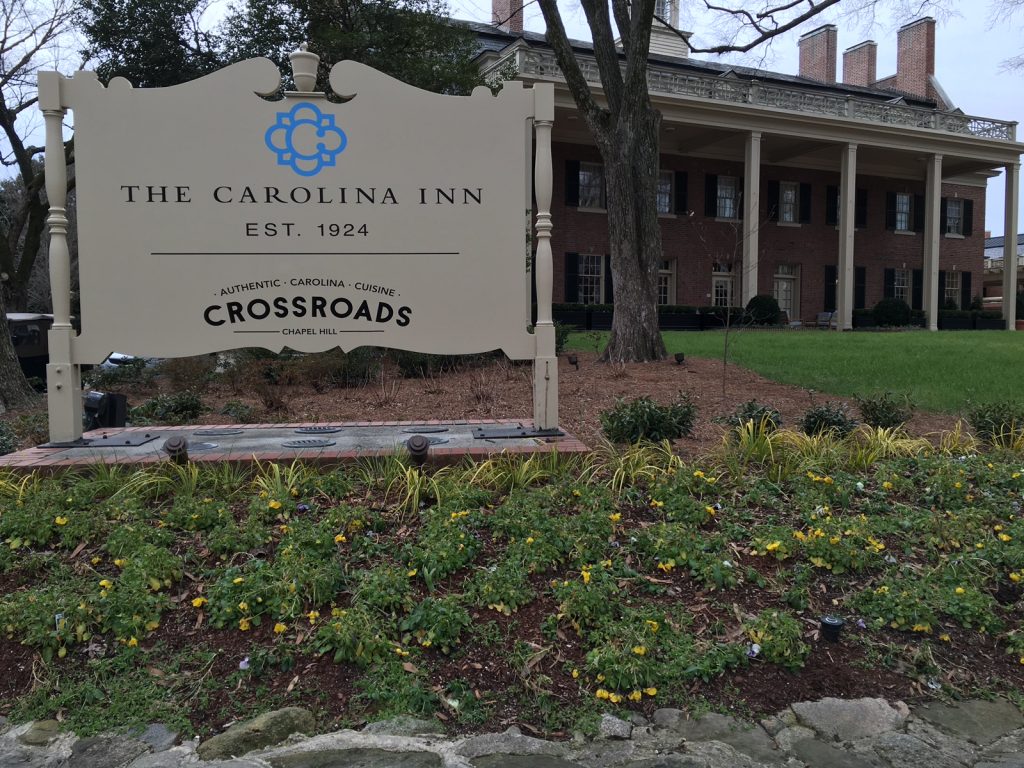
Aside from the out-of-place blue color, the remainder of the sign fits the inn’s ornate style. Its curvy shape and sophisticated all-caps serif font contribute to the inn’s elegance.


WEB DESIGN

The Carolina Inn’s website is packed with beautiful photography and useful content, its design is clean and professional, and it responds well to different browser widths. My favorite little detail is the glow that radiates from the inn’s logo.


Screen Shot 2016-02-12 at 2.54.44 AM


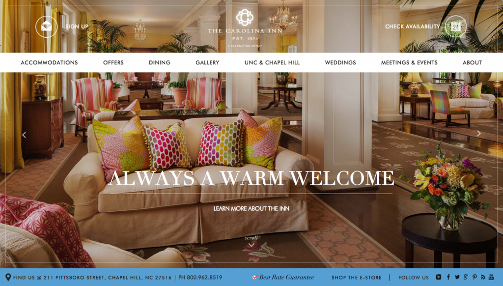
I thought it could be flawless until I continued scrolling down the homepage. Three multi-photo carousels (the animated sliders that flip through several photos or pages of information automatically) appear consecutively.


Each area highlighted in green is a carousel. Too much animation!


Animation after animation overwhelmed me and has potential to slow down the webpage’s loading time. Otherwise, though, the inn’s website looks great.


SOCIAL MEDIA

Facebook – 12,662 likes
Twitter – 3,431 followers
Instagram – 1,794 followers
Pinterest – 1,010 followers
YouTube – 45 subscribers
Google+ – 141 followers

When it comes to social media, the Carolina Inn really knows what it’s doing. Linked to its website include Facebook, Twitter, Instagram, Pinterest, YouTube and Google+. While the inn hasn’t uploaded a video to YouTube in over a year, and its Google+ mainly repurposes its Facebook posts, its other four networks are quite active. The Carolina Inn does an excellent job of posting frequently and with varying content, all of which is useful to its audience. Whether it be a photo of a wedding setup, food from its restaurant Crossroads, or a video featuring a bee farmer who helps the inn produce and sell fresh honey, the Carolina Inn has tapped into the needs of its audience on social media.


EVENTS

The Carolina Inn doesn’t just appeal to wealthy visitors coming into town. In the warmer months it hosts weekly Fridays on the Front Porch, offering live music, a picnic menu and drink specials. The best part? No cover charge. The Carolina Inn proves that a hotel can engage not just out-of-towners but also the local community.


Mick Mixon and The Franklin St Band playing now at #FOFP. #unc #outaboutnc #chapelhill #summerfun #durhamfoodie #eatwritego

A video posted by The Carolina Inn (@thecarolinainn) on


THE BOTTOM LINE

The new blue logo pasted onto the Carolina Inn’s signs outside turn me off and stand out in a bad way. But noticing this change prompted me to do more research on the hotel and discover the positive sides of its branding strategy. Its active social media, wealth of beautiful photos and events planning efforts stand out in a good way. What’s your take on the Carolina Inn’s branding?

Twinkling letters of Light Years

Light Years began as a small shop in 1985 and is still locally owned and operated today. Its specialization has always been and is still jewelry, but the shop also offers gifts, crafts and home accessories. On its website, Light Years promises to provide a unique selection, friendly service and great prices.


LOGO

Roman capital letters that are horizontally stretched form the Light Years logo. The unique arrangement and variation in size of the letters add a quirky touch to what otherwise might be a very simple word mark. The serifs (feet at the ends of each letter) almost twinkle like stars, contributing to the shop’s celestial name. Overall, Light Years’ logo is recognizable and fits with the shop’s unique personality.


logo


BUILDING SIGNAGE

Outside the Light Years on Franklin Street hangs a black awning. Its triangular shape protrudes onto the sidewalk and puts the logo at an advantageous angle to attract pedestrians passing by.


photo_1
Photo courtesy of Light Years.


But the logo’s distinct arrangement also makes for a striking sign outside its shop in Southpoint, shown below.


Photo courtesy of Light Years.


WEB DESIGN

Light Years’ web design has come a long way, especially considering this is what it looked like in 2008.


Screen Shot 2016-02-03 at 12.02.29 AM


The current design primarily highlights Light Years’ latest jewelry collection through a wealth of professional photos.


Screen Shot 2016-02-02 at 7.32.59 PM


Another feature of Light Years’ website is its blog, which has publicized new collections, sales and special events. Posting more frequently and about a greater variety of topics related to jewelry and local artisans might boost engagement. Francesca’s, a national boutique that sells similar merchandise, keeps up with a Tumblr. The blog extends beyond promotional material and often posts educational articles. While Light Years may not have the same resources, it could feature local jewelry artists, discuss trends, offer gift advice, etc.


SOCIAL MEDIA

Facebook – 1,207 likes
Twitter – 184 followers
Instagram– 401 followers
Pinterest – 30 followers

Light Years has set up a good foundation on social media through strong visuals, but a few tweaks to its strategy could promote growth and more engagement. First, Light Years should alter the names of its accounts so that its handles are consistent across all platforms. Right now, Light Years’ Facebook and Instagram accounts have the highest following, and both are under the name of “lightyearsjewelry,” which is also the domain name for the shop’s website. By switching its Twitter and Pinterest names to conform, it will be easier for potential consumers to search and find any account owned by Light Years, and the consistency will avoid confusion and improve brand recognition.

Light Years posts sharp photos to its social media accounts that frame jewelry and other accessories in a warm and well-lit environment. But analysts have shown that top brands post more often than what Light Years averages, which is not quite once a day. Posting up to twice a day on Facebook, three times a day on Twitter and Instagram and five times a day on Pinterest is generally recommended, though it ultimately depends on the quality of the content.

Currently, Light Years posts the same content across platforms with the same descriptions, which can come across as lazy. While posting similar content can work if followers on every outlet will take interest, Light Years should consider providing a lengthier description of the same photo on Facebook while keeping things short and sweet on Twitter and Instagram.


THE BOTTOM LINE

Light Years has developed brand recognition with its simple but quirky word mark that can be adapted for the shop’s building signage and website. Its blogging and social media efforts have established a good foundation for building an online presence. Light Years has an opportunity to boost its following by posting more frequently and with a variety of educational and interactive materials that pertain to its audience. What would you like to see on Light Years’ blog?