
There are few foods I enjoy more than gnocchi from Vespa, but the store’s branding isn’t quite as satiating.
LOGO
I’m uncertain of Vespa’s official logo, and that’s a problem. The logo on its website doesn’t coincide with its current building sign, and its profile picture on social media is a generic glass of wine. Vespa should draw a better connection between branding platforms by using consistent visuals outside and online.
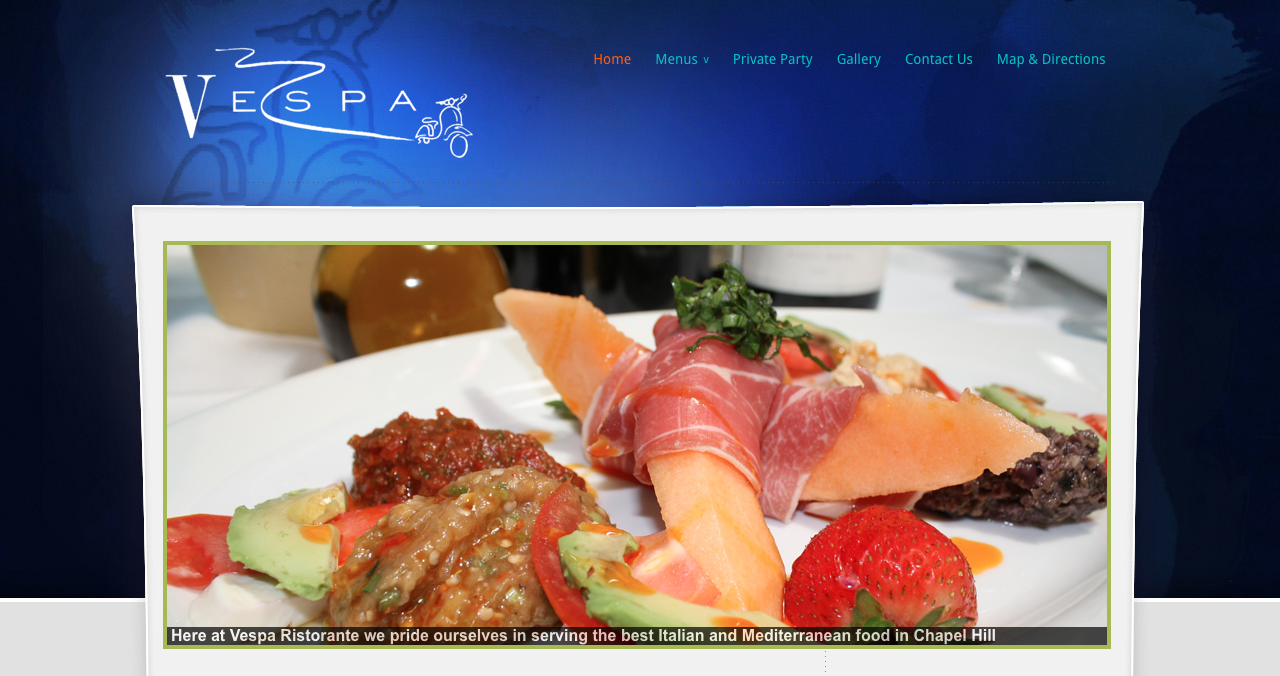
Below is the logo on Vespa’s website. If the “V” looks familiar, you might be thinking of the typeface used by Vogue. This particular type of serif font falls under the modern classification. Modern serif typefaces are characterized by a high contrast of strokes, resulting in one thick and one thin prong of the “V.” This look is very sleek and sophisticated, a good fit for a classy Italian restaurant. The scooter drawing, though a bit of an obvious choice, draws your eye from left to right, creating flow.
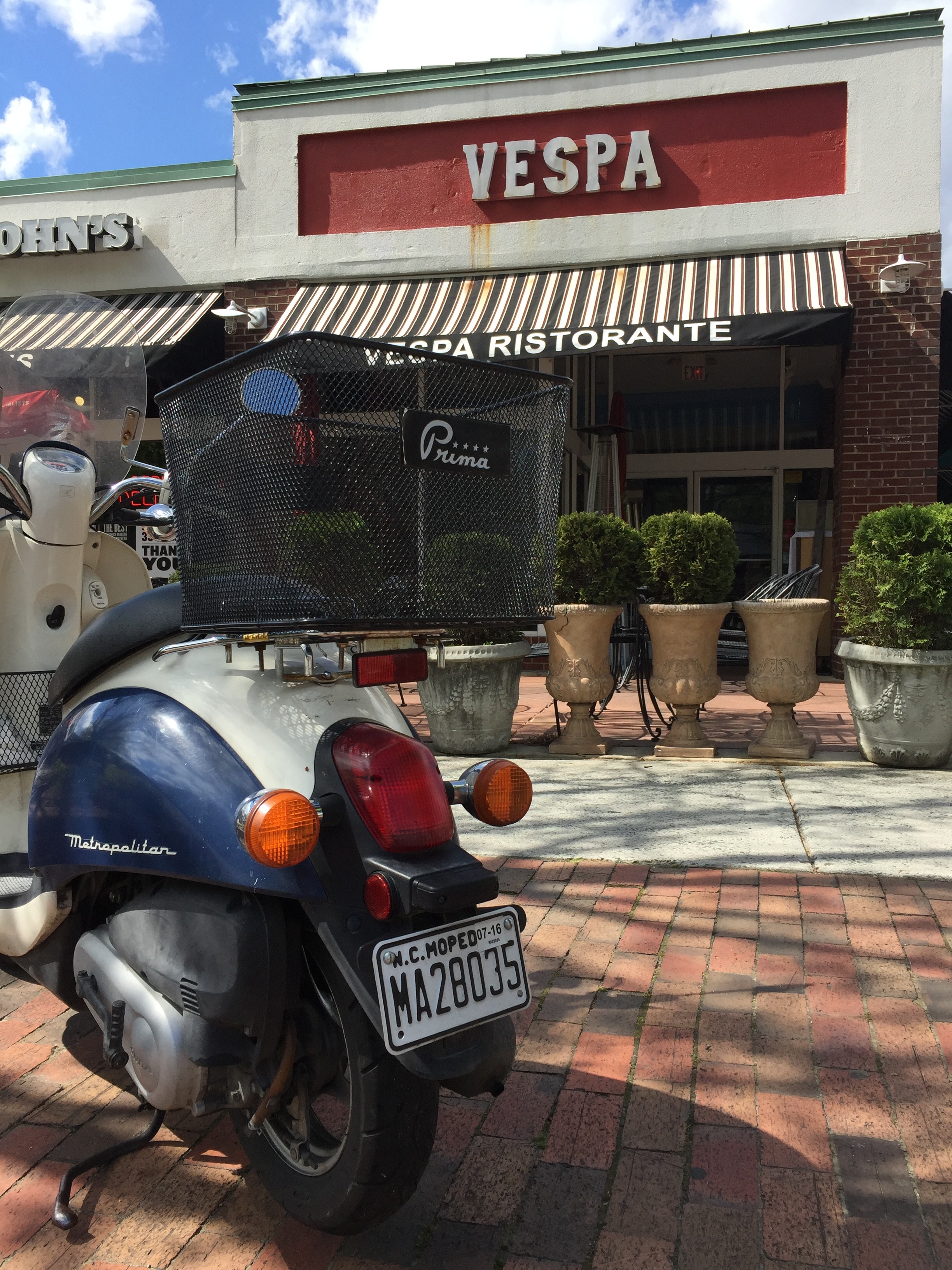
BUILDING SIGNAGE
Vespa’s exterior signage has undergone a few changes in the past several years. It used to be a variation of the logo on its current website, as shown below.
WEB DESIGN
Vespa’s website has not gotten an upgrade, creating a rift between the restaurant’s branding on and offline. The header’s drastic blue gradient is outdated and jarring, and it doesn’t flow into the light gray background seen on the lower part of each page.
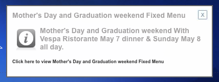
What’s worse is a pop-up that announces a fixed menu for graduation weekend. Since it’s designed like an advertisement, I automatically reacted to it as if it were an advertisement by exiting out of it immediately (sorry, advertising friends). Vespa should rethink it strategy for promoting graduation weekend – perhaps it could include this information in a blog post and publicize it on social media.
SOCIAL MEDIA
Facebook – 1,612 likes
Twitter – 49 followers
Vespa’s social media strategy is underwhelming. On Facebook and Twitter (its only active social media accounts), it posts frequent but low-quality content. Take, for example, this series of tweets.
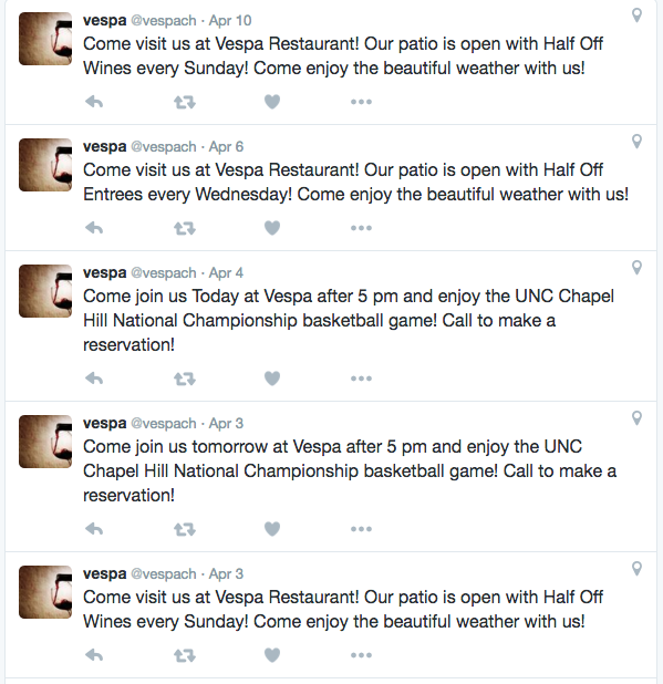
Vespa’s social media strategy serves as a good reminder that quality is more important that quantity. Posting several times in a row with surface-level advertisements will not attract customers on social media. Vespa should consider sharing useful content and engaging visuals that resonate with its customers.
Searching for Vespa’s Twitter, I came across a second inactive account under Vespa’s name. Though it has only tweeted seven times from that account, it has attracted 70 followers (1.4 times the amount of its active account). To avoid confusion, Vespa should delete its inactive account and alert those followers of the active account by following them from said active account.
THE BOTTOM LINE
Vespa’s new building signage is inviting and interesting yet simple. It should update its website and social media to reflect that upgrade, and it should rework its social media strategy to offer valuable information that engages followers.