
Crêpe Traditions replaced Gigi’s Cupcakes in a prime location on Franklin Street last October, but it should have opened up in July under the name Crêpe Culture. The Daily Tar Heel reported that a negative social media reaction prompted the restaurant to rebrand and therefore delayed its grand opening. Many Twitter users pointed out that “Crêpe Culture” regrettably rhymes with “rape culture,” though the French pronunciation of crêpe actually rhymes with step.
While “Crêpe Culture” was alliterative and perhaps better expressed the owners’ vision of infusing crêpes into Chapel Hill’s culture, the pressure to rebrand prevented the restaurant from having to differentiate itself from a pre-existing crêperie in Singapore that yields top search results on Google. Not to mention, the handles @Crepe_Culture, @CrepeCulture and @TheCrepeCulture are all occupied on Twitter.
With its local ownership and friendly service, Crêpe Traditions evokes the sentiment of a quaint community-oriented shop. Its branding efforts are a step ahead of traditional, though. Unlike many local restaurants, Crêpe Traditions boasts a solid logo and clean web design, and it’s off to a good start with social media.
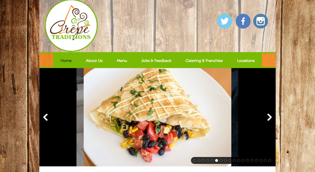
LOGO
Crêpe Traditions’ logo is characterized by an energizing orange, lime green and brown color palette. A triangular shape symbolizes the restaurant’s main feature (crêpes, of course), though it’s also reminiscent of a slice of pizza (maybe Crêpe Traditions should double as a pizza joint?). Swirls of steam rise up from the logo’s lettering, indicating that the restaurant also serves coffee.
![]()
The script font that “Crêpe” is written in evokes Parisian elegance, and the all-caps serif font of “Traditions” is, well, traditional. The two contrasting fonts complement each other well. Overall, the color scheme, graphics and typography do exactly what a logo should do – boil down the mission of the business into a simple and recognizable symbol.
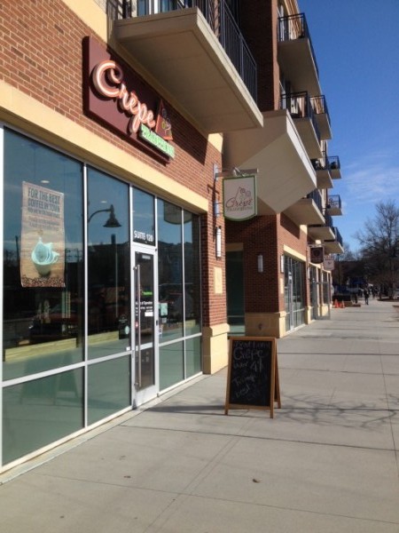
BUILDING SIGNAGE
Crêpe Traditions covers all the bases on exterior signage. Letters unique to its logo sit above the entrance. A sign hangs perpendicular to the shop and conforms to the shape of others on the 140 West strip. A transparent version of the logo adheres to the front door. Finally, a chalkboard sandwich board promotes specials.
WEB DESIGN
Crêpe Traditions’ website embraces a simplistic design that showcases bright photos of its tasty food. It is easy to navigate, and the body font is large and readable.
However, a few flawed details stuck out to me that could use polishing.
- Too much blank space in the header. The logo’s size and circular shape create a large amount of space at the top of the page when viewing on a computer. That blank space combined with space taken up by the image slider prevents important content from appearing above the fold (which refers to the portion of the website visible prior to scrolling down). To remedy this, Crêpe Traditions should replace its header logo with a horizontally arranged version such as the one hanging above its front door.
- Too many frames in the image slider. The slider or carousel, which automatically flips through several photos, is packed with a whopping 18 frames. I couldn’t even sit through one third the slides without getting bored and moving on, rendering most of those frames useless. One consulting firm recommended never inserting more than five frames into an image slider. Crêpe Traditions should reduce the amount of images it features on its home page and instead provide a simpler gallery elsewhere on the site. Doing so might also speed up the load time of the homepage.
- Poor formatting of image slider. Some web designers advise beginners to ditch sliders altogether in favor of simpler and faster loading alternatives. At the very least, Crêpe Traditions should alter its formatting to prevent chunky black borders from appearing when images don’t fit the slider dimension.
SOCIAL MEDIA
Facebook – 252 likes
Twitter – 624 followers
Instagram – 52 followers
Crêpe Traditions has established its largest social media following on Twitter, where it is also the most active. The crêperie tweets about once a day and often attaches stunning photos of its cuisine, such as this Valentine’s Day crêpe.
Happy Valentine’s Day. #CrepeUP & share ur love on this LOVE day. BTW, we r open only from 11 to 2PM today. Plan it. pic.twitter.com/IvoMI9g9Ti
— CrêpeTraditions (@CrepeTraditions) February 14, 2016
The restaurant’s proximity to UNC-Chapel Hill’s campus supplies it with a young customer base, and since younger social media users tend to consider Instagram the most important network, Crêpe Traditions should reap the benefits by becoming more active on Instagram. The owners should consider engaging students through an Instagram contest, for which it could publicize on Twitter. Perhaps consumers could Insta photos of their crêpes or invent a new crêpe combination and Insta the recipe.
THE BOTTOM LINE
I was impressed to see the progress Crêpe Traditions has made in creating a name for itself in Chapel Hill, especially considering that its original name sparked a social media backlash. The crêperie’s dedication to friendly service and quality food, its professional logo and its high activity on Twitter have all set Crêpe Traditions up for potentially explosive growth. It should consider tweaking its website and interacting with students on Instagram to continue down the path to success.
What do you think of Crêpe Traditions’ logo and web design? What type of Instagram contest/prize would lure you in?