
Mildred Cotton Council, or Mama Dip, has been serving up southern food since 1976. Mama Dip opened the restaurant with less than $100, but it quickly flourished and continues to offer country cooking as it enters its 40th year. The brand of Mama Dip’s leverages this charming backstory through its visuals and on social media, and that authenticity pays off. However, the disconnect between the restaurant’s online logo and its outside sign leads to confusion.
LOGO
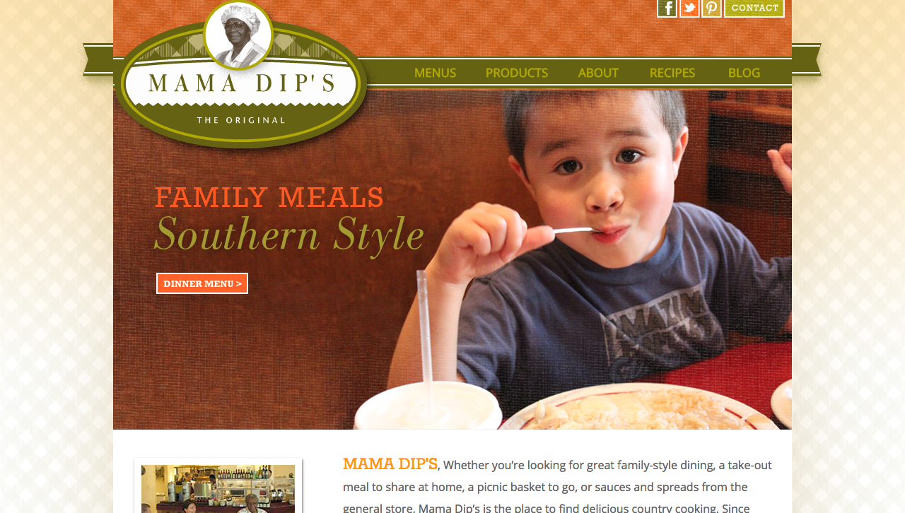
It isn’t clear which graphic associated with Mama Dip’s is its true logo. One is green in color, oval in shape and features a grayscale headshot of Mama Dip. This logo is displayed on the Mama Dip’s website. Its checkered pattern and triangular jagged edge emulate craftsmanship, and Mama Dip is certainly skilled in her trade of cooking.
![]()
Mama Dip’s uses another logo outside the restaurant and on social media. This inconsistency in visual branding is capable of stifling recognition in consumers. When I think of Mama Dip’s, I have trouble visualizing a concrete image because neither graphic is emphasized as the primary logo.
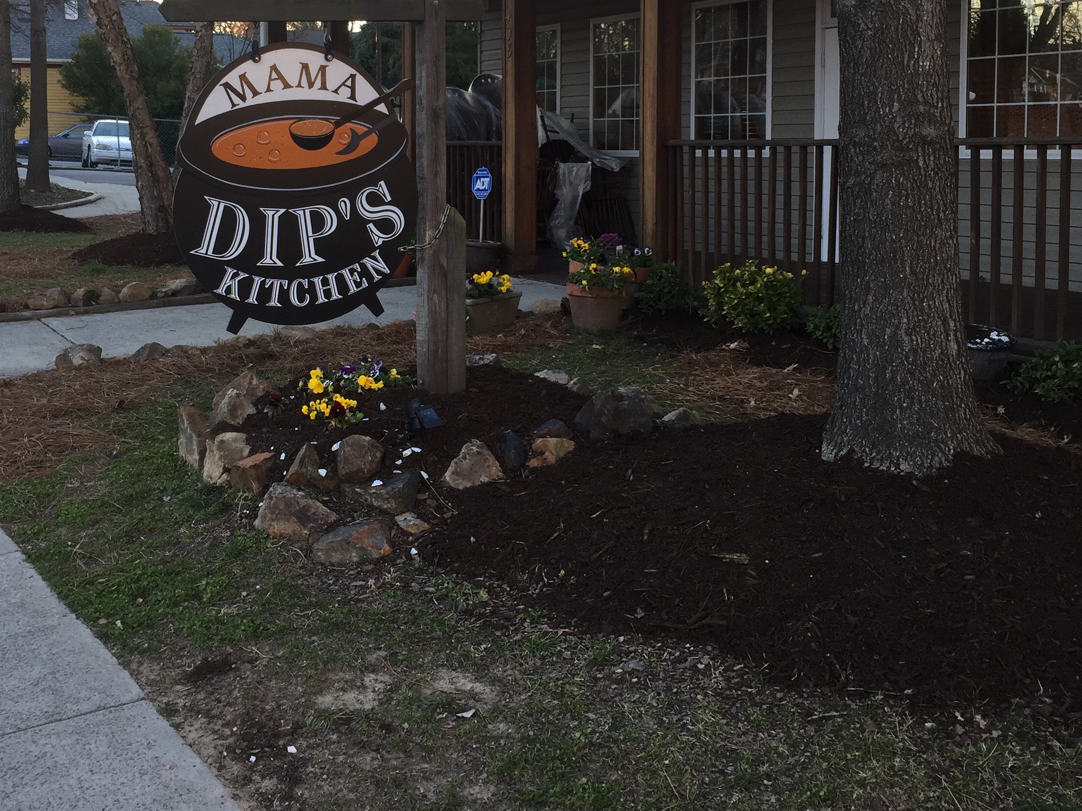
BUILDING SIGNAGE
The second graphic acts as the restaurant’s exterior signage. The sign takes the shape of a giant soup cauldron. The white lettering stands out against the black kettle, achieving high readability. Overall, the graphic is memorable and relevant to Mama Dip’s.
I imagine the bubbles in the soup aim to depict boiling temperature, but I find that they more closely resemble soap bubbles. What type of soup is brewing, I wonder.
WEB DESIGN/CONTENT
The Mama Dip’s website brings in subdued orange and green colors that complement each other and are soft on the eyes – no overwhelming or bright hues here. The cross hatch pattern on the logo and in the header and background are reminiscent of a picnic tablecloth, which symbolizes family and unity.
As for web content, the site promotes authenticity by providing a brief history of the 40-year-old restaurant and by offering recipes. The website links to a blog, which would also contribute to the genuine character of Mama Dip’s. Unfortunately, there is only one blog post from 2013.
SOCIAL MEDIA
Facebook – 1,681 likes
Twitter – 120 followers
Pinterest – 123 followers
Posts by Mama Dip’s are neither frequent nor consistent. Sometimes posts come twice per day, and sometimes it there will be month-long gaps. But when Mama Dip’s does post, the content is meaningful and often involves an employee or customer. Take this post about a couple who visits every year to celebrate a special anniversary:
It’s this type of authenticity over which big brands go crazy. Authentic social media marketing is often cited as one of the best online strategies, and it appears to pay off for Mama Dip’s. Each Facebook post yields about 50-100 likes, heaps more than what I have seen for other local restaurants.
On Twitter, Mama Dip’s is much less active and therefore less engaging. The restaurant is absent from Instagram entirely, but Insta users often tag their location at Mama Dip’s. These consumers have already begun spreading awareness via Instagram and have therefore created a unique opportunity. Mama Dip’s should get onto Instagram and interact with these users, which would further promote its authentic brand.
THE BOTTOM LINE
Conflicting visuals prevent consistent branding and reduce the likelihood of making a strong impression on newcomers. Mama Dip’s should consider addressing the discrepancy between its building signage and online visuals.
Authenticity naturally radiates from Mama Dip’s, and the restaurant has already begun to enrich its brand on social media. If the time and resources become available, Mama Dip’s should become active on Instagram to continue growing.