
Cholanad’s South Indian cuisine scores around 4 out of 5 on every food review site. How does its visual branding score?
LOGO
You can find several variations of Cholanad’s logo floating around the restaurant’s website and social media accounts, and the common denominator is the choice of fonts for “Cholanad” and “Restaurant & Bar.” The former is set in Ruling Script, and the latter is set in Tempus Sans. Both of these fonts debuted in the early to mid-1990s, so they’re a bit dated.
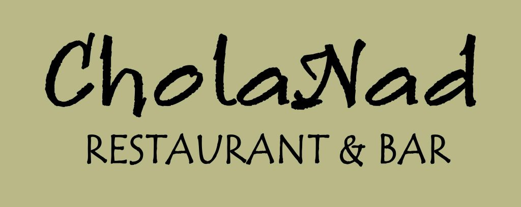
The fonts may be too stylized to mesh well together. Ruling Script is calligraphic and thus takes on a distinct handwritten style. Tempus Sans is more toned down, but the quirks make for a playful style, especially when in lowercase. Take note of the “n,” for example. Its leg curves inward, giving the character a unique look. For me, the two fonts don’t make for a perfect combination. However, it could be worse. At least it’s not one of these fonts.
![]()
Aside from visual impact, Cholanad’s logo uses a capital “N,” but on the website, Cholanad is spelled with a lowercase “n.” While it may seem trivial, the inconsistency of capitalization comes off as careless and unprofessional.
BUILDING SIGNAGE
Perhaps the most confusing and illegible sign on Franklin Street, Cholanad’s flag puts forth too much information. On second thought, perhaps it isn’t the amount but rather the lack of clear organization. One of the most important rules of typography is establishing hierarchy – Cholanad’s misuse of vertical text, angled text, different font weights and different font sizes has me trying to read everything simultaneously, and it isn’t working.
People tend to read the biggest text first, which is often at the top of the design. Though “Cholanad” is the largest text, its vertical display and left alignment diminish its power and render it hard to read. Since the restaurant’s name is the most important text, it should be front and center.
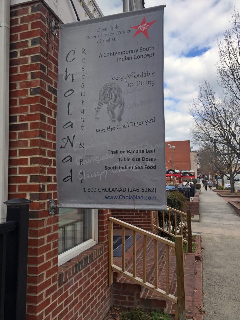
The next most important information on the sign is “A Contemporary South Indian Concept” because it tells passersby what type of cuisine to expect. While set in bold and located at the top of the sign, this text is overshadowed by the centered text and bold red graphic just above, which highlights awards Cholanad has received. The graphic that reads “Best of the Triangle 2012” is the only pop of color on the sign and thus commands far too much attention for what it’s worth.
The remaining text refers to affordable prices, the restaurant’s apparent mascot, specific menu items and contact information. Size and treatment of this text should reflect its subordinate value. Some information should be eliminated entirely or placed on a separate sign or pamphlet.
The Tamil script displayed in the background ties in the restaurant’s Indian theme, but it becomes distracting when trying to read information.
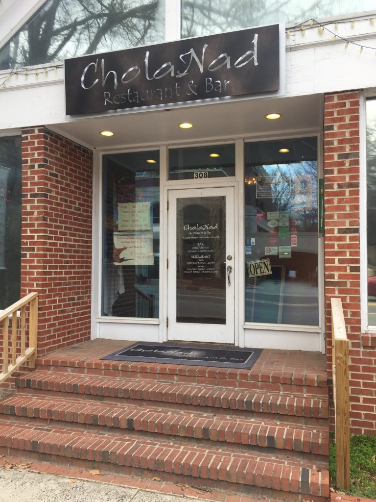
Fortunately, the sign directly above Cholanad’s entrance (see below) is simplified and much more legible. “Restaurant & Bar” is a bit hard to read because of the sign’s inverted style. Overall, though, the sign looks elegant.
WEB DESIGN
Cholanad’s web design is outdated but easy to navigate. An issue that particularly stuck out to me includes the antiquated style of buttons like “Reserve Now” and the social media links. Replacing those graphics with flat, minimalist designs would be an easy place to begin updating Cholanad’s website to conform to contemporary trends.
Cholanad’s gray and jade green color scheme is soothing and subtle, but the green background behind “5th Year Anniversary Drink Specials” is brighter than the rest and should be altered to match the left sidebar.
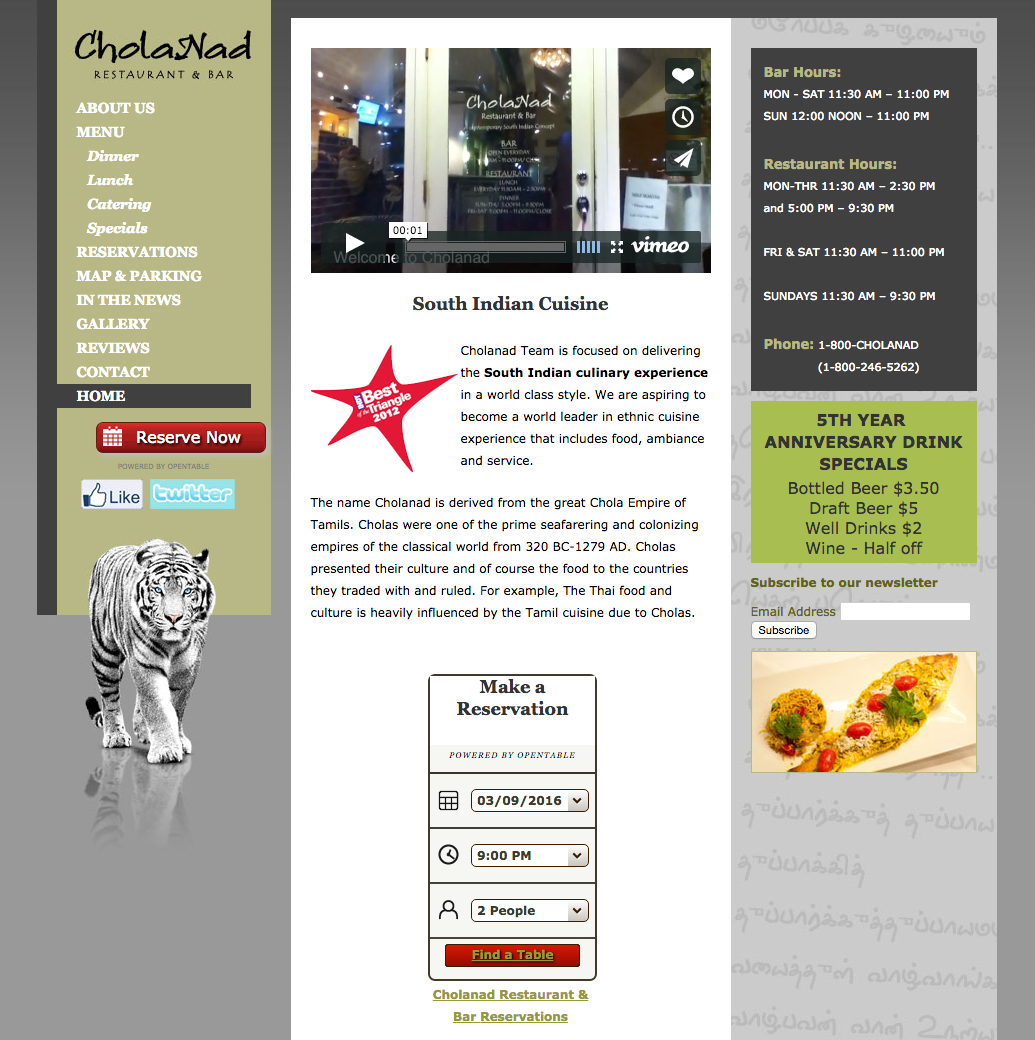
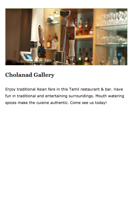
Cholanad teases website visitors by offering a gallery page with no photos. Its Facebook page offers a wealth of high quality photos that should be present on the website too.
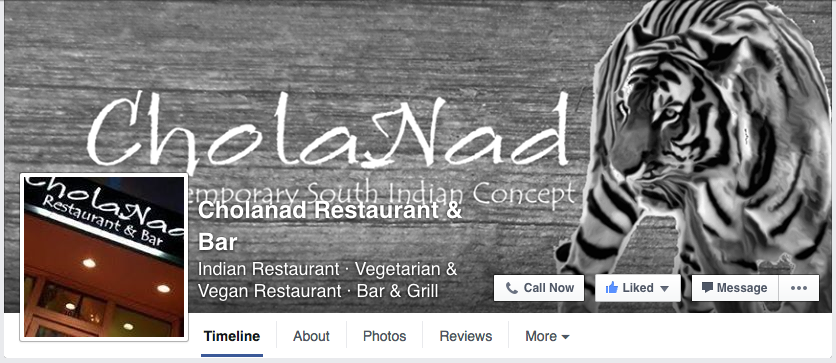
USE OF BENGAL TIGER
On its building signage and website, Cholanad features different photos of a white Bengal tiger, a species native to India. Since Bengals are endangered, I associate them with terms like “rarity” and “value.” Perhaps Cholanad is drawing a connection with white tigers to assert itself as a rare food option? If you have more information regarding the tiger, comment below.
SOCIAL MEDIA
Facebook – 598 likes
Twitter – 70 followers
Cholanad uses its social media primarily to publicize awards that it has won – awards worth boasting! Cholanad doesn’t post often, however, and it could fill in those gaps with additional useful content. Because Cholanad offers authentic Indian cuisine, it could use social media to provide educational materials like recipes and traditions. Or perhaps it could forge a more interactive relationship by sharing stories of regular customers or featuring employees.
Cholanad’s visuals on Facebook could use some adjusting to fit the platform’s unique layout. For example, some of the text on its cover photo is unreadable due to its profile picture, name and description.
THE BOTTOM LINE
Cholanad offers highly rated South Indian food and has proven its value by winning various awards. Its visual branding, however, is often confusing, unreadable, outdated and inconsistent. Cholanad should consider overhauling its building signage and updating its website so that its branding is as high quality as its food.