
I love Buns because of the flexibility. Some days, I’m in the mood for one a pre-invented burger. Other days, I want to invent my own burger, and Buns makes it easy to do that. Through in-store visuals and an annual event, Buns reflects this mission through its branding strategy.
LOGO / BUILDING SIGNAGE
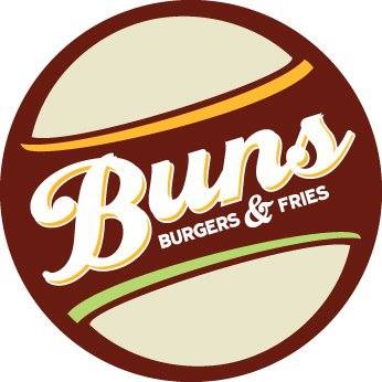 Buns’ logo is full of buns. Two buns surround “Buns” to form a burger. The style is retro, and “Buns” is written in a vintage script font reminiscent of a ’50s style diner. The brown, beige, orange and green color scheme is unique and pleasant.
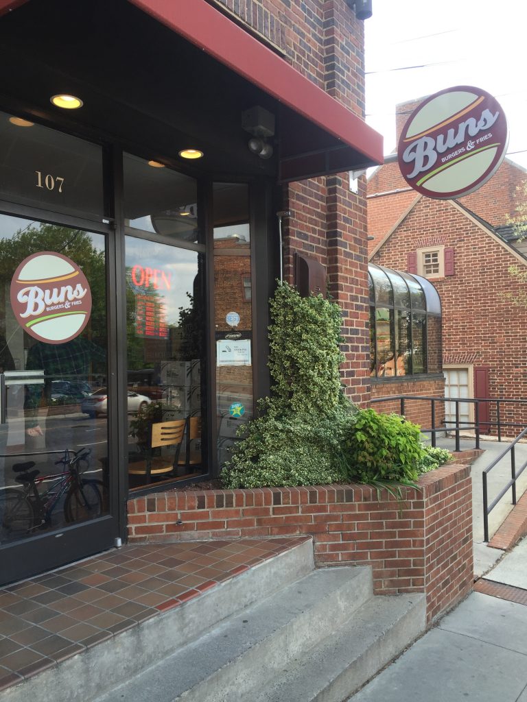
Outside the restaurant you’ll find Buns’ logo pasted to the door and hanging perpendicular to the sidewalk. “Buns” protrudes from the hanging sign, adding interest and commanding the attention of pedestrians.
MENU DESIGN
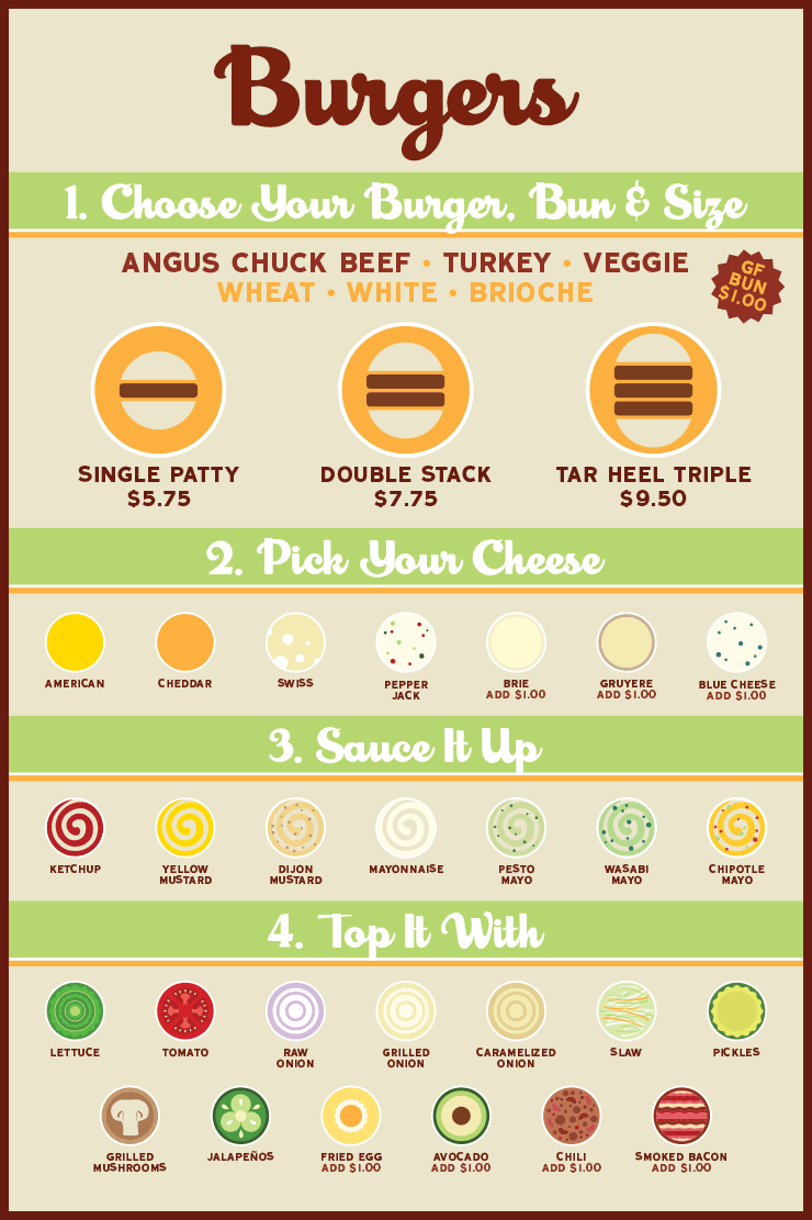
Inside the restaurant is a wall-sized menu that promotes Buns’ mission of providing flexibility in the burger creation process. Organized as a step-by-step process, the menu is easy to understand, and circular flat icons of each topping make for a unique and memorable experience.
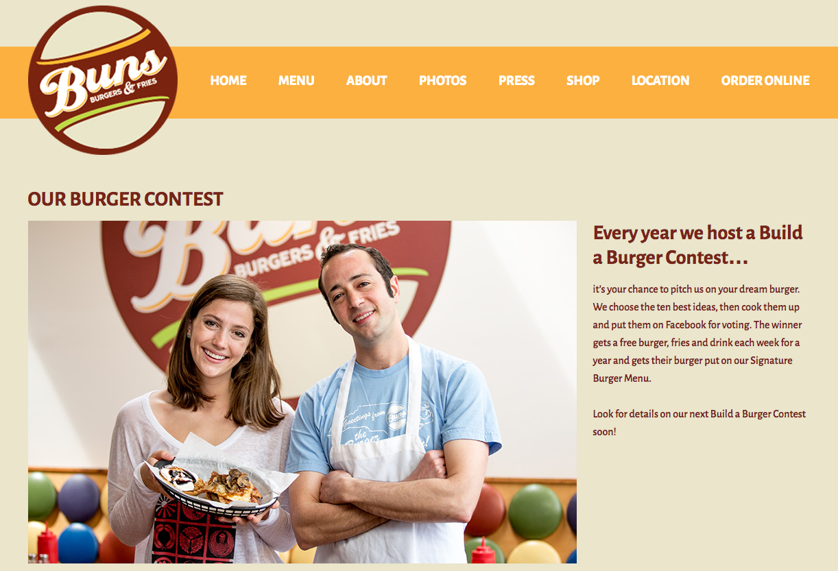
ANNUAL BURGER CONTEST
Every year Buns hosts a Build a Burger Contest, the epitome of its goal of letting customers take charge of their burgers. The contest promotes interaction between Buns and its customers, and because the winner is chosen by a Facebook vote, it generates buzz on social media. Crisp photos of each glorious invention can be viewed on the contest webpage.
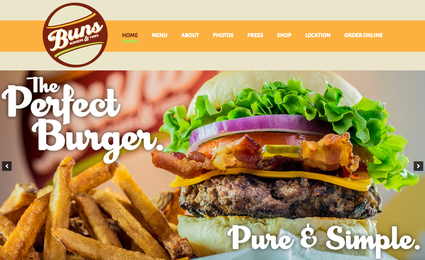
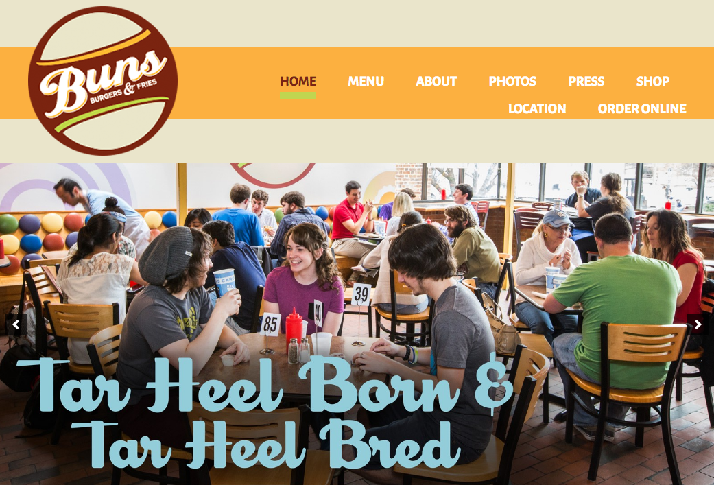
WEB DESIGN
Buns’ website leverages its logo’s warm color scheme, which coincides with the colors of most of its photos. The website’s layout and categorization of pages make for a smooth user experience.
The website is responsive to various browser widths, but the logo’s low resolution becomes more obvious on a mobile platform. Most (if not all) smartphones use HD screens that are capable of displaying more pixels on a screen, but if an image isn’t large enough, the screen will stretch the pixels it has to work with, creating a blurry photo.
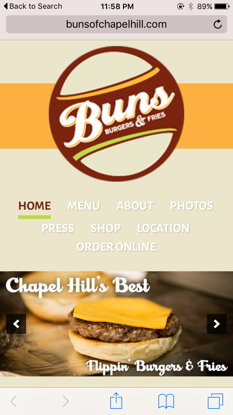
At smaller browser widths, the navigation menu is forced onto a second line, which looks disjointed and awkward.
Despite these minor issues, Buns’ website looks professional and promotes the brand through consistent visuals and good content.
SOCIAL MEDIA
Facebook – 2,139 likes
Twitter – 133 followers
Instagram – 92 followers
On social media, Buns focuses on promoting specials, sharing media coverage and publicizing events like its burger contest.
The 2015 #BunsBuildABurger Contest Finalists await your vote. Visit our FB page to chime in. http://t.co/5PkER7hYtB pic.twitter.com/HVmcDFqNpW
— BUNS Burgers & Fries (@BunsBurgersCH) April 6, 2015
Buns hasn’t posted to its Instagram in more than a year, and it only posts to Facebook and Twitter a few times a month. Maybe I’m a sucker for a good burger foodie, but with sharp images of unique burger creations, Buns has the material to post much more often to its social media accounts.
THE BOTTOM LINE
Buns’ brand centers around letting customers control their burger experience, and its logo, creative menu design and annual contest accurately reflect that mission. With a few website tweaks and a more active social media presence, Buns could take over Chapel Hill and turn everyone into a burger-loving fiend like yours truly,