In an earlier post I linked to an article that described the five types of logos: letter marks, emblems, brand marks, word marks and combination marks. Here’s a brief summary of each type of logo and a local example to go along with each.
Letter Marks
Some businesses with long names create an abbreviation and use it as a symbol for their brand. Most television stations use a letter mark – think HBO, CNN, ABC, etc.
Not many brands in Chapel Hill use letter marks. Artisan Pizza Kitchen now uses an abbreviation but is placed inside a hexagon, so it acts as more of an emblem. Similarly, Carolina Dining Services uses a memorable abbreviation, but it’s usually accompanied by a square box.
Logos with text inside a symbol are considered emblems. They’re iconic and resemble badges, like Starbucks or Harley-Davidson.
Midway Community Kitchen and Buns both evoke the emblem style in their logos.
[row][column md=”6″ sm=”6″ mdoff=”1″ smoff=”1″]
[/column][column md=”4″ sm=”4″]
[/column][/row]
Brand Marks
Brand marks forego the brand’s name in favor of a single graphic or symbol – Apple and Nike are two internationally recognized brand marks.
Local business may find it difficult to become so well-established that a symbol on its own will suffice, so there aren’t many brand marks in Chapel Hill.
The Carolina Inn occasionally allows its symbol to stand alone, but most often its brand name accompanies the symbol.
Word Marks
Word marks write out the brand’s name and leave it at that. Brands will often use unique fonts to make their logo stand out. Disney is a prime example.
Lots of local businesses use word marks, including Light Years, Carrburritos and 411 West Italian Café.
Combination Marks
Perhaps the best fit for local businesses, combination marks merge symbols and text for a logo that offers visual appeal and promotes brand name recognition.
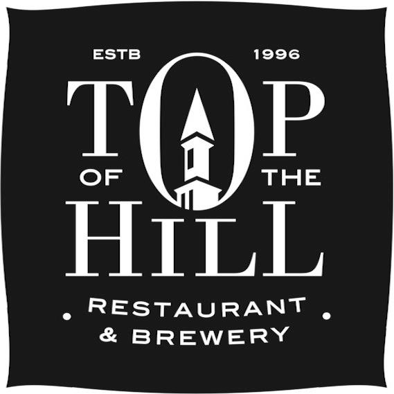
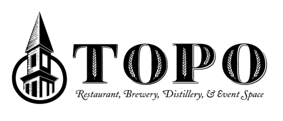
Some local examples include the Root Cellar, Crépe Traditions and Top of the Hill.
[row][column md=”3″ sm=”3″ mdoff=”1″ smoff=”1″]
[/column][column md=”7″ sm=”7″]
[/column][/row]
There are many options to consider when choosing a logo for your local business. Emblems and combination marks seem to dominate the scene in Chapel Hill – both styles make it easy for customers to recognize the brand name and offer engaging visuals.
After finishing up my latest blog post on 411 West Italian Café, I began to think about the various local businesses I have researched in the past four months. Because there are so many great local food spots on Franklin Street, I anticipated from the start that many of my posts would review restaurants, but I had no idea of the extent of my bias until breaking down the numbers.
Of 20 local businesses reviewed, 16 were restaurants. Yikes! This got me thinking. Did other factors affect my choices of which businesses to look into?
Below is a map locating every business I blogged about, with numbers corresponding to the order in which I blogged. Except for a few outliers, my blog largely focused on West Franklin Street. I walk down that stretch of Franklin Street to and from class every day, which means I saw those business’s signs every day, and they infiltrated my mind and prompted me to write about them.
From the moment I created this blog, I knew that my biases would inherently affect each post. After all, design isn’t always based on objective facts. After creating this map, I have come to realize that bias is apparent in all aspects of this blog, from choosing the subject matter to critiquing the brands.
Sometimes, though, bias is good. As one psychologist argues, bringing unique predispositions to the table often helps facilitate problem solving. In any case of collaboration, unique and biased perspectives are what contributes to the end product. That’s why I encourage you to comment on my blog posts and offer your opinions. What do you make of the skewed breakdown of my blog posts? Comment below with your thoughts.
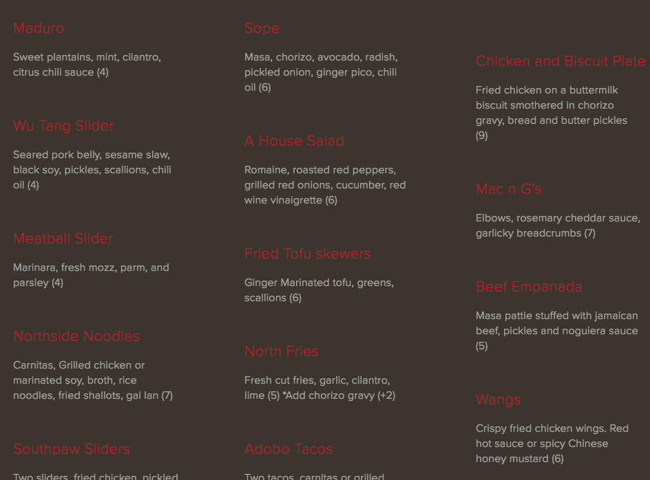
411 West Italian Café serves high-quality and tasty food, which keeps the restaurant busy. It’s always packed on weekend nights, and I always find myself satiated (albeit with a food baby) after eating there. Despite the success, 411’s fragmented and seemingly aimless visual branding prevent a consistent image.
LOGO
411’s disorder begins with its logo. Below are two variations, the first from the website, and the second from Twitter. Both include similar features: “four eleven west” spelled out in a lowercase script font, “Italian Cafe” spelled out in all caps with loose letter spacing, and “411” written in italic serif numerals.
Inconsistencies, even if subtle, detract from consistent branding. In this case, “411” is in front of “four eleven west” in one logo but behind it in another. One logo uses drop shadows, and the other doesn’t.
411 Logo: Version 2
The treatment of “Italian Cafe” is notably very different – in the second version, the letter spacing (also called tracking) is much tighter, and the letters appear to be somewhat condensed or squished vertically. The size is also much smaller in comparison to the remaining portion of the logo.
The second logo is more consistent with the exterior building signage, meaning the web design logo is what should change to reflect a cohesive brand. That being said, these two more similar logos aren’t identical. The colors are an obvious difference, but a close glance reveals a discrepancy in the sizing and placement of “four eleven west” over “411.”
BUILDING SIGNAGE
Outside 411 is a flag that displays not only the logo but also a high-contrast sepia image of two people riding bicycles with dogs. I have no inkling of what this graphic could possibly mean. Is biking with dogs an Italian tradition? Designs that have meaning behind them are more impactful, so if there is reason behind 411’s sign, it should make that meaning more clear and use similar visuals on its website.
Despite the unclear meaning, the sign is visually interesting and unique. The sepia image seamlessly fades into white, allowing space for the logo.
A photo posted by 411 West Italian Cafe (@411_west) on
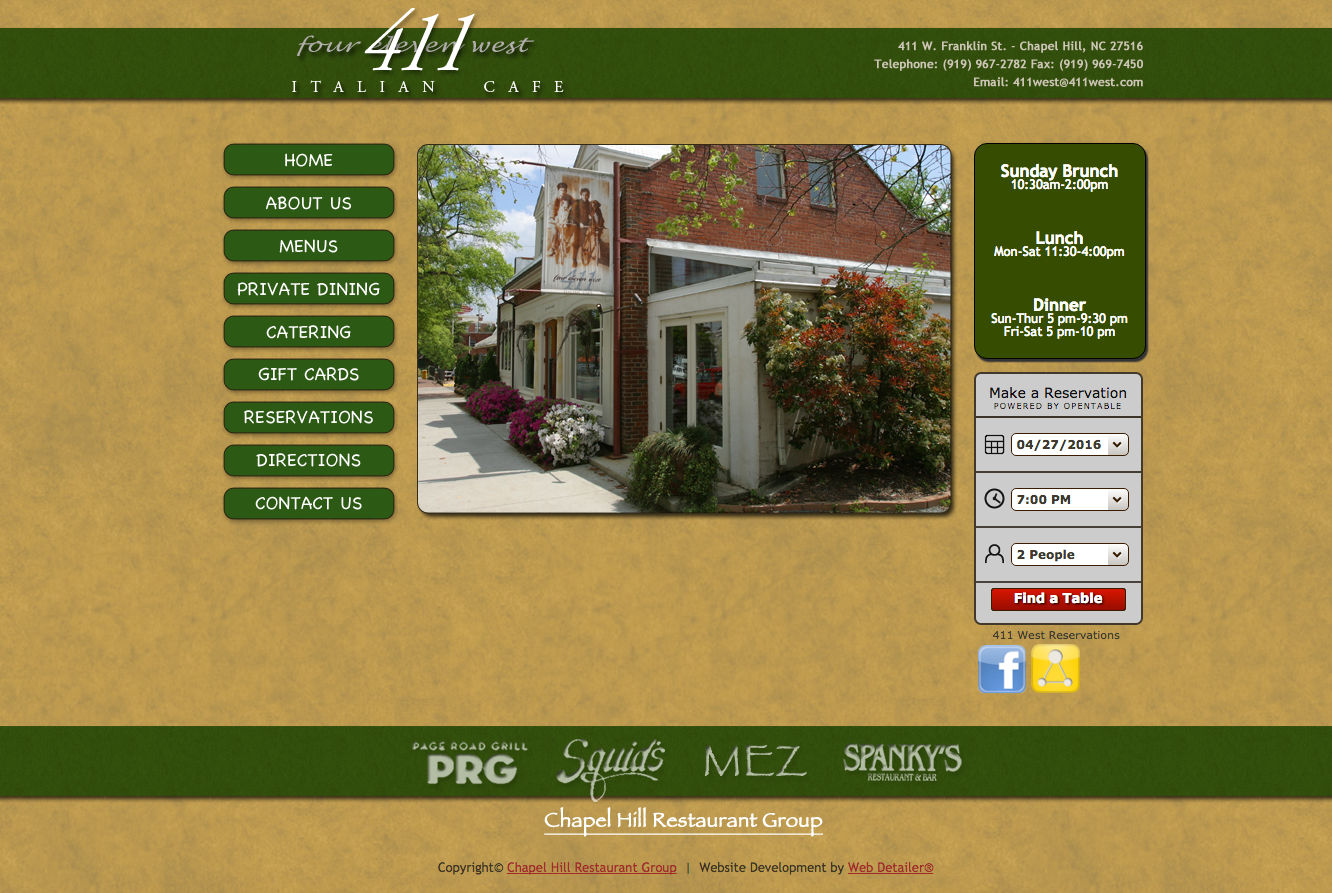
WEB DESIGN
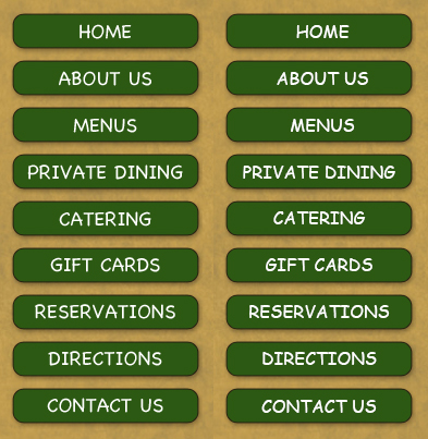
411’s mission is to provide a high-quality dining experience at an affordable price, but its outdated web design reflects something less than elegant. The green header, navigation buttons and sidebar overwhelm each page and command too much attention.
The style of the reservation widget and social media links are inconsistent with the rest of the site and also stick out too much.
At first glance, 411 appears to use two of the world’s most hated fonts: Papyrus and Comic Sans. But what looks like Comic Sans is in reality Chalkboard, Apple’s 2003-released alternative to Comic
Though similar, 411 uses Chalkboard (pictured left), which is the Macintosh alternative to Comic Sans (pictured right for comparison).
The two fonts are very similar, though Chalkboard is less widely criticized. Whether you think Comic Sans and Chalkboard deserve the notoriety, these fonts are fitting for playful, casual settings – everything 411 isn’t.
As for Papyrus, the font’s infamy disqualifies it from being taken seriously.
With its high-quality food and service, 411 should use elegant scripts, sophisticated serifs, or just about anything except Papyrus and Chalkboard. 411’s logo already uses two fitting fonts, one script and one serif, that would work well on the website.
A photo posted by 411 West Italian Cafe (@411_west) on
411 posts about once a week on Facebook and Instagram but hasn’t tweeted since last July. With larger followings on Facebook and Instagram, it may have been a smart move to focus on two social media platforms, especially considering the visually oriented nature of Facebook and Instagram. 411’s content is engaging and of high quality; it should consider posting more often to boost its social media presence.
THE BOTTOM LINE
411’s disconnected, unexplained and sometimes downright tacky graphics left me confused and without a clear picture of what the restaurant’s visual identity is. Its food is delicious, and sharp photos on social media reflect that. 411 should bring its visual branding up to standard.
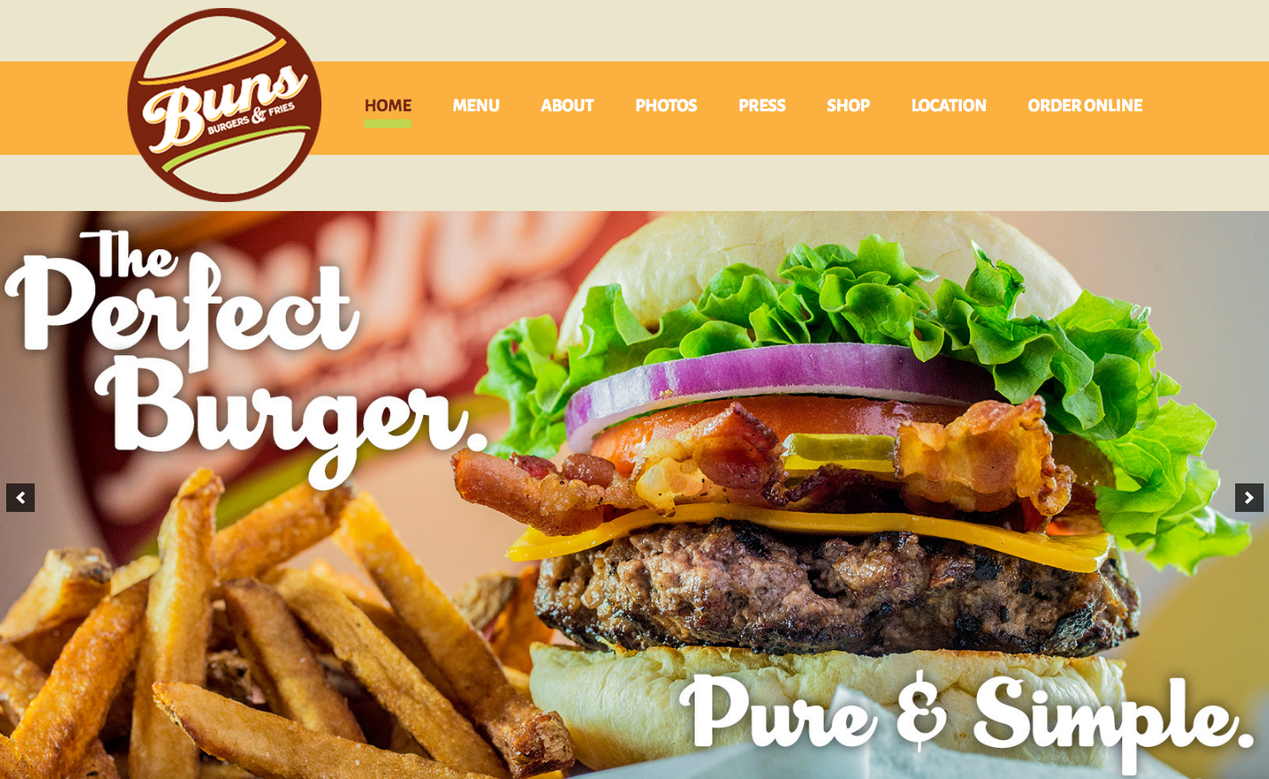
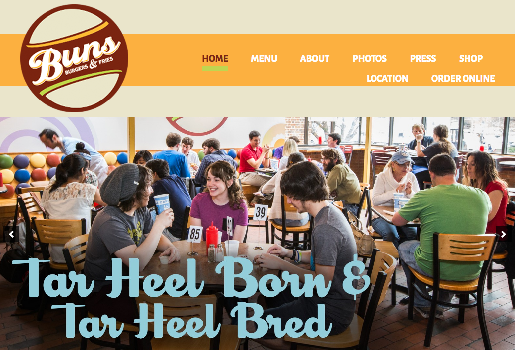
I love Buns because of the flexibility. Some days, I’m in the mood for one a pre-invented burger. Other days, I want to invent my own burger, and Buns makes it easy to do that. Through in-store visuals and an annual event, Buns reflects this mission through its branding strategy.
LOGO / BUILDING SIGNAGE
Buns’ logo is full of buns. Two buns surround “Buns” to form a burger. The style is retro, and “Buns” is written in a vintage script font reminiscent of a ’50s style diner. The brown, beige, orange and green color scheme is unique and pleasant.
Outside the restaurant you’ll find Buns’ logo pasted to the door and hanging perpendicular to the sidewalk. “Buns” protrudes from the hanging sign, adding interest and commanding the attention of pedestrians.
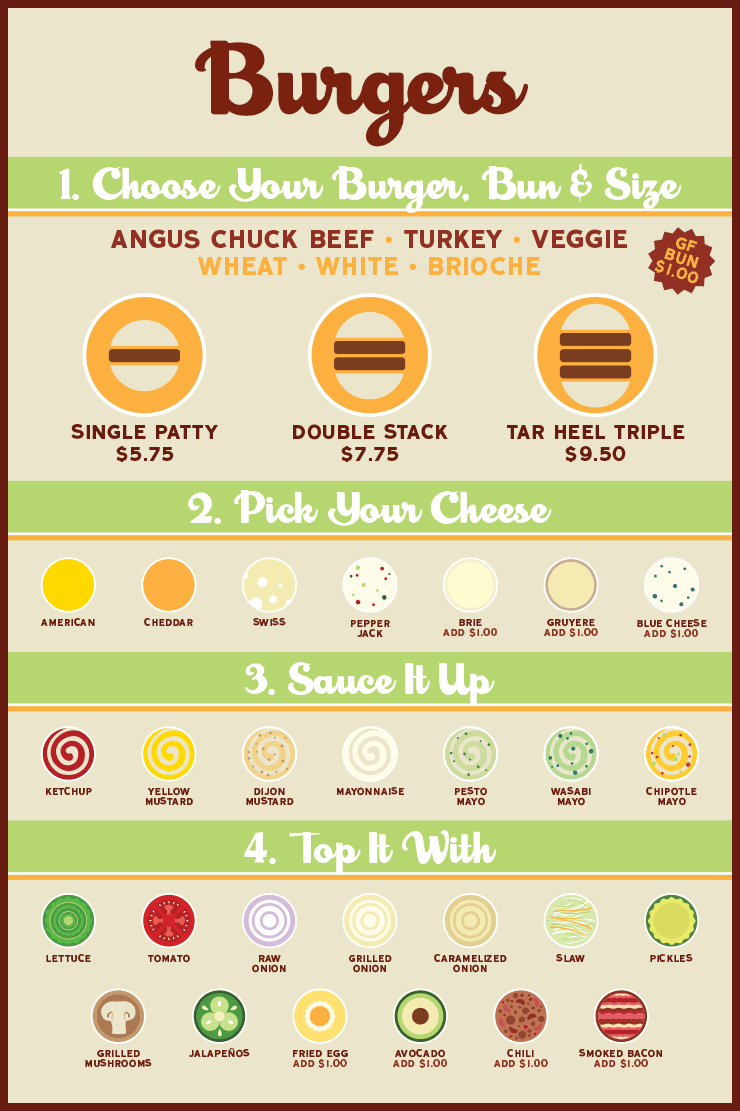
MENU DESIGN
Inside the restaurant is a wall-sized menu that promotes Buns’ mission of providing flexibility in the burger creation process. Organized as a step-by-step process, the menu is easy to understand, and circular flat icons of each topping make for a unique and memorable experience.
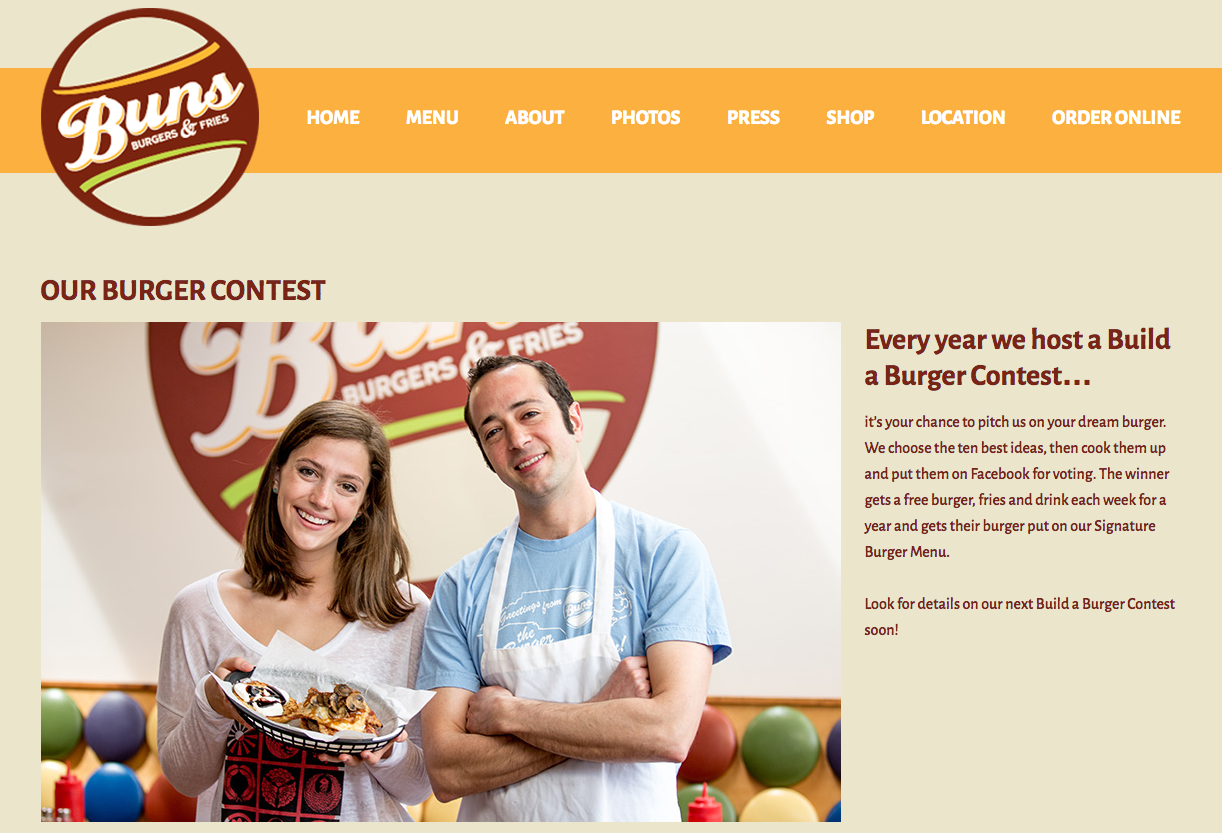
ANNUAL BURGER CONTEST
Every year Buns hosts a Build a Burger Contest, the epitome of its goal of letting customers take charge of their burgers. The contest promotes interaction between Buns and its customers, and because the winner is chosen by a Facebook vote, it generates buzz on social media. Crisp photos of each glorious invention can be viewed on the contest webpage.
WEB DESIGN
Buns’ website leverages its logo’s warm color scheme, which coincides with the colors of most of its photos. The website’s layout and categorization of pages make for a smooth user experience.
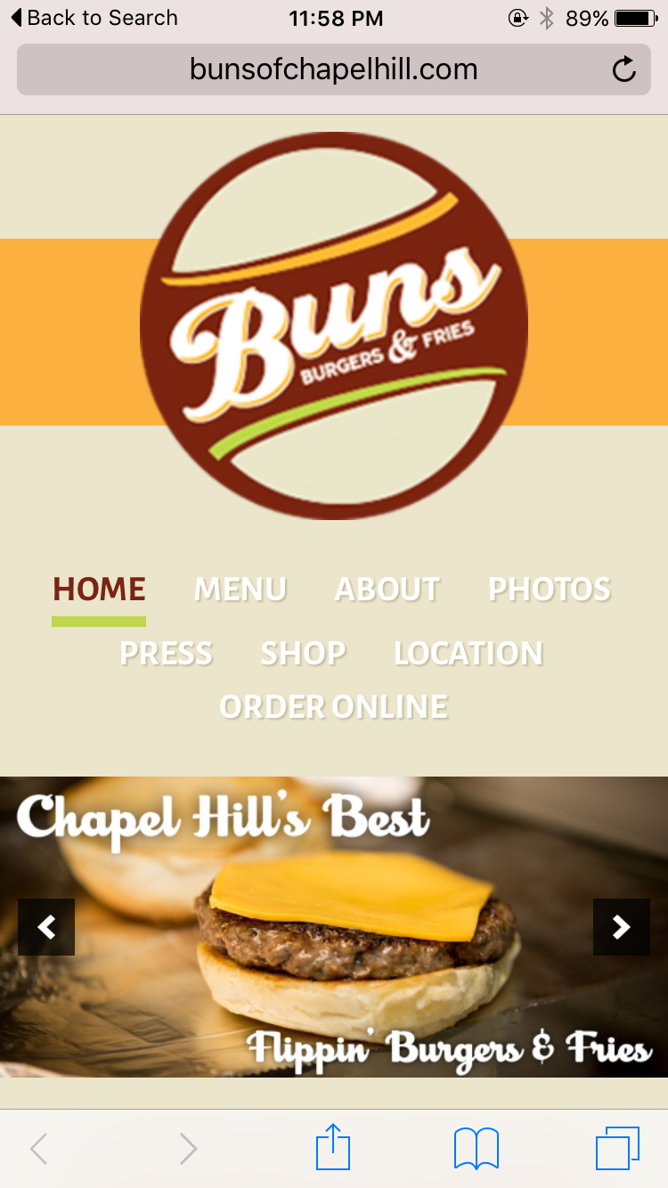
The website is responsive to various browser widths, but the logo’s low resolution becomes more obvious on a mobile platform. Most (if not all) smartphones use HD screens that are capable of displaying more pixels on a screen, but if an image isn’t large enough, the screen will stretch the pixels it has to work with, creating a blurry photo.
At smaller browser widths, the navigation menu is forced onto a second line, which looks disjointed and awkward.
Despite these minor issues, Buns’ website looks professional and promotes the brand through consistent visuals and good content.
— BUNS Burgers & Fries (@BunsBurgersCH) April 6, 2015
Buns hasn’t posted to its Instagram in more than a year, and it only posts to Facebook and Twitter a few times a month. Maybe I’m a sucker for a good burger foodie, but with sharp images of unique burger creations, Buns has the material to post much more often to its social media accounts.
THE BOTTOM LINE
Buns’ brand centers around letting customers control their burger experience, and its logo, creative menu design and annual contest accurately reflect that mission. With a few website tweaks and a more active social media presence, Buns could take over Chapel Hill and turn everyone into a burger-loving fiend like yours truly,
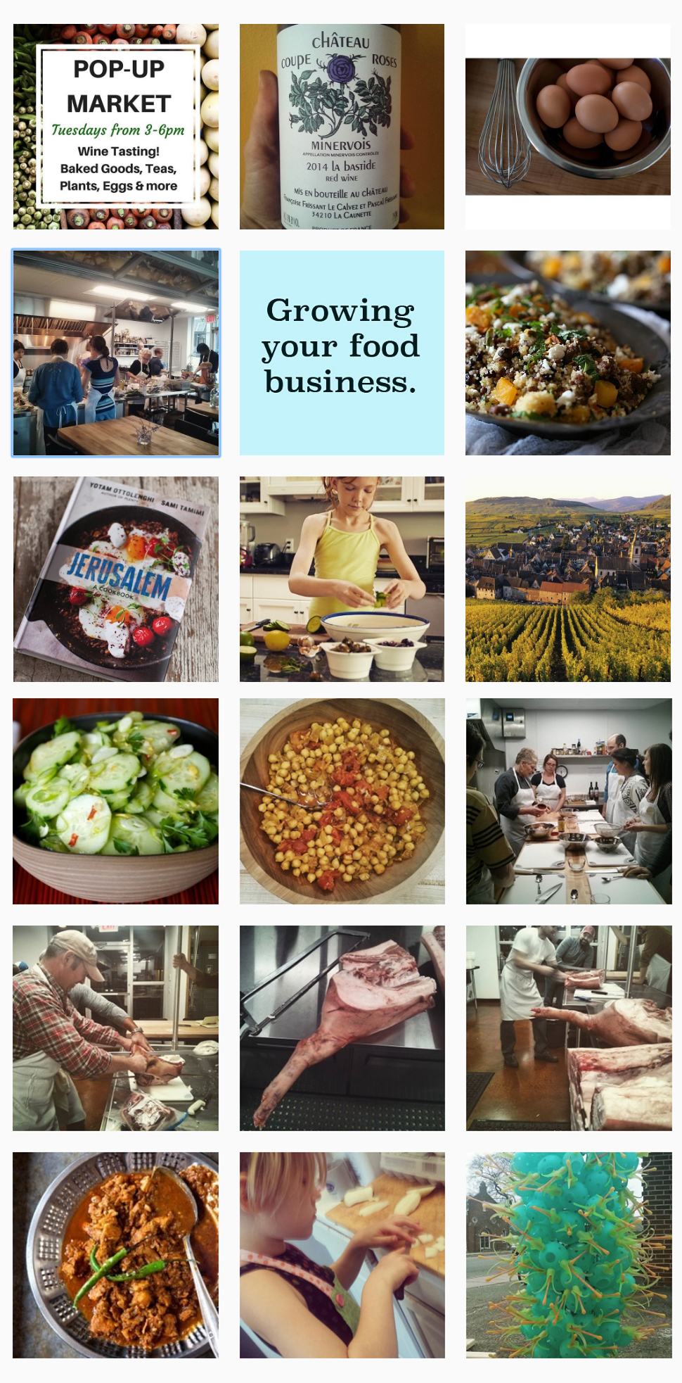
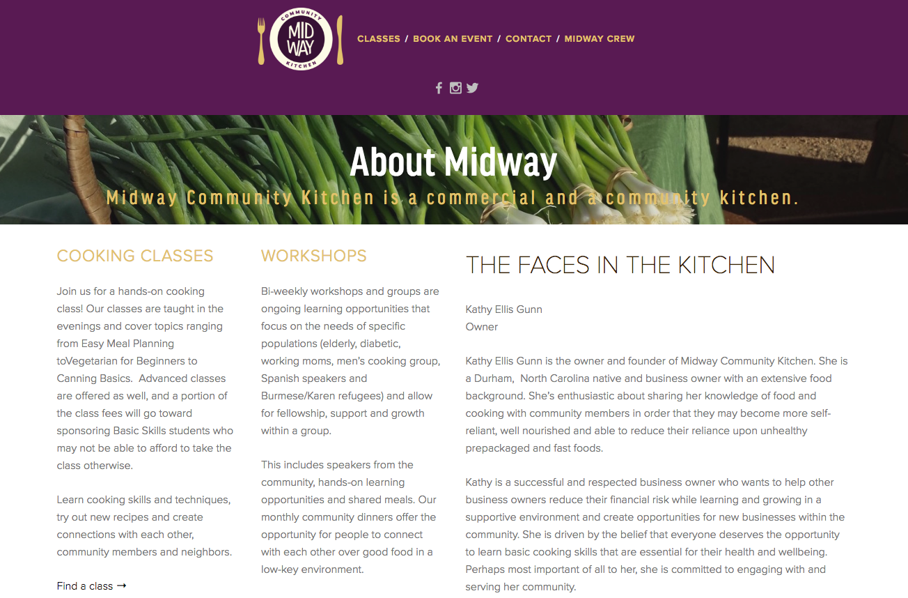
It’s a place where community members can prepare food to sell, grow their businesses, teach classes, host events, learn cooking skills and gather to eat good meals. Midway Community Kitchen is among other things a tool for local food businesses looking to grow – let’s look at how it fares in branding itself.
LOGO
With its bright colors and playful sans serif font, Midway’s logo is eye-catching. The logo is a unique spin-off of an emblem, a typo of logo in which text is placed inside a symbol. Midway is indeed placed inside a circle – a good choice since round shapes imply inclusion, community, commitment and love.
Midways logo extends beyond your basic emblem, though. The circle doubles as a plate, and a fork and knife complete the image. This creative symbolism boosts the logo’s meaning and makes it more memorable.
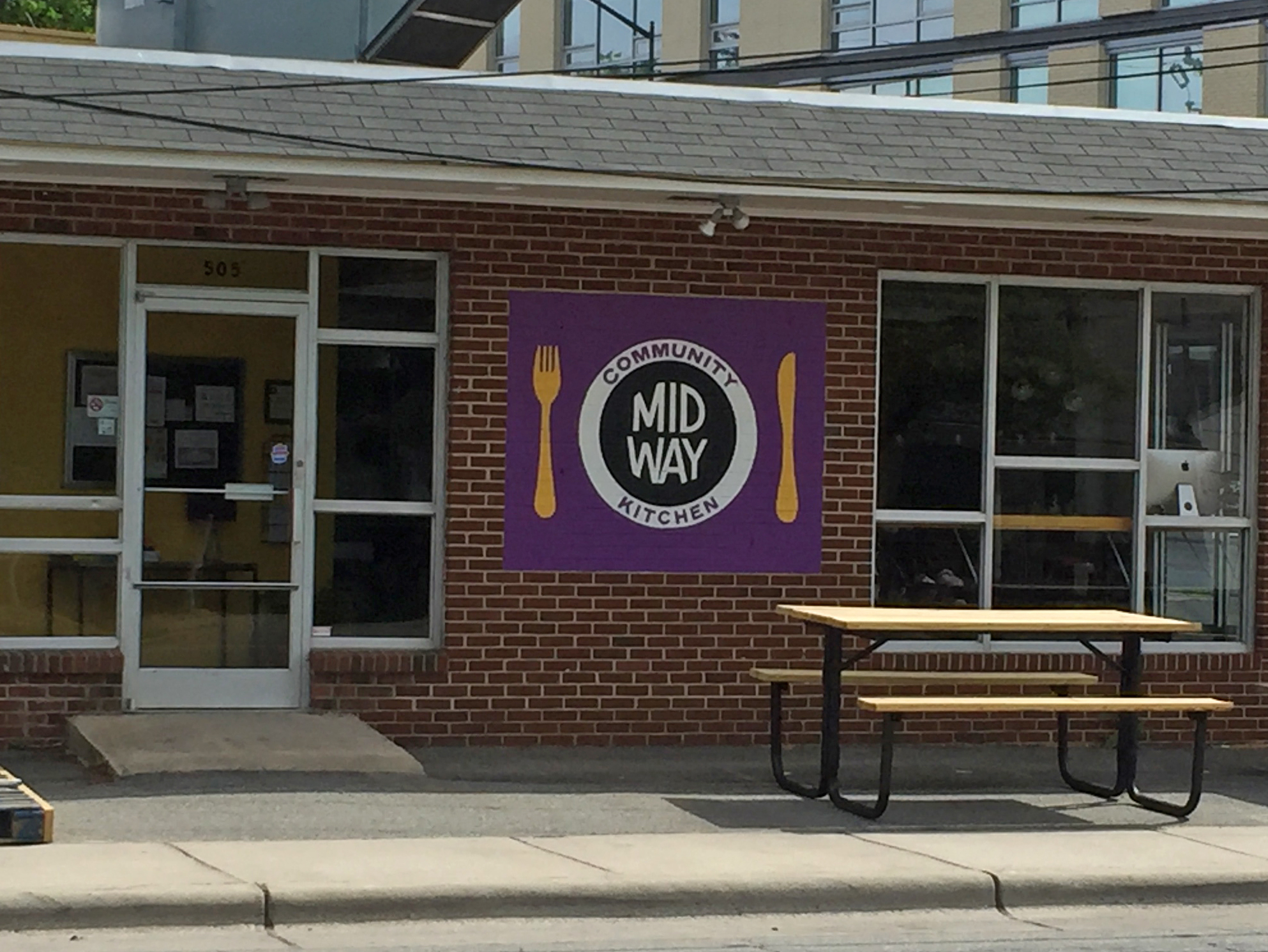
BUILDING SIGNAGE
A hand-painted replica of the logo, Midway’s building signage promotes recognition through consistency. Though subtle, the colors on the sign differ slightly from online versions of the logo. For an even more seamless brand, Midway might consider adjusting the colors, either outside or online.
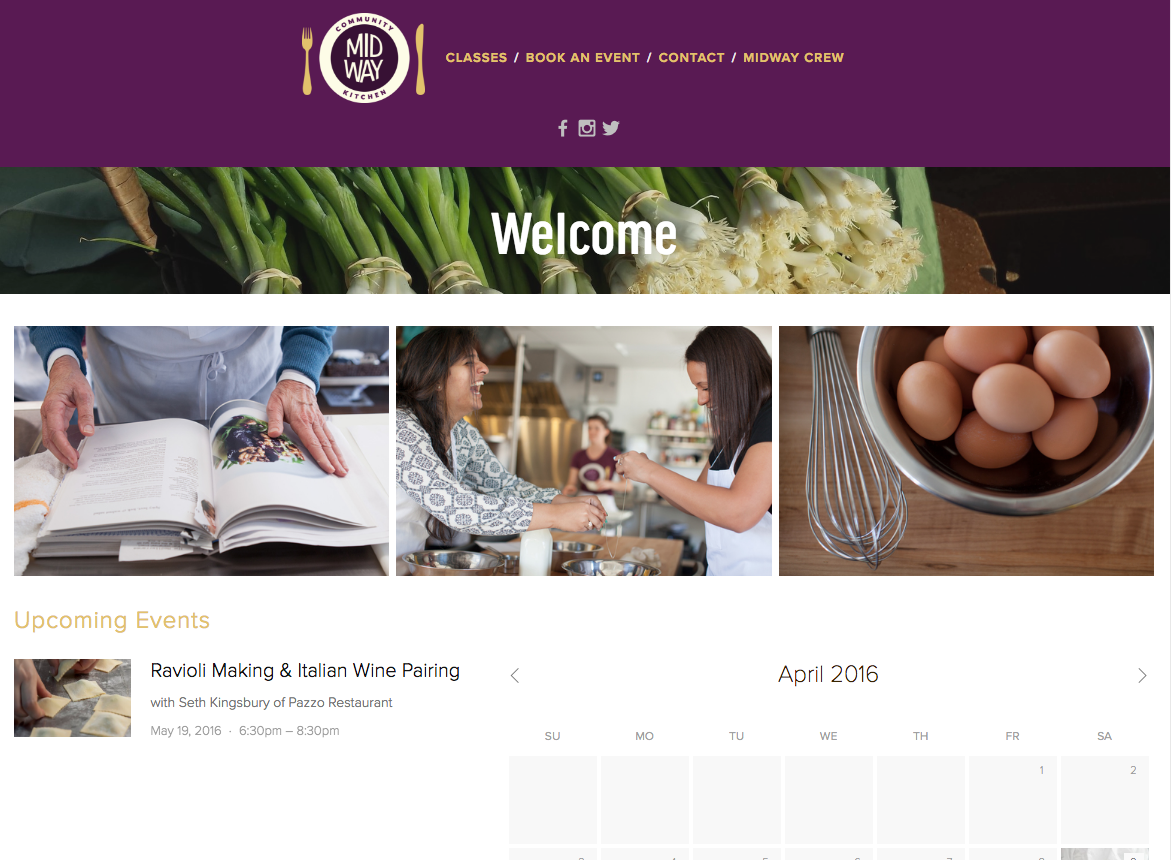
WEB DESIGN
Midway’s web design is smooth and straightforward. It features high-quality photos and promotes its events – an important part of its brand – on the homepage.
What’s missing from Midway’s navigation menu is a link to its “About Midway” page, which I found by Googling “Midway Community Kitchen.” The page explains the mission of Midway, but without providing a link in the navigation, most people won’t see this vital information.
One last note on web design – the design for Midways tab icon (located on the left-hand side of your browser tab) is a bit too complex for maximum legibility. When sized down, the icon is hard to see; details like the utensils and “M” disappear.
On social media, Midway focuses on publicizing its events, but it also posts useful information like improving knife skills and shares third-party articles like food business marketing tips.
On Instagram, Midway does a great job of alternating between captivating foodies and authentic photos from cooking classes. Below is a snapshot of Midway’s Instagram posts.
Instagram is the least active of Midway’s three social media accounts, so my only recommendation is that it post a daily photo to Instagram from inside its walls.
THE BOTTOM LINE
Midway’s mission is unique and backed by authentic and loving community members. Its visual branding is consistent, and it posts a variety of content to social media. To continue down the road to a powerful branding strategy, Midway should update its website to include hidden pages in the navigation menu.
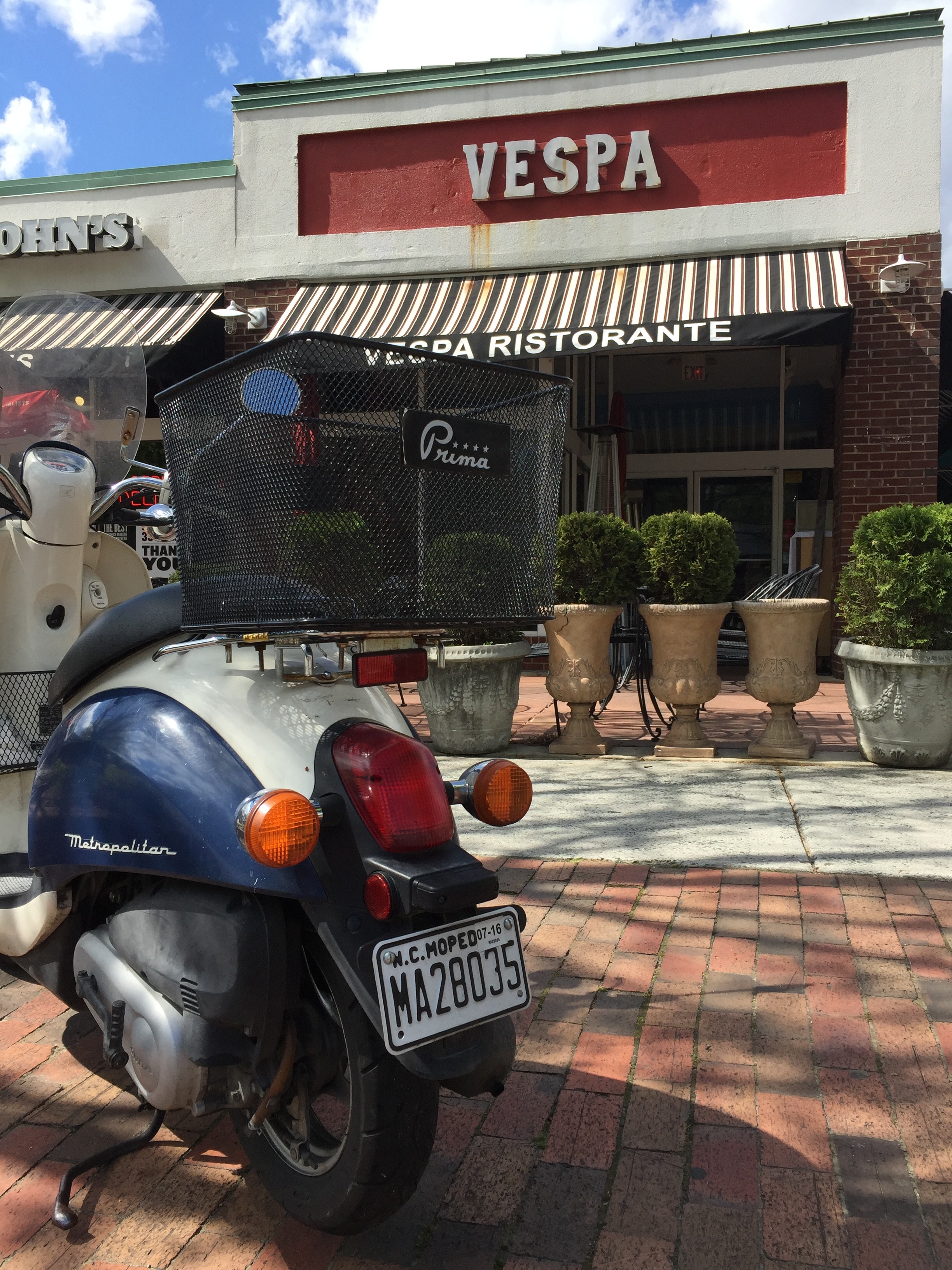
There are few foods I enjoy more than gnocchi from Vespa, but the store’s branding isn’t quite as satiating.
LOGO
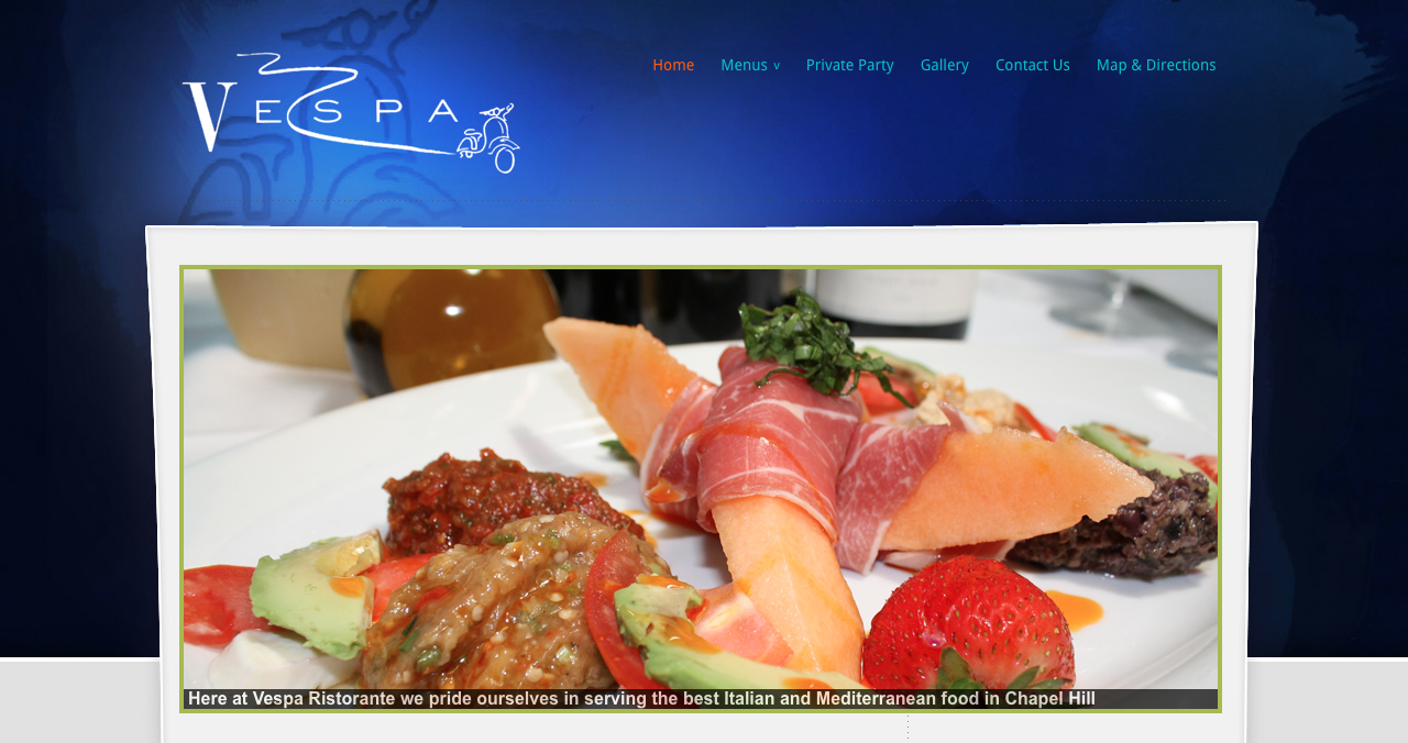
I’m uncertain of Vespa’s official logo, and that’s a problem. The logo on its website doesn’t coincide with its current building sign, and its profile picture on social media is a generic glass of wine. Vespa should draw a better connection between branding platforms by using consistent visuals outside and online.
Below is the logo on Vespa’s website. If the “V” looks familiar, you might be thinking of the typeface used by Vogue. This particular type of serif font falls under the modern classification. Modern serif typefaces are characterized by a high contrast of strokes, resulting in one thick and one thin prong of the “V.” This look is very sleek and sophisticated, a good fit for a classy Italian restaurant. The scooter drawing, though a bit of an obvious choice, draws your eye from left to right, creating flow.
(Vespa’s logo is naturally transparent, so I placed it in front of a turquoise background for visibility purposes.)
BUILDING SIGNAGE
Vespa’s exterior signage has undergone a few changes in the past several years. It used to be a variation of the logo on its current website, as shown below.
Recently, Vespa simplified its building sign and brought in a new color. The updated font is neither a clear sans serif nor serif font. There are subtle rounded serifs on all letters except the “S.” Whatever you may call it, the new style is warm and friendly. The white letters stand out against the red background and always catch my eye as I pass by.
WEB DESIGN
Vespa’s website has not gotten an upgrade, creating a rift between the restaurant’s branding on and offline. The header’s drastic blue gradient is outdated and jarring, and it doesn’t flow into the light gray background seen on the lower part of each page.
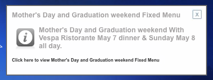
What’s worse is a pop-up that announces a fixed menu for graduation weekend. Since it’s designed like an advertisement, I automatically reacted to it as if it were an advertisement by exiting out of it immediately (sorry, advertising friends). Vespa should rethink it strategy for promoting graduation weekend – perhaps it could include this information in a blog post and publicize it on social media.
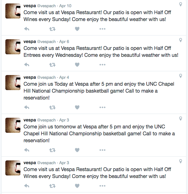
Vespa’s social media strategy is underwhelming. On Facebook and Twitter (its only active social media accounts), it posts frequent but low-quality content. Take, for example, this series of tweets.
Vespa’s social media strategy serves as a good reminder that quality is more important that quantity. Posting several times in a row with surface-level advertisements will not attract customers on social media. Vespa should consider sharing useful content and engaging visuals that resonate with its customers.
Searching for Vespa’s Twitter, I came across a second inactive account under Vespa’s name. Though it has only tweeted seven times from that account, it has attracted 70 followers (1.4 times the amount of its active account). To avoid confusion, Vespa should delete its inactive account and alert those followers of the active account by following them from said active account.
THE BOTTOM LINE
Vespa’s new building signage is inviting and interesting yet simple. It should update its website and social media to reflect that upgrade, and it should rework its social media strategy to offer valuable information that engages followers.
Living in Chapel Hill’s historic Northside neighborhood, I take particular interest in any business or organization whose name features Northside. The Northside District, aptly named for its location just across the street from the neighborhood, popped up some time last fall.
LOGO
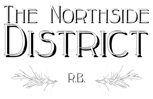
Thin serif letters accompanied by symmetrical foliage make up the logo for the Northside District. A drop shadow overwhelms the frail letters. Perhaps if the shadow sat a bit closer to the letters, it wouldn’t be as distracting. Two branches of wispy, thin leaves create interest and surround the letters “R.B.” I’m uncertain of what R.B. stands for, but the leaves are certainly a nice touch.
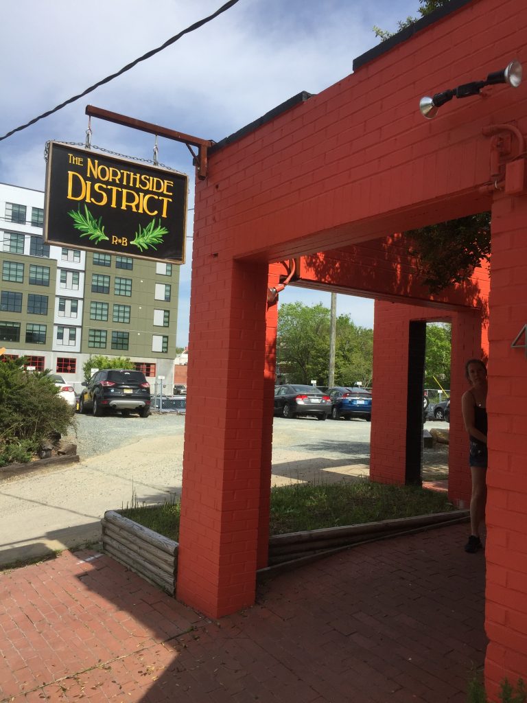
BUILDING SIGNAGE
The Northside District’s building sign is what alerted me to the restaurant’s existence – it’s a hand-painted sign featuring bright bold colors that contrast well with the black background. Unlike the overwhelming drop shadow present on the online logo, the paints create subtle dimension without diminishing the sign’s readability.
WEBSITE
The Northside District’s website is underdeveloped – visitors will find only a photo and the logo on the homepage. Considering Chapel Hill’s Northside neighborhood’s deep history, I was hoping to find a detailed description of the restaurant’s concept and an explanation behind its name.
The website does offer a menu, though the red font color is hard to read against the slate gray background.
When viewing on a mobile platform, however, the background becomes white and text becomes readable.
The Northside District has garnered 600 likes on Facebook, but even more impressive is its stellar rating. All 22 reviewers rated the Northside District 5 out of 5, and many studies suggest good ratings can make a big impact on customer perception. One study found that 68 percent of respondents said that positive customer reviews made them trust a local business more.
As far as social media content goes, the Northside District publicizes events like karaoke and “Facebreaker,” a comedy mic night. The restaurant also posts photos of well-presented dishes and promotes daily specials.
For a new business especially, promoting a cohesive brand is vital. Currently, the Northside District’s profile picture is the Tar Heel symbol. It should replace it with its logo.
THE BOTTOM LINE
With its superb reviews and eye-catching sign, the Northside District is off to a good start. To bolster its success, the restaurant should add depth to its website and upload its logo to Facebook.
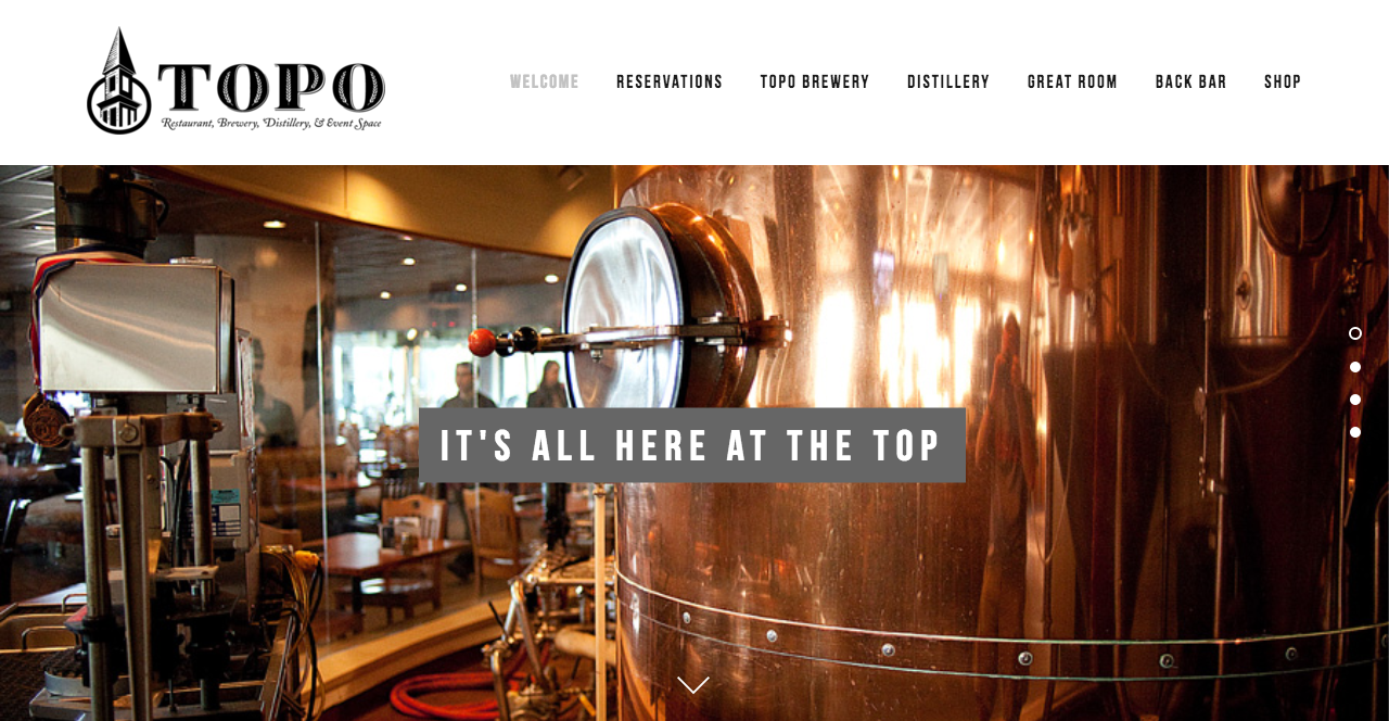
Truth be told, I never truly understood how Top of the Hill became known as TOPO. Is it the “o” from “of?” As in, “TOPO is located on top o’ the hill?” Comment below if you can confirm. Regardless, TOPO is an inspirational local brand that has experienced enormous success since its conception in 1994.
LOGO
TOPO falls under the list of many local businesses that have redesigned their logos. The original logo, pictured below, integrates typography with an iconic illustration of… wait, is it the Morehead-Patterson Bell Tower or the University United Methodist Church? The illustration doesn’t perfectly match either tower. In fact, both have conical roofs, unlike the mystery tower featured in both of TOPO’s logos.
TOPO’s old logo resembles a historical plaque.
Tower confusion aside, TOPO’s new logo features a beautifully detailed and high-contrast illustration. TOPO embraced its abbreviation and tossed “Top of the Hill,” giving way to bolder and more stylized letters. Grains of wheat embellish each embossed letter, alluding to TOPO’s spirit distillery, which opened in 2012. Overall, TOPO’s high-contrast and stylized logo contributes to the business’s elegant style.
BUILDING SIGNAGE
TOPO’s building signage hasn’t been updated since the logo change, but its metal lettering produces a subdued sheen and fits well regardless of the redesign.
WEB DESIGN
TOPO’s website is minimalist and free of distractions, but its navigation system isn’t the most user friendly. With three of the top navigation tabs linking to the brewery, distillery and Back Bar, TOPO places too much emphasis on its alcoholic offerings. Scrolling down on the homepage leads to TOPO’s food menu, but considering the main image is of the brewery, that fact it isn’t obvious. TOPO’s food menu deserves a spot on its website navigation menu, even if the link simply directs visitors halfway down the homepage.
TOPO has leveraged social media by understanding its target audience and by tailoring messages to that audience. Whether it be families, alumni, students or what-have-you, TOPO lovers are likely diehard Carolina fans. Seated in the heart of downtown Chapel Hill, TOPO has embraced its customer base by posting about all things Carolina: the first day of classes, Tar Heel basketball, student a capella groups and snow days.
TOPO also posts stunning photos, retweets media coverage, and publicizes daily specials and events. Overall, TOPO’s frequent and consistent social media strategy pays off.
THE BOTTOM LINE
TOPO’s visuals and social media work well together to form a comprehensive branding strategy, all of which targets Carolina fans. Perhaps the tower will forever remain a mystery – leave a comment if you can clarify.
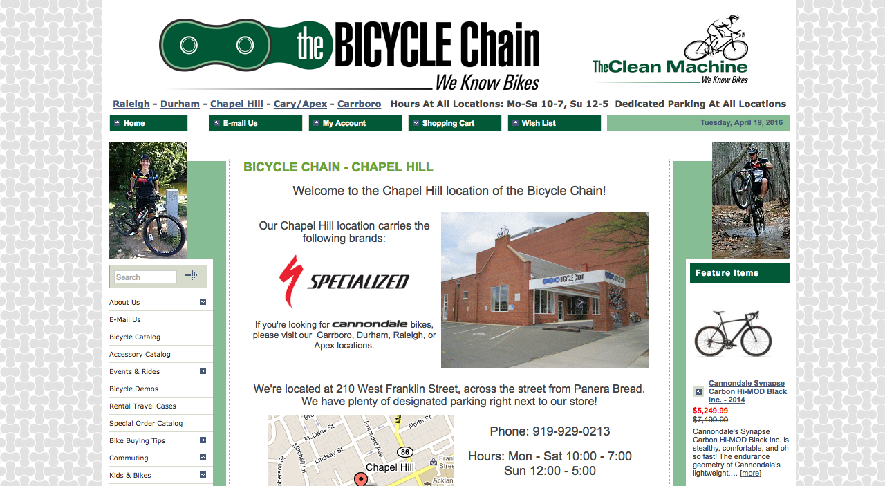
As the daughter of two avid bikers, I couldn’t resist delving into Chapel Hill’s sports shop scene. The Bicycle Chain sells a variety of bikes for different purposes and offers a wealth of helpful tips on its website. Its communications strategy is on the right path (bike path, that is) but could make a few changes to further promote itself as a useful resource for bicyclists, experts and newbies alike.
BRAND NAME
The Bicycle Chain brand began with the opening of Carrboro’s The Clean Machine in 1972. The Chapel Hill store opened in 1992 as Franklin Street Cycles. Two more stores opened in the decade following: Cycle Center in Durham and The Bike Rack in Raleigh. In 2007, current owners Doug Venema and Scott Smith opened a fifth store in Apex and rebranded all stores except Carrboro’s to become The Bicycle Chain.
The Clean Machine in Carrboro remains as such, which fragments the brand and creates confusion, especially considering all stores share one website: http://thebicyclechain.com. Though it may be hard to let go of an old name, maintaining two names for the same business hurts recognition of both stores.
LOGO
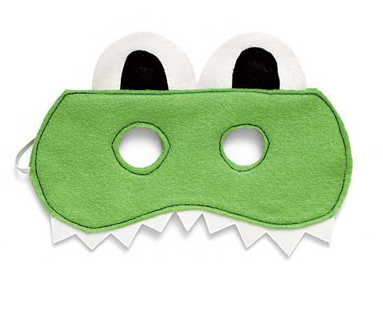
The Bicycle Chain’s logo comprises a shape familiar to any bike lover – a link from a bike chain. The graphic is minimalist and clearly connects to the brand’s name, though after staring at it for too long, I began picturing a frog mask…
The logo uses an extremely condensed sans serif font. Written in all caps and in bold, “Bicycle” is fairly legible. However, the lowercase letters that spell out “the” and “chain” are cramped with little space between already narrow letters. Condensed fonts are notorious for poor readability, and this text is a bit hard to read. That being said, the shop’s simple and short name saves the logo from being completely illegible.
The Bicycle Chain’s logo doesn’t always catch my eye when I pass by the store, but it communicates the essence of the business.
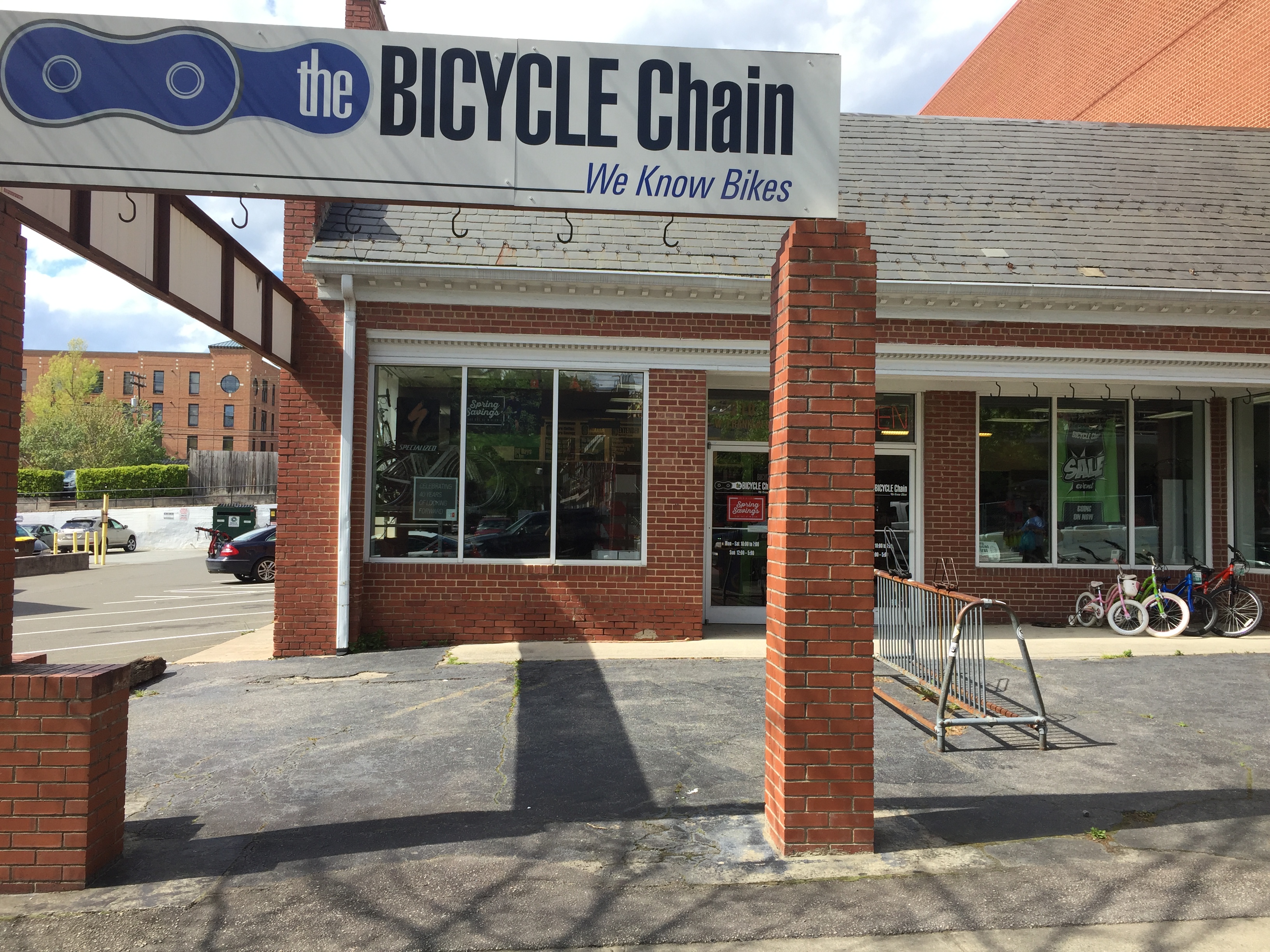
BUILDING SIGNAGE
The Bicycle Chain’s building sign is an exact print of its logo but in blue rather than green. Perhaps it’s to signify support for Carolina, though the blue isn’t quite UNC-Chapel Hill’s Pantone® 542. Aside from the color inconsistency, The Bicycle Chain’s building signage aligns closely with its online branding, which is important for building a cohesive image.
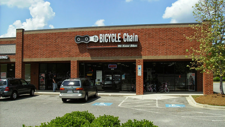
Overall, the sign is lackluster. Since the logo is simplistic, I would’ve liked to see some dimension in the lettering. For example, the Bicycle Chain in Cary offers a sign that stands out against a brick wall.
WEB DESIGN AND CONTENT
The Bicycle Chain’s web design is free from distracting animations and is fairly easy to navigate. One issue with the navigation, though, is poor organization of useful resources. The store offers a wealth of helpful information ranging from how to pick the best bike, how to stay safe on the road, how to maintain a bike, and more, but these articles are split into menus titled “Bike Buying Tips,” “Commuting,” “Kids & Bikes,” “Help With Your New Bicycle,” “Service Department,” “Accessories and Apparel” and “Reading Room.” Instead of displaying all of these categories in the side navigation, The Bicycle Chain should consider condensing them into one tab titled “Helpful Information” or “Important Tips,” and offering a filter-by-category option.
The Bicycle Chain has attracted a sizable following on Facebook and Twitter, though it posts rarely. It experimented with Instagram for a few weeks about a year and a half ago but has since abandoned the platform – should it have? As I’ve mentioned in previous posts, Instagram skews toward Millenials, whereas bicyclists tend to be older. A 2013 study found the average age of a bicyclist to be 37 years old, though that number is down from 43 percent in 2008.
While the average age of bicyclists is older than the average age of Instagram users, the gap is decreasing. Since the fastest growing demographic on Instagram is 40-to-60 year olds, the Bicycle Chain should consider leveraging the changing media landscape by appealing to older Instagram users – not to mention college bicyclists.
Sharing valuable and timely content on social media will boost engagement, and The Bicycle Chain already has a comprehensive collection of how-to articles and tips. It should continue building that collection and start sharing it on social media.
THE BOTTOM LINE
It’s clear that The Bicycle Chain is operated and supported by knowledgeable and enthusiastic bike lovers – reorganizing and sharing relevant information with consumers via social media will further propel the store toward success.
What’s your take on The Bicycle Chain’s branding? Do you like its logo? Does it remind you of a frog mask, too? Share your thoughts in a comment below.
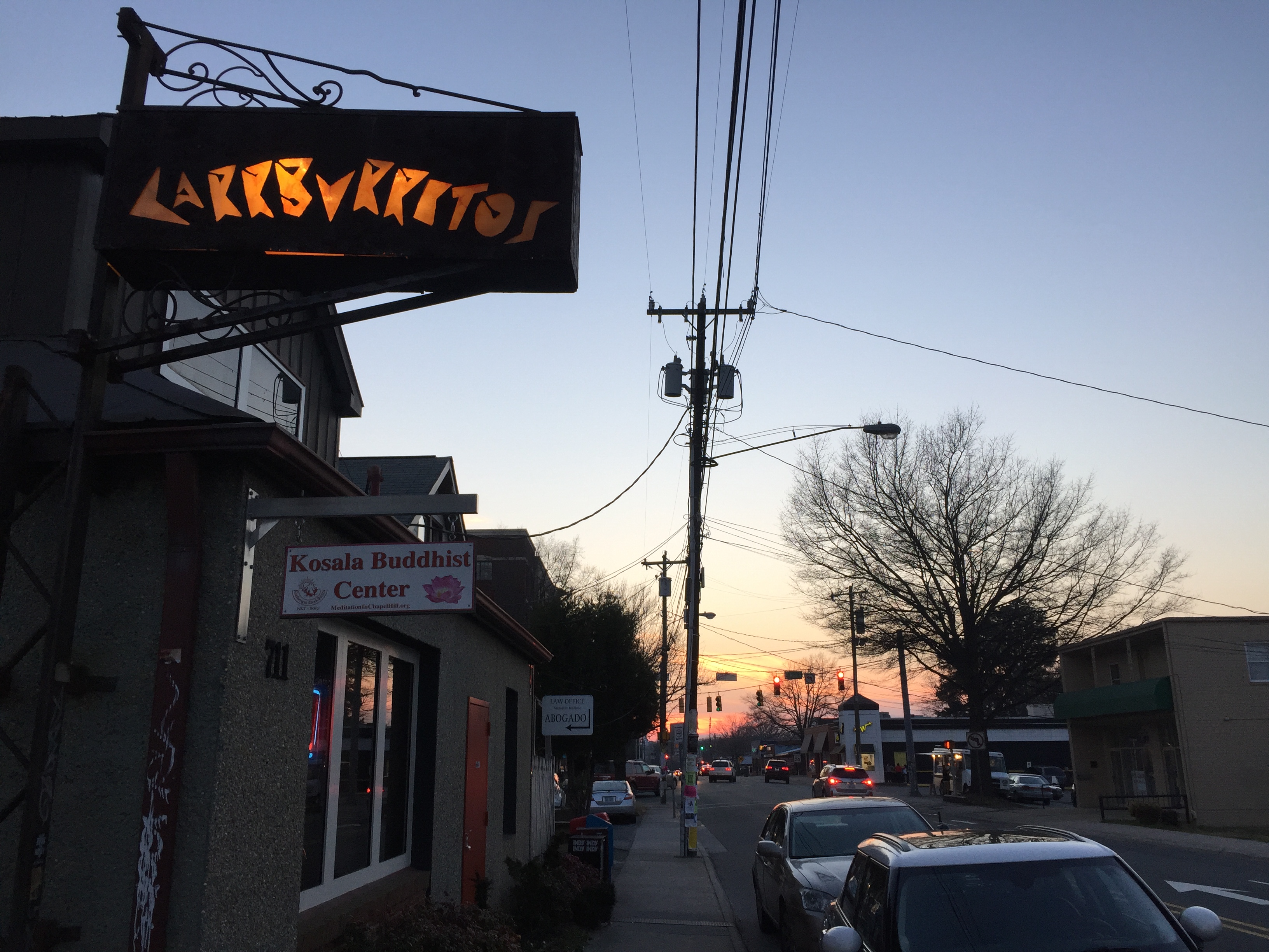
Few things are as satisfying as eating a burrito in Carrboro, and Carrburritos provides just that (with a catchy name to go along with it). Its quirky logo has always caught my eye, which prompted me to examine the rest of its branding.
LOGO
Carrburritos uses bold letters in its logo that bear resemblance to many Greek-style fonts such as Dalek or Pirho Herakles. Another font, Surfboard, also possesses similar characteristics. The enclosed spaces (often called counters) within the letters A, R, B and O all take triangular shapes. Except for the O, each letter is only made up of straight lines. The style is reminiscent of Greek or perhaps Mexican culture, but I wouldn’t automatically draw the connection. Carrburritos’ style thus avoids the cliche, and the result is a unique logo I can only associate with the taqueria.
BUILDING SIGNAGE
Carrburritos’ sign outside enhances and adds spice to the logo. A warm and lively orange color shines through the rectangular sign, illuminating Carrburritos’ easily discernible letters. The light is soft and subdued, resulting in a sign that is less obnoxious and easier to read than neon.
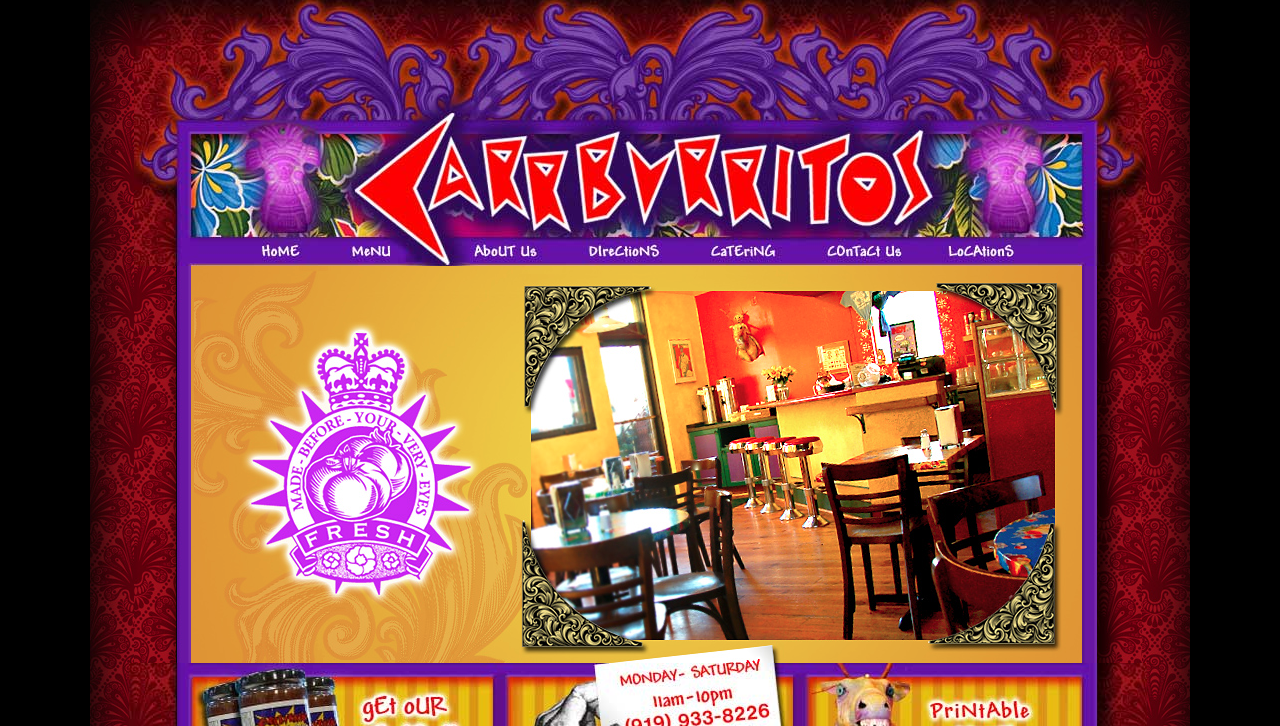
WEB DESIGN
Contrary to the subdued nature of Carrburritos’ building signage, its website is far from subtle. Vivid red, purple and orange colors overwhelm every page. Gaudy glow effects are rampant, and ill-fitted fonts make for an unpleasant experience. The colors clash, as do the fonts (clicking through each page, I think I counted six unique typefaces – most designers recommend sticking to two or three). The website’s flashy design simply doesn’t align with the down-to-earth vibe I get from Carrburritos’ building signage and restaurant culture in general.
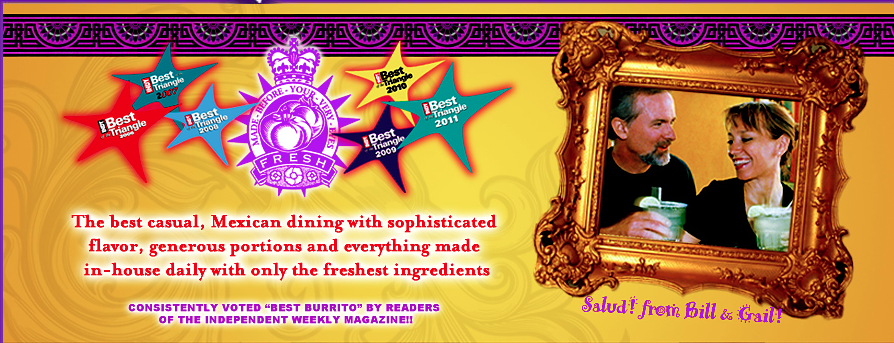
On Carrburritos’ “about” page, those same tacky colors and fonts detract from what might otherwise paint an authentic picture. The photo of owners Bill and Gail is candid and heartwarming, but the frame commands too much attention.
Carrburritos owns a shell of a Facebook page – it hasn’t posted since 2010, it lacks a profile picture and cover photo, and it offers minimal amounts of information regarding its food and culture. Carrburritos is absent from Twitter and Instagram, though like many great restaurants, Insta users still tag its location regularly. If Carrburritos were to create an account on Instagram, it would already have access to an abundance of user-generated content for the restaurant to monitor and engage.
Carrburritos opened a second store in Davidson (contrary to its name fitting so perfectly to Carrboro). The Davidson store is much more active on social media and has garnered 3,322 likes on Facebook and 243 followers on Twitter. Carrburritos of Carrboro might benefit from monitoring Davidson’s social media to gather ideas for its own social media campaign.
THE BOTTOM LINE
Carrburritos has established a unique culture that its logo and building signage reflect perfectly. However, its web design clashes – Carrburritos should consider revamping its website to complement rather than detract from its brand. Its absence from social media is a missed opportunity. Carrburritos would greatly benefit from engaging with users on Instagram and adding photos and content to Facebook.
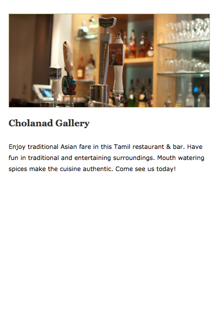
Cholanad’s South Indian cuisine scores around 4 out of 5 on everyfoodreviewsite. How does its visual branding score?
LOGO
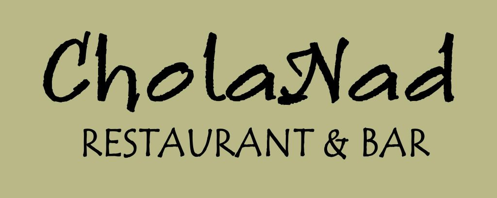
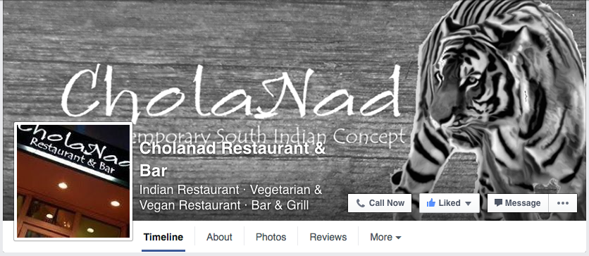
You can find several variations of Cholanad’s logo floating around the restaurant’s website and social media accounts, and the common denominator is the choice of fonts for “Cholanad” and “Restaurant & Bar.” The former is set in Ruling Script, and the latter is set in Tempus Sans. Both of these fonts debuted in the early to mid-1990s, so they’re a bit dated.
The fonts may be too stylized to mesh well together. Ruling Script is calligraphic and thus takes on a distinct handwritten style. Tempus Sans is more toned down, but the quirks make for a playful style, especially when in lowercase. Take note of the “n,” for example. Its leg curves inward, giving the character a unique look. For me, the two fonts don’t make for a perfect combination. However, it could be worse. At least it’s not one of these fonts.
Aside from visual impact, Cholanad’s logo uses a capital “N,” but on the website, Cholanad is spelled with a lowercase “n.” While it may seem trivial, the inconsistency of capitalization comes off as careless and unprofessional.
BUILDING SIGNAGE
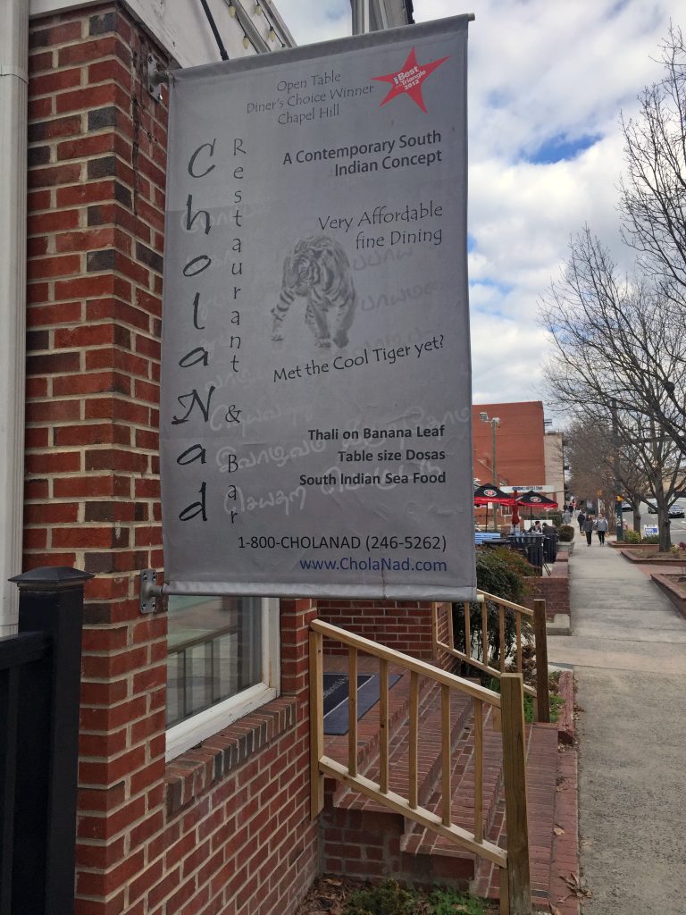
Perhaps the most confusing and illegible sign on Franklin Street, Cholanad’s flag puts forth too much information. On second thought, perhaps it isn’t the amount but rather the lack of clear organization. One of the most important rules of typography is establishing hierarchy – Cholanad’s misuse of vertical text, angled text, different font weights and different font sizes has me trying to read everything simultaneously, and it isn’t working.
People tend to read the biggest text first, which is often at the top of the design. Though “Cholanad” is the largest text, its vertical display and left alignment diminish its power and render it hard to read. Since the restaurant’s name is the most important text, it should be front and center.
The next most important information on the sign is “A Contemporary South Indian Concept” because it tells passersby what type of cuisine to expect. While set in bold and located at the top of the sign, this text is overshadowed by the centered text and bold red graphic just above, which highlights awards Cholanad has received. The graphic that reads “Best of the Triangle 2012” is the only pop of color on the sign and thus commands far too much attention for what it’s worth.
The remaining text refers to affordable prices, the restaurant’s apparent mascot, specific menu items and contact information. Size and treatment of this text should reflect its subordinate value. Some information should be eliminated entirely or placed on a separate sign or pamphlet.
The Tamil script displayed in the background ties in the restaurant’s Indian theme, but it becomes distracting when trying to read information.
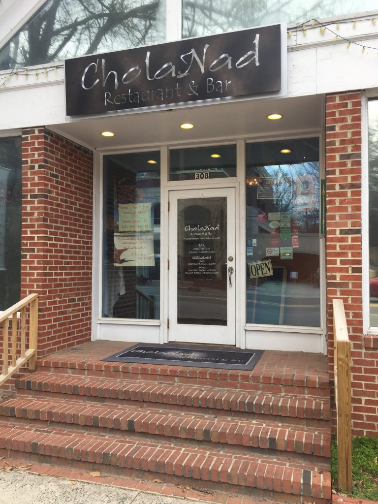
Fortunately, the sign directly above Cholanad’s entrance (see below) is simplified and much more legible. “Restaurant & Bar” is a bit hard to read because of the sign’s inverted style. Overall, though, the sign looks elegant.
WEB DESIGN
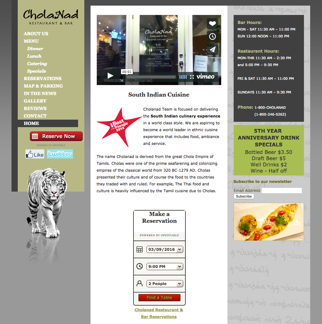
Cholanad’s web design is outdated but easy to navigate. An issue that particularly stuck out to me includes the antiquated style of buttons like “Reserve Now” and the social media links. Replacing those graphics with flat, minimalist designs would be an easy place to begin updating Cholanad’s website to conform to contemporary trends.
Cholanad’s gray and jade green color scheme is soothing and subtle, but the green background behind “5th Year Anniversary Drink Specials” is brighter than the rest and should be altered to match the left sidebar.
Cholanad teases website visitors by offering a gallery page with no photos. Its Facebook page offers a wealth of high quality photos that should be present on the website too.
Where is the gallery?
USE OF BENGAL TIGER
On its building signage and website, Cholanad features different photos of a white Bengal tiger, a species native to India. Since Bengals are endangered, I associate them with terms like “rarity” and “value.” Perhaps Cholanad is drawing a connection with white tigers to assert itself as a rare food option? If you have more information regarding the tiger, comment below.
Cholanad uses its social media primarily to publicize awards that it has won – awards worth boasting! Cholanad doesn’t post often, however, and it could fill in those gaps with additional useful content. Because Cholanad offers authentic Indian cuisine, it could use social media to provide educational materials like recipes and traditions. Or perhaps it could forge a more interactive relationship by sharing stories of regular customers or featuring employees.
Cholanad’s visuals on Facebook could use some adjusting to fit the platform’s unique layout. For example, some of the text on its cover photo is unreadable due to its profile picture, name and description.
There’s that tiger again!
THE BOTTOM LINE
Cholanad offers highly rated South Indian food and has proven its value by winning various awards. Its visual branding, however, is often confusing, unreadable, outdated and inconsistent. Cholanad should consider overhauling its building signage and updating its website so that its branding is as high quality as its food.
Mildred Cotton Council, or Mama Dip, has been serving up southern food since 1976. Mama Dip opened the restaurant with less than $100, but it quickly flourished and continues to offer country cooking as it enters its 40th year. The brand of Mama Dip’s leverages this charming backstory through its visuals and on social media, and that authenticity pays off. However, the disconnect between the restaurant’s online logo and its outside sign leads to confusion.
LOGO
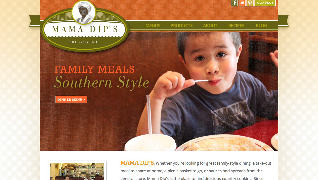
It isn’t clear which graphic associated with Mama Dip’s is its true logo. One is green in color, oval in shape and features a grayscale headshot of Mama Dip. This logo is displayed on the Mama Dip’s website. Its checkered pattern and triangular jagged edge emulate craftsmanship, and Mama Dip is certainly skilled in her trade of cooking.
Mama Dip’s uses another logo outside the restaurant and on social media. This inconsistency in visual branding is capable of stifling recognition in consumers. When I think of Mama Dip’s, I have trouble visualizing a concrete image because neither graphic is emphasized as the primary logo.
BUILDING SIGNAGE
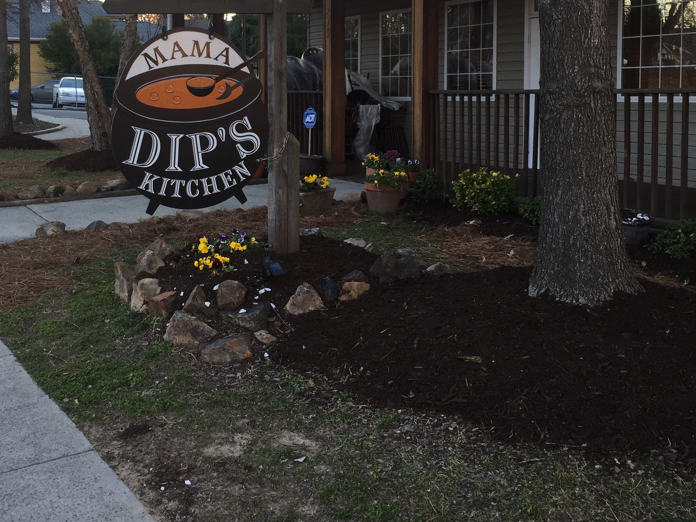
The second graphic acts as the restaurant’s exterior signage. The sign takes the shape of a giant soup cauldron. The white lettering stands out against the black kettle, achieving high readability. Overall, the graphic is memorable and relevant to Mama Dip’s.
I imagine the bubbles in the soup aim to depict boiling temperature, but I find that they more closely resemble soap bubbles. What type of soup is brewing, I wonder.
WEB DESIGN/CONTENT
The Mama Dip’s website brings in subdued orange and green colors that complement each other and are soft on the eyes – no overwhelming or bright hues here. The cross hatch pattern on the logo and in the header and background are reminiscent of a picnic tablecloth, which symbolizes family and unity.
As for web content, the site promotes authenticity by providing a brief history of the 40-year-old restaurant and by offering recipes. The website links to a blog, which would also contribute to the genuine character of Mama Dip’s. Unfortunately, there is only one blog post from 2013.
Posts by Mama Dip’s are neither frequent nor consistent. Sometimes posts come twice per day, and sometimes it there will be month-long gaps. But when Mama Dip’s does post, the content is meaningful and often involves an employee or customer. Take this post about a couple who visits every year to celebrate a special anniversary:
It’s this type of authenticity over which big brands go crazy. Authentic social media marketing is often cited as one of the best online strategies, and it appears to pay off for Mama Dip’s. Each Facebook post yields about 50-100 likes, heaps more than what I have seen for other local restaurants.
On Twitter, Mama Dip’s is much less active and therefore less engaging. The restaurant is absent from Instagram entirely, but Insta users often tag their location at Mama Dip’s. These consumers have already begun spreading awareness via Instagram and have therefore created a unique opportunity. Mama Dip’s should get onto Instagram and interact with these users, which would further promote its authentic brand.
THE BOTTOM LINE
Conflicting visuals prevent consistent branding and reduce the likelihood of making a strong impression on newcomers. Mama Dip’s should consider addressing the discrepancy between its building signage and online visuals.
Authenticity naturally radiates from Mama Dip’s, and the restaurant has already begun to enrich its brand on social media. If the time and resources become available, Mama Dip’s should become active on Instagram to continue growing.

 [/column][/row]
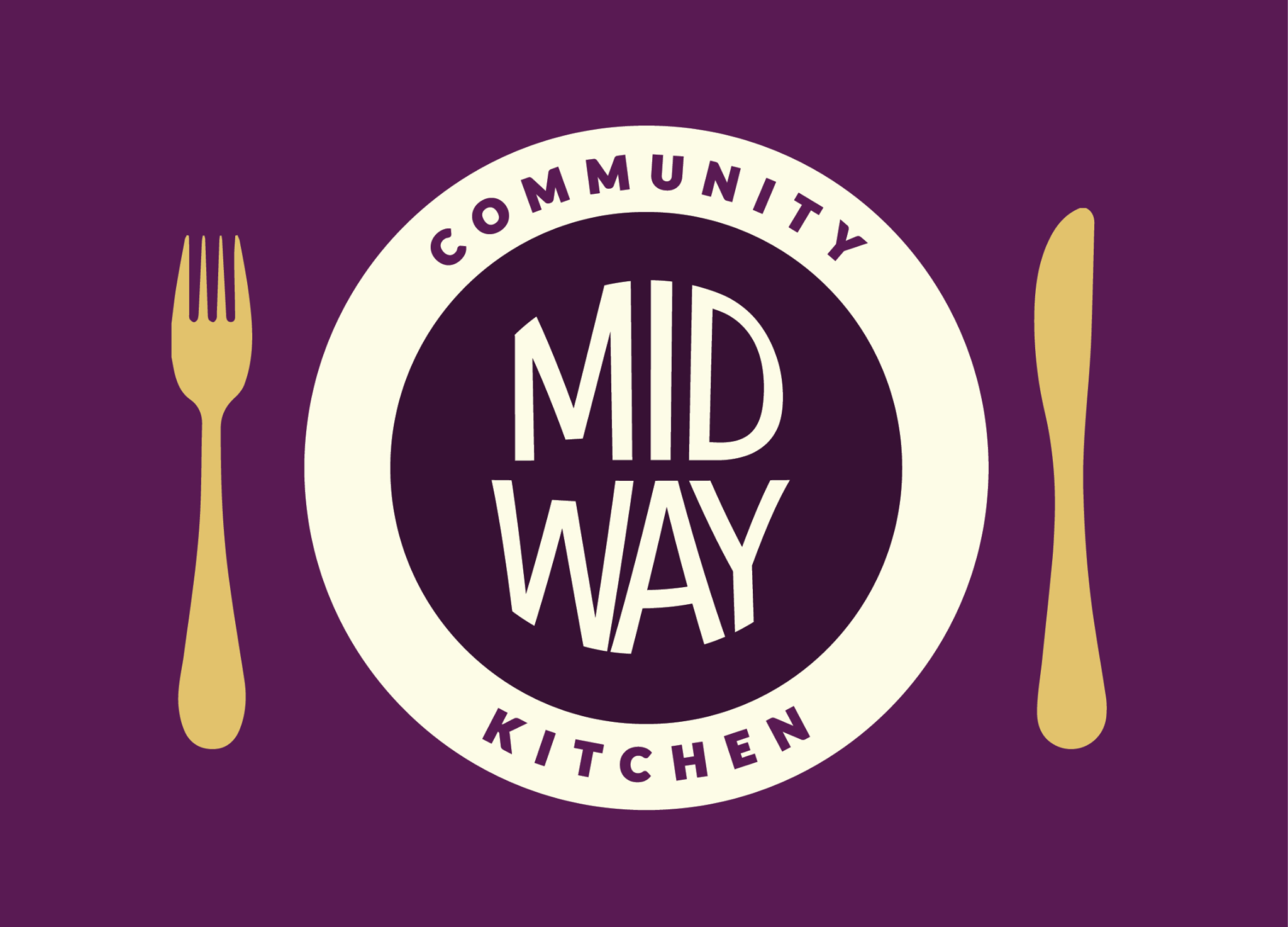 [/column][column md=”4″ sm=”4″]
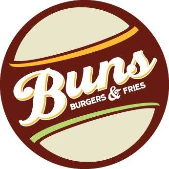 [/column][/row]
 Brand marks forego the brand’s name in favor of a single graphic or symbol – Apple and Nike are two internationally recognized brand marks.
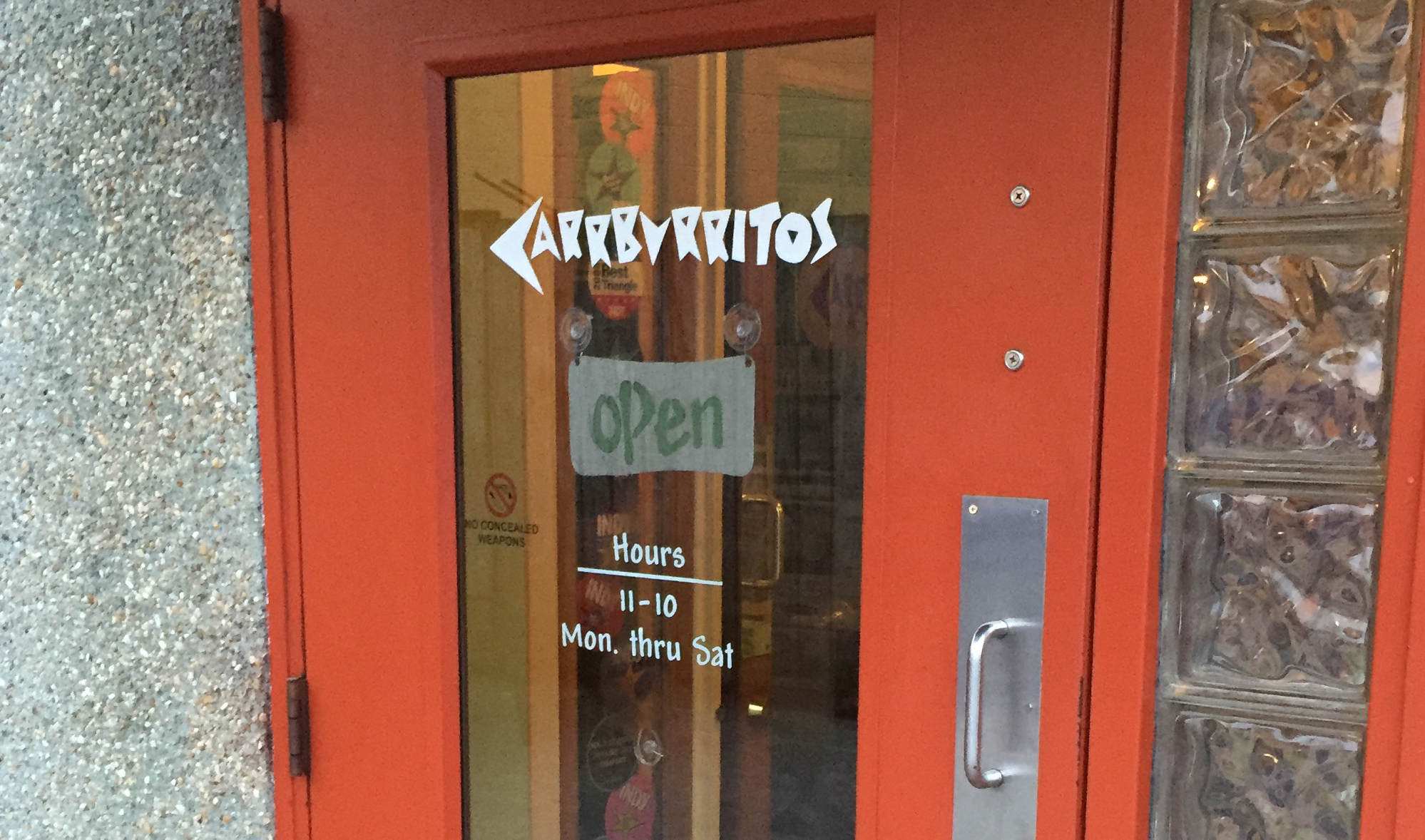
 [/column][/row]
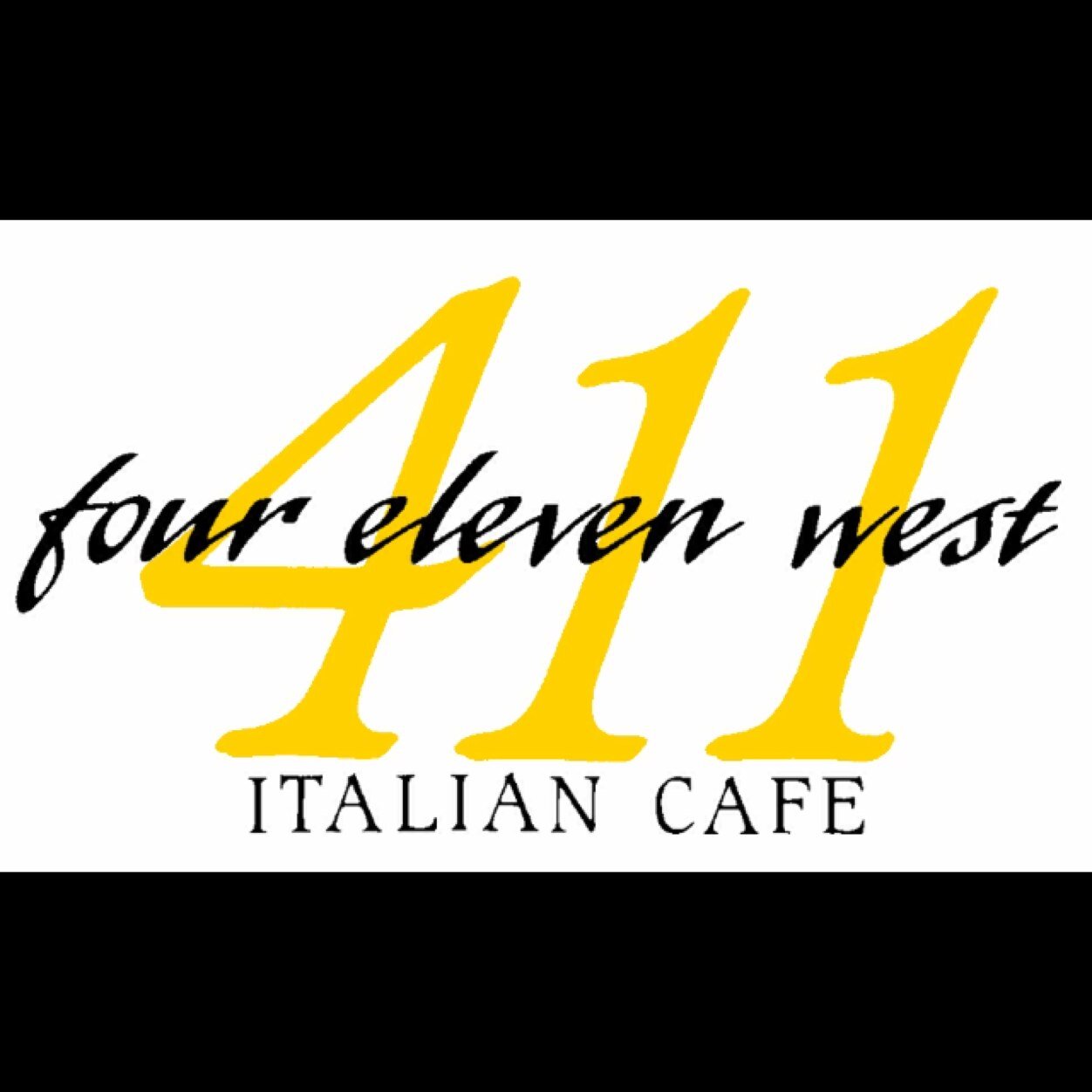
 At first glance, 411 appears to use two of the world’s most hated fonts:
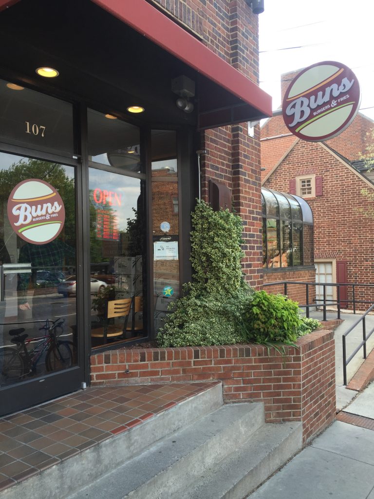
 One last note on web design – the design for Midways tab icon (located on the left-hand side of your browser tab) is a bit too complex for maximum legibility. When sized down, the icon is hard to see; details like the utensils and “M” disappear.