In an earlier post I linked to an article that described the five types of logos: letter marks, emblems, brand marks, word marks and combination marks. Here’s a brief summary of each type of logo and a local example to go along with each.
Letter Marks
Some businesses with long names create an abbreviation and use it as a symbol for their brand. Most television stations use a letter mark – think HBO, CNN, ABC, etc.
Not many brands in Chapel Hill use letter marks. Artisan Pizza Kitchen now uses an abbreviation but is placed inside a hexagon, so it acts as more of an emblem. Similarly, Carolina Dining Services uses a memorable abbreviation, but it’s usually accompanied by a square box.
[row]
[column md=”5″ sm=”5″ mdoff=”1″ smoff=”1″]![]() [/column]
[/column]
[column md=”5″ sm=”5″] [/column][/row]
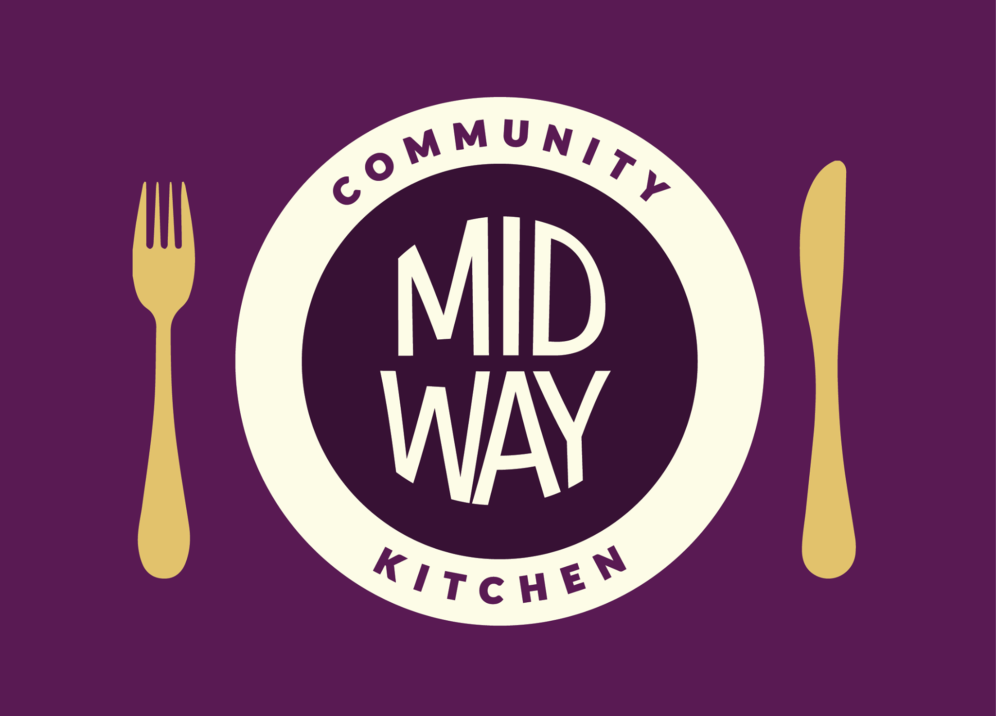
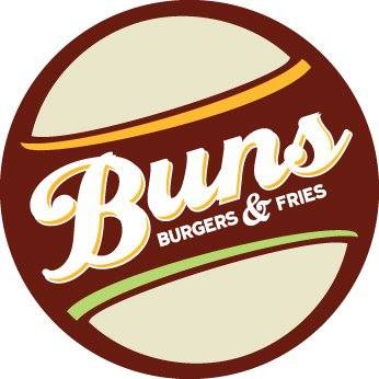
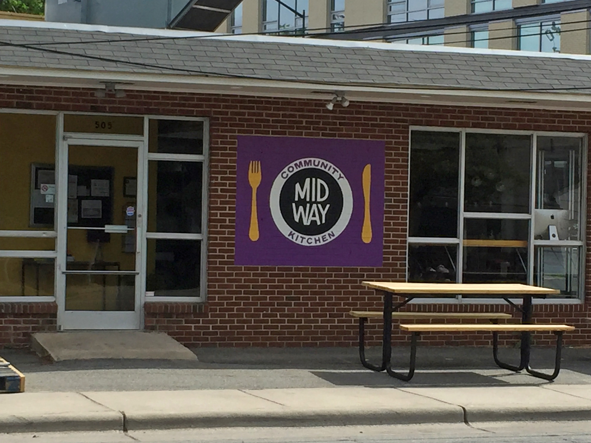
Emblems
Logos with text inside a symbol are considered emblems. They’re iconic and resemble badges, like Starbucks or Harley-Davidson.
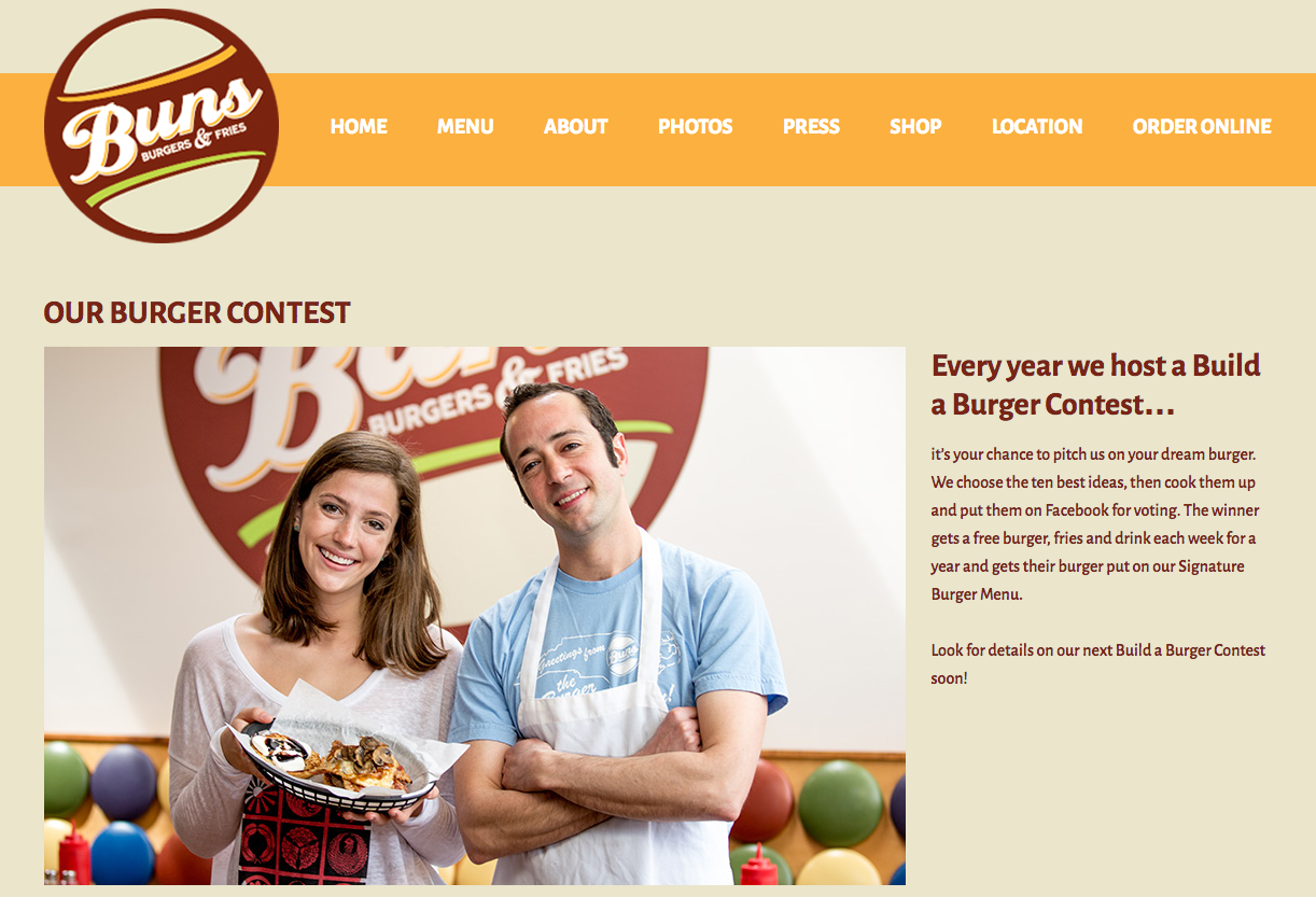
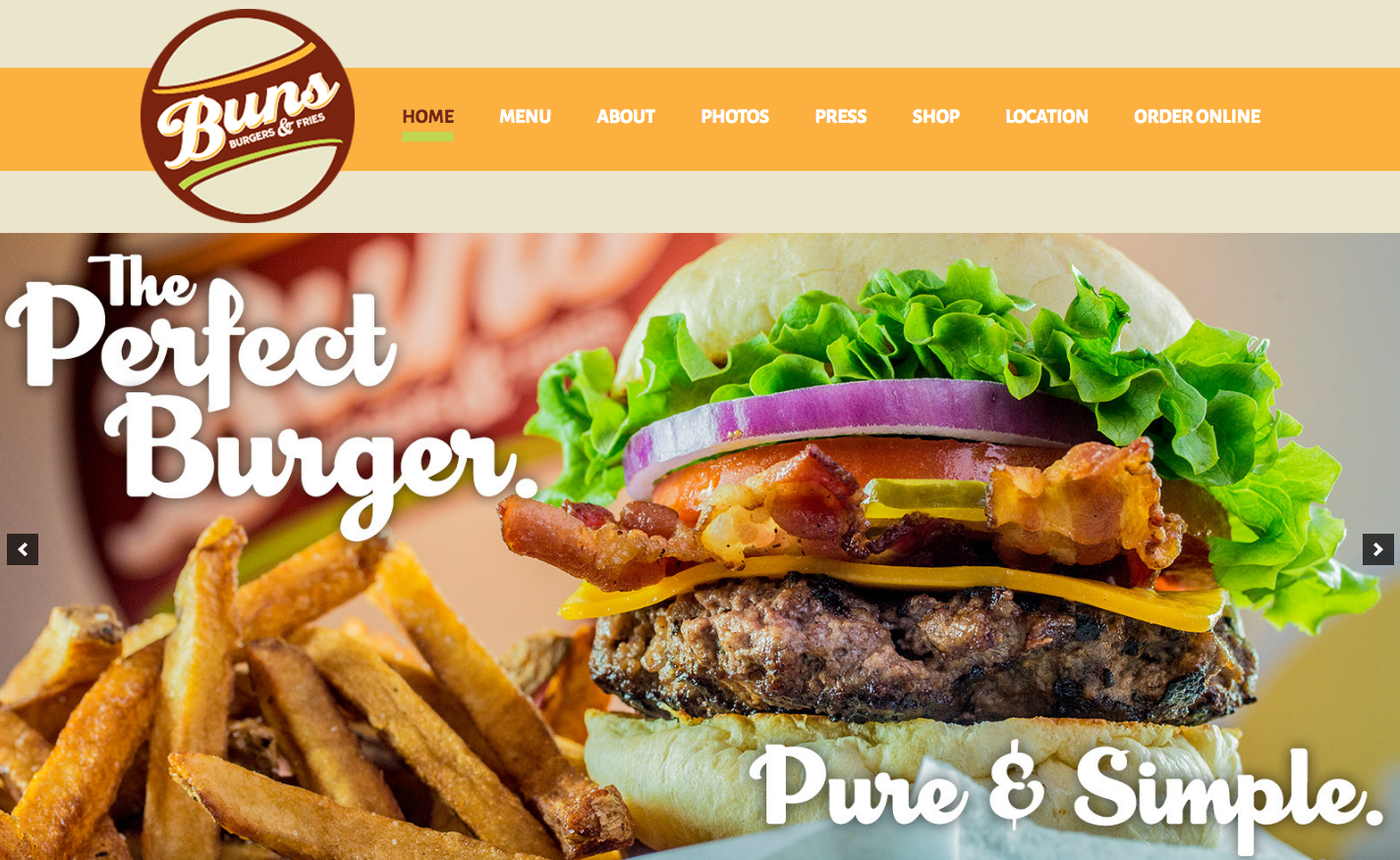
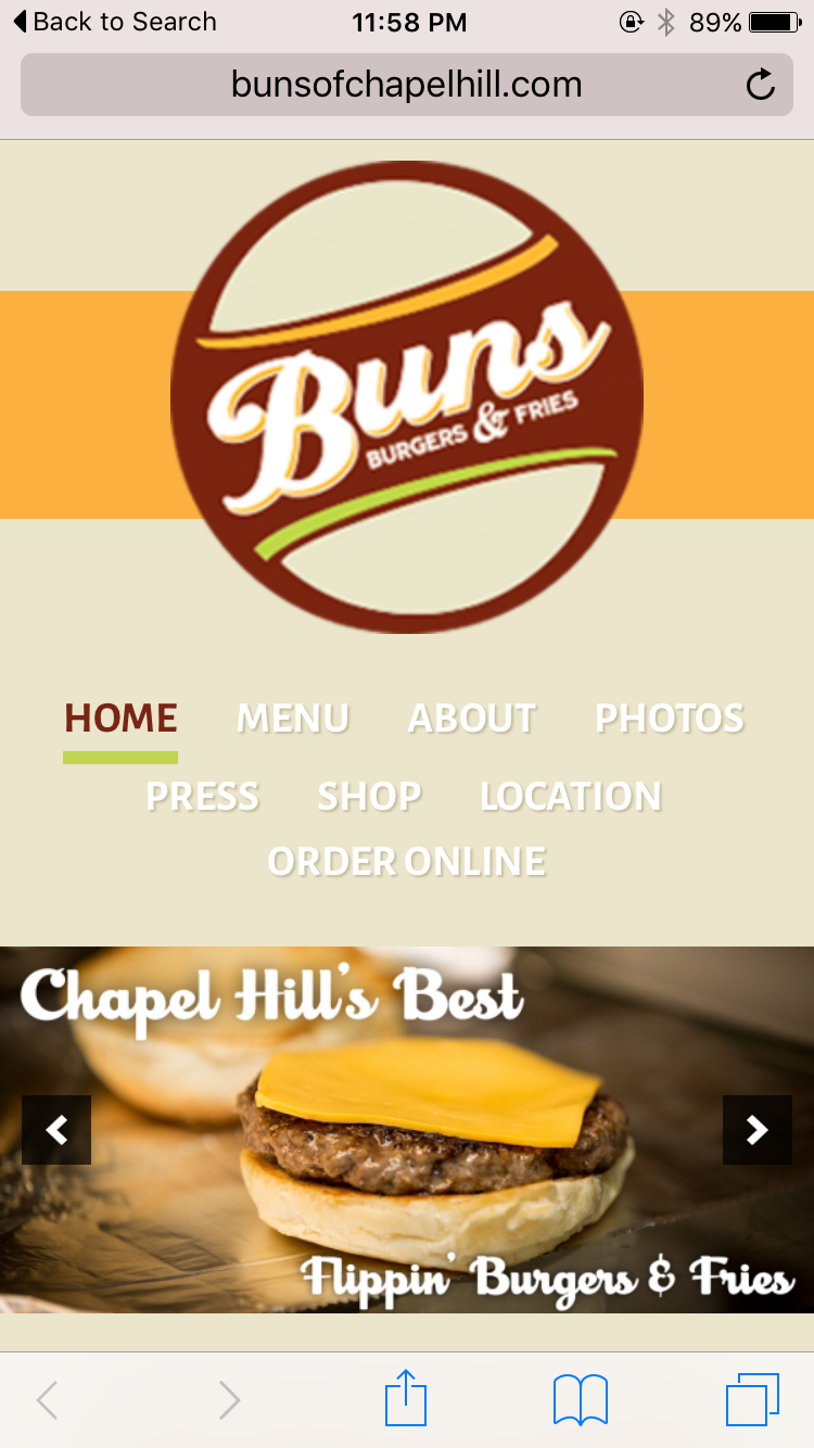
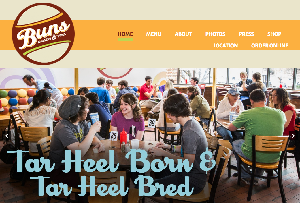
Midway Community Kitchen and Buns both evoke the emblem style in their logos.
[row][column md=”6″ sm=”6″ mdoff=”1″ smoff=”1″]
 [/column][column md=”4″ sm=”4″]
 [/column][/row]
Brand Marks
 Brand marks forego the brand’s name in favor of a single graphic or symbol – Apple and Nike are two internationally recognized brand marks.
Local business may find it difficult to become so well-established that a symbol on its own will suffice, so there aren’t many brand marks in Chapel Hill.
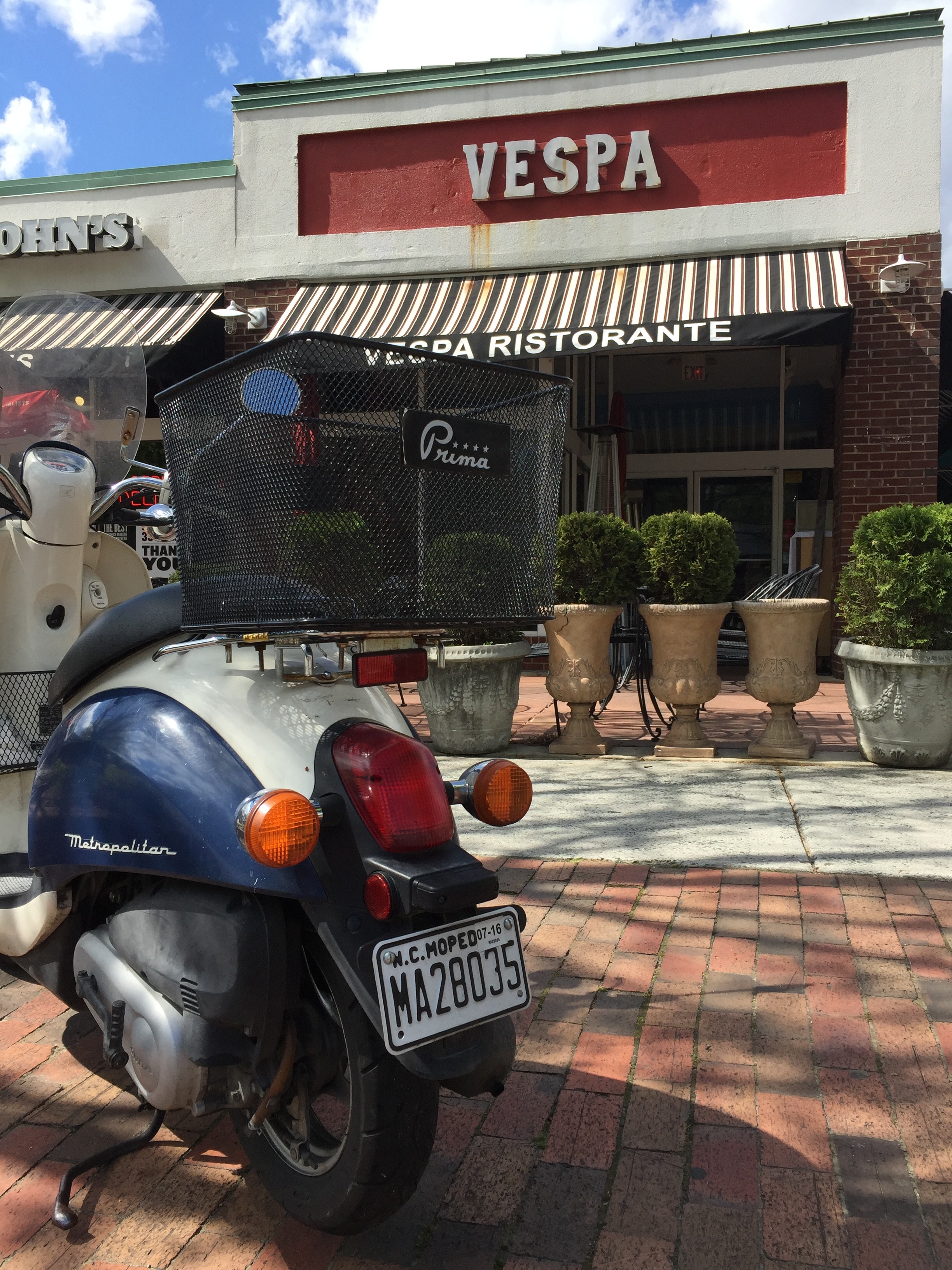
The Carolina Inn occasionally allows its symbol to stand alone, but most often its brand name accompanies the symbol.
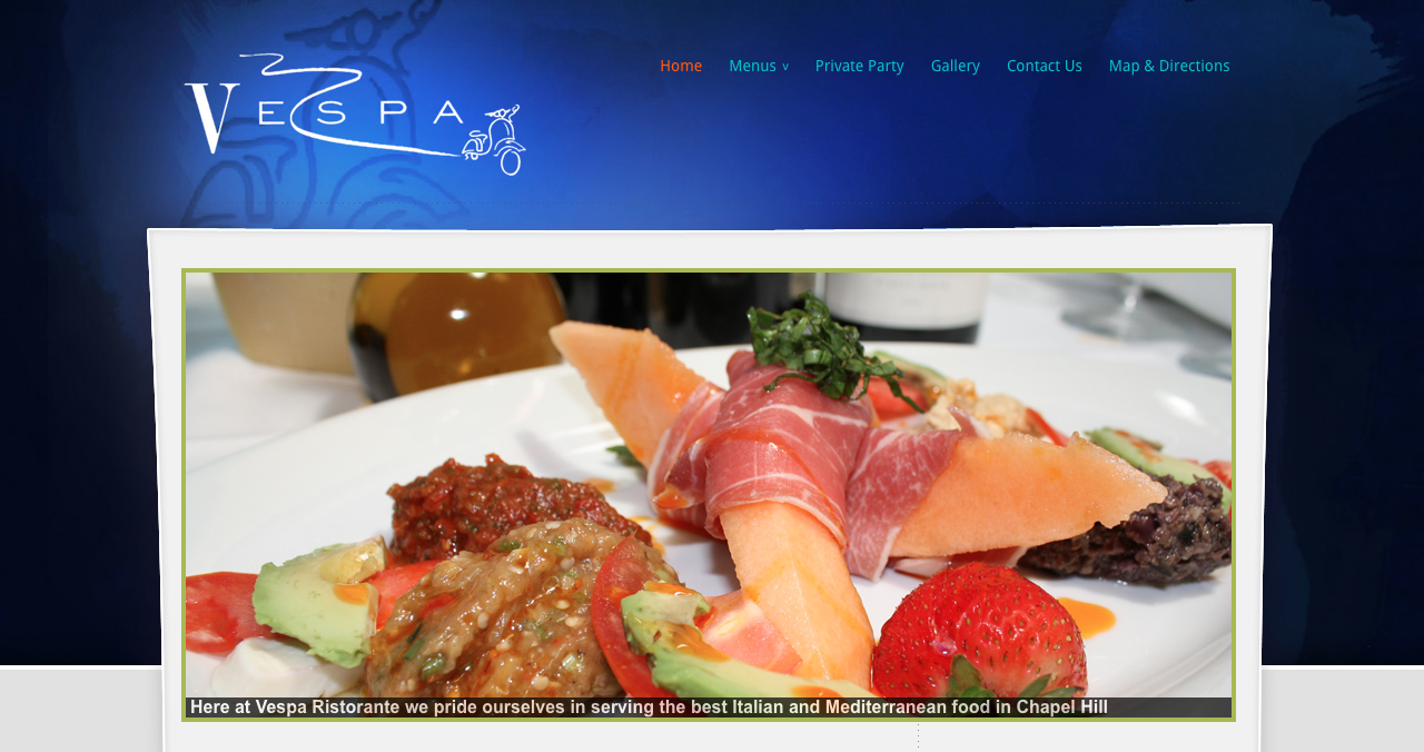
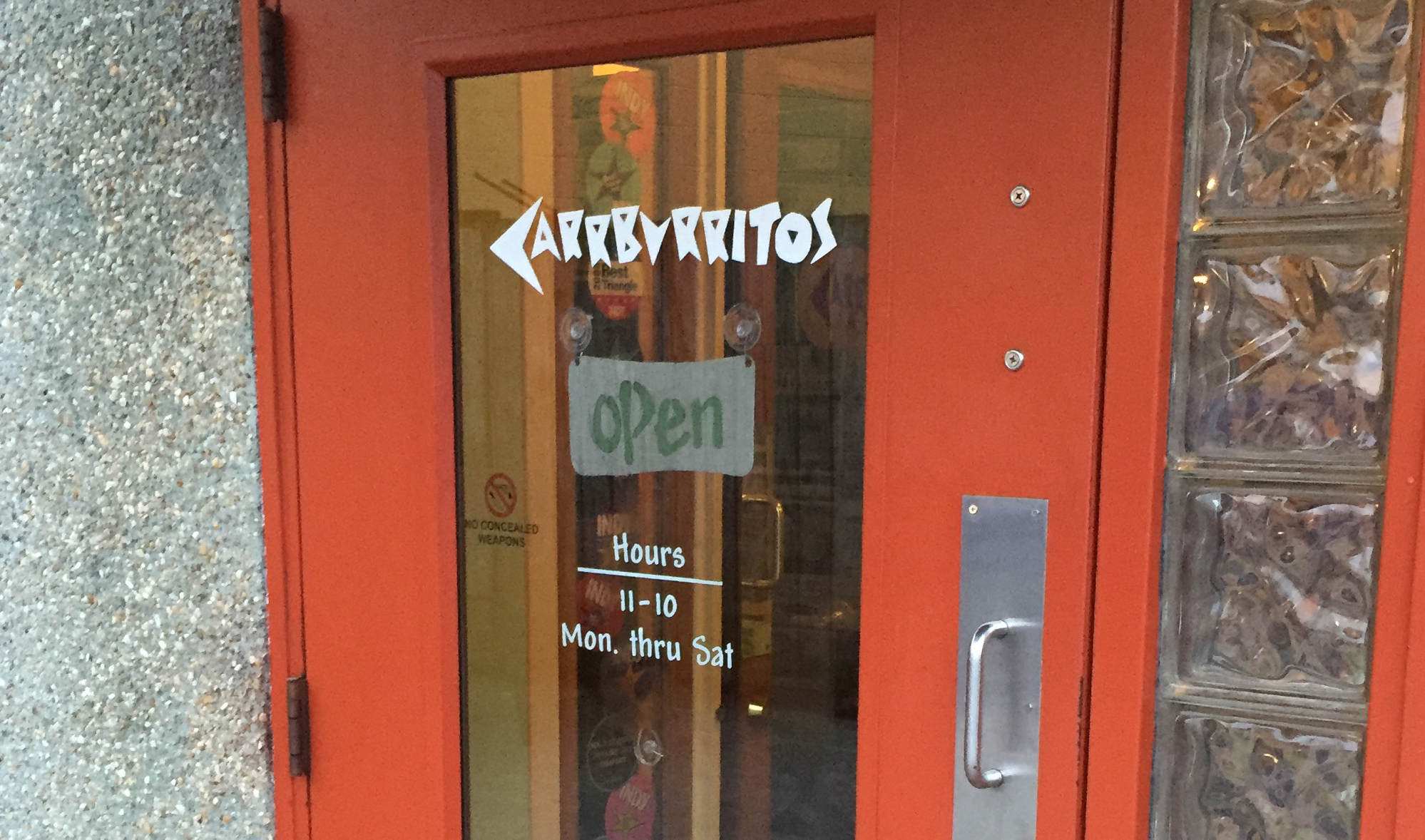
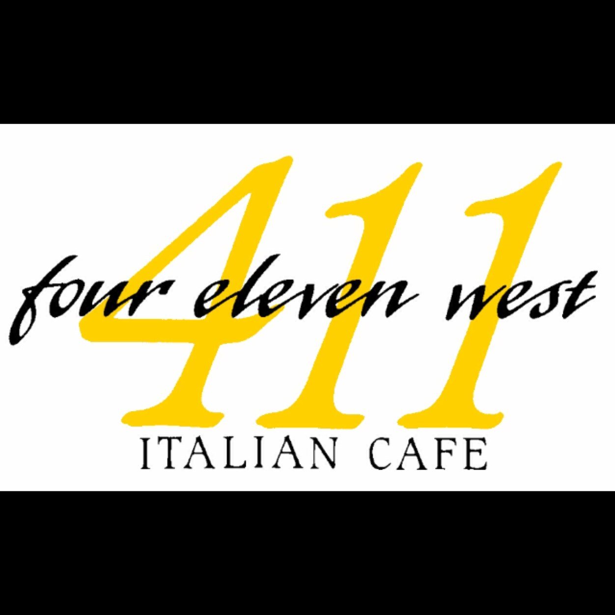
Word Marks
Word marks write out the brand’s name and leave it at that. Brands will often use unique fonts to make their logo stand out. Disney is a prime example.
Lots of local businesses use word marks, including Light Years, Carrburritos and 411 West Italian Café.
![]()
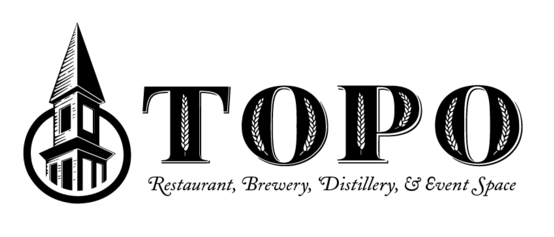
Combination Marks
Perhaps the best fit for local businesses, combination marks merge symbols and text for a logo that offers visual appeal and promotes brand name recognition.
Some local examples include the Root Cellar, Crépe Traditions and Top of the Hill.
![]()
[row][column md=”3″ sm=”3″ mdoff=”1″ smoff=”1″]![]()
[/column][column md=”7″ sm=”7″]
 [/column][/row]
There are many options to consider when choosing a logo for your local business. Emblems and combination marks seem to dominate the scene in Chapel Hill – both styles make it easy for customers to recognize the brand name and offer engaging visuals.
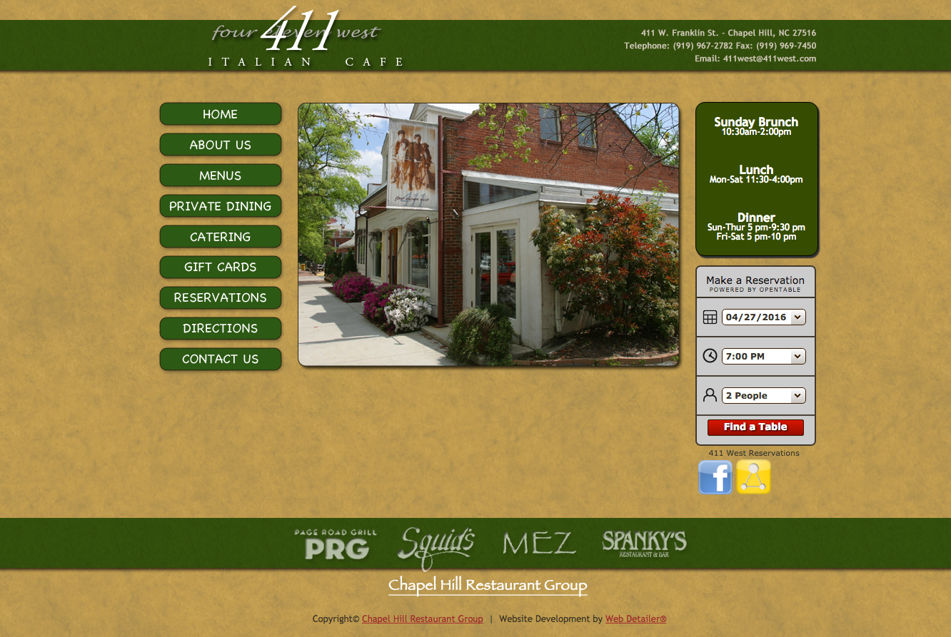
 At first glance, 411 appears to use two of the world’s most hated fonts:
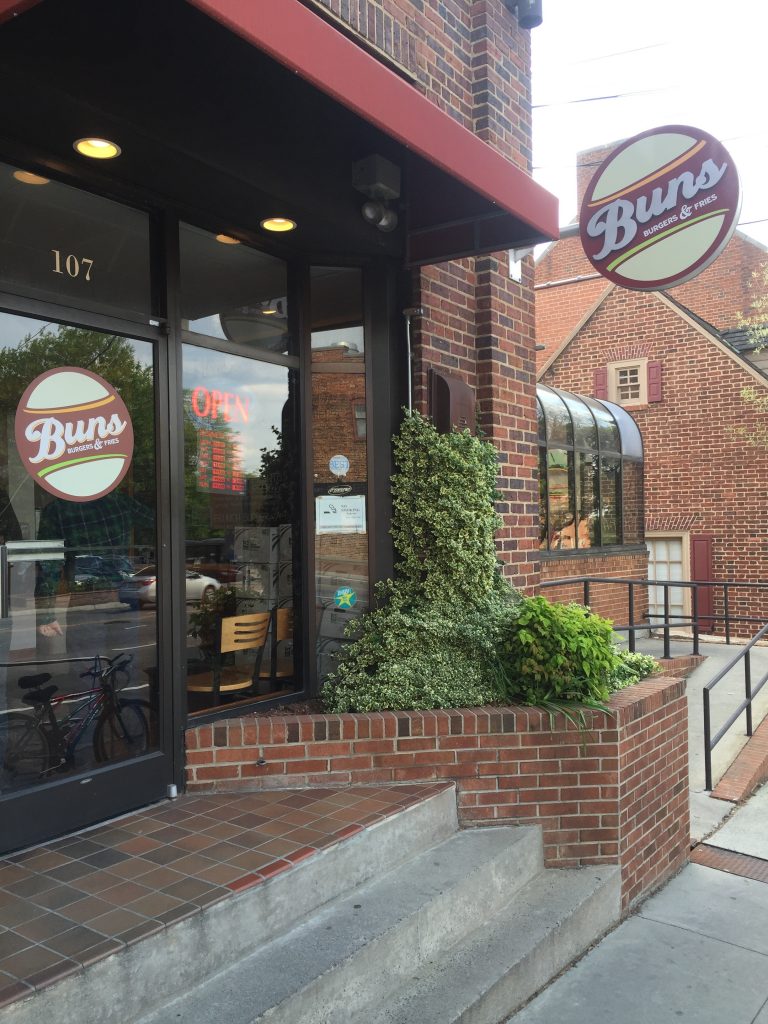
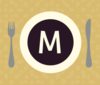 One last note on web design – the design for Midways tab icon (located on the left-hand side of your browser tab) is a bit too complex for maximum legibility. When sized down, the icon is hard to see; details like the utensils and “M” disappear.