Artisan Pizza Kitchen gets new logo, dubs itself “APK”

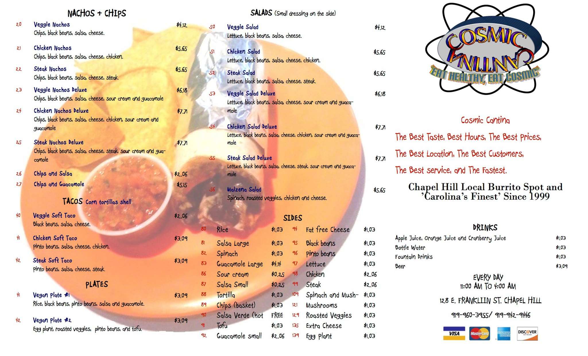
I once heard a rumor that Artisan Pizza Kitchen – previously known as Artichoke Basil – changed its name because it hijacked its brand and menu from a store in New York, and that store threatened to sue. I found some evidence to substantiate this claim here, but Artisan also mentioned on Facebook in 2011 that it rebranded due to a trademark issue with another restaurant.


LOGO 2011 – 2015

Artisan’s logo looked somewhat similar to its old one in the immediate years following the name change. Overlooking the Comic Sans typeface (because we should all already know that’s a no-no), other issues with the old logo present themselves.

The font size of “Artisan” appears to be larger than that of “Pizza” and “Kitchen.” The tight spacing around the curved text clashes with the ample amount of space within the circle. The text “Chapel Hill, NC” is unreadable against the dark red background, and “Since 2008” is much too small to read. The basil plant graphic doesn’t relate to the restaurant’s new name and looks out of place.


logo_604x447_jpg_300x237_crop_upscale_q85
Photo courtesy of Local Research.


Fortunately, the faults of the old logo are now irrelevant, as Artisan has rebranded again. The shop came under new ownership in the summer of 2015, and with new owners came another new logo.


LOGO 2015 –

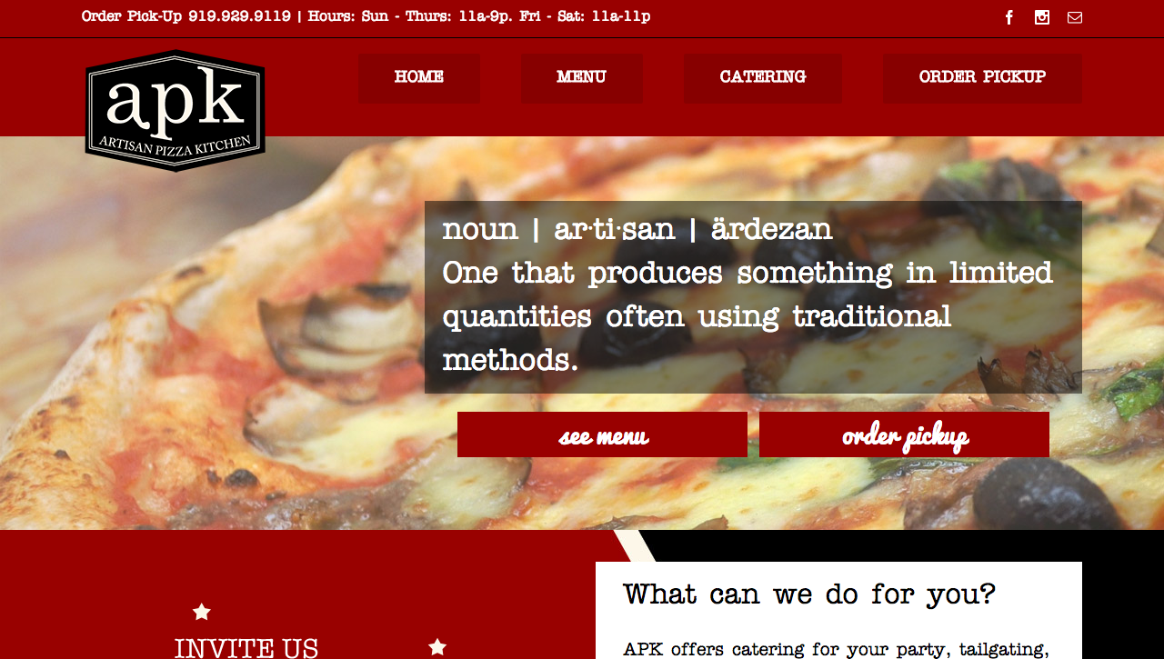
Artisan’s new logo embodies minimalism and sophistication. Its black and light cream color scheme is simple and clean, the serif font choice promotes professionalism, and the thin white double border adds a subtle touch of style.

A few quirks in the design prevent the logo from being too simple. The unique hexagonal shape gives an otherwise simple design more personality. The serifs or feet of the “p” and “k” align with the angles of the the hexagon. The foot of the “a” also appears to extend further than one would expect.


Logo-Black-small


One flaw that caught my eye is the discrepancy in spacing. Between the top of the “k” and the border is very tight, but spacing is roomier between the bottom of the “p” and the smaller lettering that spells out the pizzeria’s full name. This inconsistency is subtle, but the devil is in the details.

Overall, Artisan’s new logo is professional and fresh. I don’t refer to the restaurant as “APK,” but perhaps the acronym will catch on in good time.


BUILDING SIGNAGE

Outside the building, Artisan updated its windows to reflect the logo change. On either side of the entrance appear two white prints of the logo, which promote recognition of the pizzeria’s latest rebranding. The awning remains the same, connecting the past with present.


[facebook_post url=”https://www.facebook.com/artisanpizzakitchen/photos/a.320044378033173.63589.200571419980470/899876170049988/?type=3&theater” width=””]


WEB DESIGN

Artisan’s website showcases the restaurant’s logo upgrade by displaying the graphic prominently in the top left. The logo’s black background contrasts with the red background of the site’s header and footer. The combination of a slab serif (think typewriter) and a brush script follows a basic rule for pairing fonts by creating contrast. However, the slab serif feels a bit oversized in some areas on the site and may clash somewhat with the chic style of the serif used in the logo.


Screen Shot 2016-03-04 at 9.01.28 AM


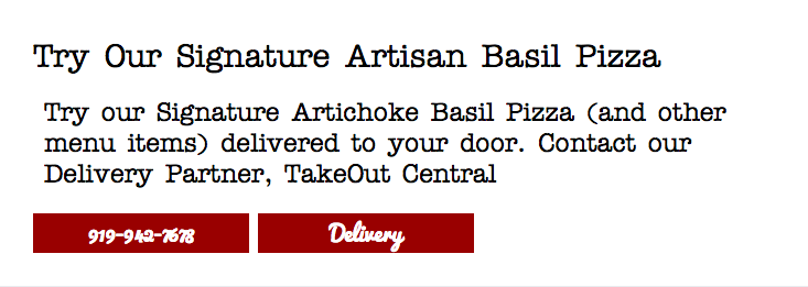
The website is cognizant of varying browser sizes and makes subtle but important changes to increase readability at narrower widths. For example, on wider screens, visitors will see a faded pattern of illustrations of pizza slices, cheese blocks and toppings, as pictured below.


Screen Shot 2016-03-07 at 12.17.45 AM


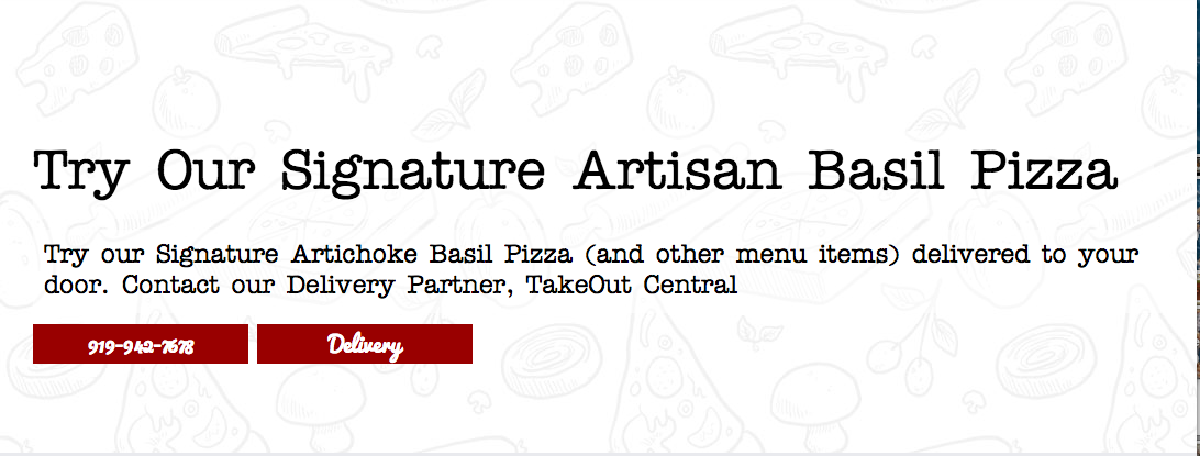
The pattern effectively embellishes an otherwise bland white background. But if a visitor is viewing on a smaller screen, the pattern could become distracting. Thus, the pattern disappears, presumably to increase readability and promote faster load times.


Screen Shot 2016-03-07 at 12.18.52 AM


SOCIAL MEDIA

Facebook – 519 likes
Twitter – 42 followers
Instagram – 57 followers

Since the ownership change, Artisan has upped its activity on Facebook and Instagram, but its Twitter account appears to remain dormant. As I have mentioned in previous blog posts, Facebook and Instagram appear to be most advantageous for reaching students in Chapel Hill, so I’m neither surprised by nor worried about inactivity on Twitter.

Posting consistently to social media is a great start for Artisan. To continue building a following, it should begin engaging its followers more directly, perhaps through a social media contest or other method of stimulating interaction.


THE BOTTOM LINE

Artisan’s latest rebranding efforts have resulted in a modern and professional visual identity that catches the eye of passersby on Franklin Street. Its activity on social media has spiked since new owners took the reigns, but it has not accumulated a large amount of followers. With time and more engagement on social media, I suspect students will take note of Artisan’s new brand and perhaps even begin calling the pizzeria “APK.” Will you?

Explosive success at Rumors, but not from a logo

When I picture my favorite restaurants and shops, I often visualize their logos. But with Rumors, I don’t picture a concrete graphic. Instead, a muddle of Instagram photos take over my mind. I picture Rumors’ outside patio area, which sits nicely between the Baxter Arcade and Beer Study.

Although Rumors has only been open in Chapel Hill since the fall of 2013 (there are two other Rumors shops – one in Florida and one in Virginia), it has seen explosive success on social media, both in followers and engagement. Rumors doesn’t rely on a memorable logo to drive its branding, but that doesn’t mean it isn’t using visuals. Consistent photos of outfit pairings and just-in merchandise flood Rumors’ social media accounts and continue attracting new customers.


LOGO

The closest Rumors gets to a logo is perhaps the lettering featured in its Facebook profile picture. This logo isn’t featured anywhere else – not on its other social media accounts nor its website. Considering Rumors’ wild success on social media, perhaps no logo is necessary. But to promote recognition and consistency, Rumors should at the very least consider matching its profile pictures across social media accounts.


Screen Shot 2016-03-01 at 12.22.38 AM


BUILDING SIGNAGE

Through its building signage, Rumors promotes itself as stylish and trendy yet vintage and classic. It combines thin and clean lettering on its window with an old-school sign bordered by light bulbs. This juxtaposition of new and old caters to Rumors’ youthful market of hipsters.


💜 It’s true 💜 Open 11-7 for ya come thru 😘 #rumors #shoplocal #thrift #chapelhill

A photo posted by Rumors Boutique Chapel Hill (@rumorsnc) on


WEB DESIGN

Rumors Chapel Hill shares its website with the two other Rumors boutiques, located in Miami and Richmond. This makes it difficult to establish itself as an independent shop and refer consumers to its social media accounts, but the web design is still consistent in some ways. It’s also easy to navigate and free of slow-to-load animations.


Screen Shot 2016-02-25 at 9.17.02 PM
The background of the homepage matches that of Rumors’ Facebook cover photo.


The website contains a few holes, however. With as much personality as Rumors shows in store and on social media, I would have expected it to keep up with a blog — content could range from posting merchandise to suggesting outfit pairings to offering money-saving tips to providing DIY tutorials. Alas, the Rumors blog is nonexistent.


Screen Shot 2016-02-25 at 9.18.46 PM


SOCIAL MEDIA

Facebook – 6,119 likes
Twitter – 112 followers
Instagram – 5,529 followers (and 12,476 posts !!)

I can’t think of any local business that has made a bigger impression on social media than Rumors. It posts photos of its latest merchandise on Instagram several times a day, which aligns with the fast-paced social media culture of its younger target audience.

A lot of the success can be chalked up to Rumors’ consignment shop business model. When it’s selling authentic brands like Doc Martens at low prices, consumers are given a high incentive keep up with Rumors’ social media. But isn’t that what social media is all about — understanding your audience and providing a resource based on their interests? Rumors also engages with its audience and promotes authenticity by using locals for its models.

Another interesting aspect of Rumors’ social media strategy is its preference of Facebook and Instagram over Twitter. Rumors hasn’t posted original content to Twitter since October 2013, about a month after it opened. I suspect the shop owners realized quickly that Instagram and Facebook were more lucrative considering their younger consumer base and high volume of photos.


THE BOTTOM LINE

Since smaller businesses are often more limited by money and time, it’s important to prioritize certain branding efforts over others. Rumors has prioritized its Facebook and Instagram accounts over other aspects like logo development and blog writing. As it continues to grow and gain more resources, Rumors should consider expanding its branding efforts beyond Facebook and Instagram. But for now, its social media presence is impressive on its own.

Sutton’s Drug Store now a misnomer

If you’ve never been to Sutton’s Drug Store, you’re missing out on one of the greatest traditions in Chapel Hill. Photos of customers cover the walls, and Carolina basketball jerseys hang from above – you become immersed in a sea of Carolina blue the moment you walk in.


I formed my first impression of Sutton’s on its 90th anniversary, a fateful day in 2013 when Sutton’s offered hot dogs at its original 1923 price. Sutton’s closed its drug store a year and a half ago due to corporate competition, but its restaurant is the more widely known facet of the business and continues to thrive.

Although the drug store is gone, the restaurant’s official name remains Sutton’s Drug Store. For an incoming student or visitor, the name might appear misleading or ill-fitting, but Sutton’s is grounded in history. Changing the name might erase some of its historical prominence, and I tend to refer to the restaurant simply as “Sutton’s” anyway.


LOGO

0354-logo


An oval filled with an orange gradient sits in the back of the Sutton’s logo, creating a vintage diner feel. A similar characteristic is found in the Al’s logo, which possesses a somewhat similar restaurant style. The next layer of the logo is what appears to be a milkshake, a favorite item sold at Sutton’s that has earned top ratings. If a milkshake is what the graphic is portraying (if you can confirm that, comment below!), I would say it is stretched too horizontally. Moreover, the utensil sticking out isn’t clearly distinguishable – is it a spoon or a straw?

The typography is what shines in this logo – horizontal lines fill the letters, which certainly fits with an older style and dovetails with the stroked lines that border the oval and the milkshake graphic.


BUILDING SIGNAGE

Outside the store hangs a building sign that faces pedestrians directly as they walk by. The shape of the sign and its black border further emphasize the classic style. Sutton’s also features all-caps classic serif letters, though their beige color sometimes becomes hard to read against the white background, especially in this subpar photo that I snapped.


buildingsignage


Sutton’s used to feature a striped white and red awning that stood out, and without it, the roofing feels a little empty. I’m unsure of when or why the awning was removed, so leave a comment if you have an explanation.


WEB DESIGN

The history of Sutton’s is what sets it apart from competitors, so I was disappointed to see that Sutton’s didn’t include it on its website, even though it leads website visitors into thinking there’s a story waiting for them. The following is listed on the homepage of Sutton’s.


Screen Shot 2016-02-23 at 4.23.44 PM


But clicking the link leads to a sad, blank page.


Screen Shot 2016-02-23 at 4.22.25 PM


Skeleton pages appear to be rampant on the Sutton’s site. Since Sutton’s is filled with photos in store, I expected a vast gallery on its site. The gallery page leads to its Facebook gallery, which felt like a cop-out to me. Granted, its Facebook gallery does house an abundance of group photos, but Sutton’s should consider featuring at least a few on its website.


Screen Shot 2016-02-23 at 4.22.07 PM


Aside from the blank pages, the design of the website is organized and readable, though a little outdated and generic. I’m not sure I like the background of wood planks. Unless you’re Sup Dogs and have a wooden outside patio, wooden planks don’t quite relate, but that’s just my opinion. The main font being used appears to be Lobster, which contributes to the retro style.


Screen Shot 2016-02-23 at 4.19.40 PM


SOCIAL MEDIA

Facebook – 5,146 likes
Twitter – 568 followers
Google+ – 3 followers

By far the most popular social media account for Sutton’s is Facebook, but that doesn’t mean the account is active. Sutton’s hasn’t posted to its Facebook account since August 2015, and it’s been offline Twitter since January 2015.

For smaller and more traditional restaurants, social media can be too big of a time investment for its worth, especially if the restaurant caters to an older demographic. But Sutton’s along with every shop on Franklin Street can leverage the hunger pangs of thousands of UNC students, a population that isn’t going anywhere and will never age. If Sutton’s can find the time to create a social media strategy and schedule social media posts, it could resonate with younger college students and pay off.


THE BOTTOM LINE

Sutton’s is an old-time favorite on Franklin, and though the drug store closed down, the restaurant won’t be going anywhere any time soon. To boost awareness and popularity, Sutton’s should update its website to include its famous history and photos, and it should consider becoming more active on social media. After all, don’t we all want to be reminded of hot dogs every once in a while?

Crepe Traditions: On the path to non-traditional branding

Crêpe Traditions replaced Gigi’s Cupcakes in a prime location on Franklin Street last October, but it should have opened up in July under the name Crêpe Culture. The Daily Tar Heel reported that a negative social media reaction prompted the restaurant to rebrand and therefore delayed its grand opening. Many Twitter users pointed out that “Crêpe Culture” regrettably rhymes with “rape culture,” though the French pronunciation of crêpe actually rhymes with step.

While “Crêpe Culture” was alliterative and perhaps better expressed the owners’ vision of infusing crêpes into Chapel Hill’s culture, the pressure to rebrand prevented the restaurant from having to differentiate itself from a pre-existing crêperie in Singapore that yields top search results on Google. Not to mention, the handles @Crepe_Culture, @CrepeCulture and @TheCrepeCulture are all occupied on Twitter.

With its local ownership and friendly service, Crêpe Traditions evokes the sentiment of a quaint community-oriented shop. Its branding efforts are a step ahead of traditional, though. Unlike many local restaurants, Crêpe Traditions boasts a solid logo and clean web design, and it’s off to a good start with social media.


LOGO

Crêpe Traditions’ logo is characterized by an energizing orange, lime green and brown color palette. A triangular shape symbolizes the restaurant’s main feature (crêpes, of course), though it’s also reminiscent of a slice of pizza (maybe Crêpe Traditions should double as a pizza joint?). Swirls of steam rise up from the logo’s lettering, indicating that the restaurant also serves coffee.


Logo-Circle


The script font that “Crêpe” is written in evokes Parisian elegance, and the all-caps serif font of “Traditions” is, well, traditional. The two contrasting fonts complement each other well. Overall, the color scheme, graphics and typography do exactly what a logo should do – boil down the mission of the business into a simple and recognizable symbol.


BUILDING SIGNAGE

Crêpe Traditions covers all the bases on exterior signage. Letters unique to its logo sit above the entrance. A sign hangs perpendicular to the shop and conforms to the shape of others on the 140 West strip. A transparent version of the logo adheres to the front door. Finally, a chalkboard sandwich board promotes specials.


IMG_9792.JPG


WEB DESIGN

Crêpe Traditions’ website embraces a simplistic design that showcases bright photos of its tasty food. It is easy to navigate, and the body font is large and readable.


Screen Shot 2016-02-16 at 8.13.55 PM


However, a few flawed details stuck out to me that could use polishing.

  1. Too much blank space in the header. The logo’s size and circular shape create a large amount of space at the top of the page when viewing on a computer. That blank space combined with space taken up by the image slider prevents important content from appearing above the fold (which refers to the portion of the website visible prior to scrolling down). To remedy this, Crêpe Traditions should replace its header logo with a horizontally arranged version such as the one hanging above its front door.
  2. Too many frames in the image slider. The slider or carousel, which automatically flips through several photos, is packed with a whopping 18 frames. I couldn’t even sit through one third the slides without getting bored and moving on, rendering most of those frames useless. One consulting firm recommended never inserting more than five frames into an image slider. Crêpe Traditions should reduce the amount of images it features on its home page and instead provide a simpler gallery elsewhere on the site. Doing so might also speed up the load time of the homepage.
  3. Poor formatting of image slider. Some web designers advise beginners to ditch sliders altogether in favor of simpler and faster loading alternatives. At the very least, Crêpe Traditions should alter its formatting to prevent chunky black borders from appearing when images don’t fit the slider dimension.


SOCIAL MEDIA

Facebook – 252 likes
Twitter – 624 followers
Instagram – 52 followers

Crêpe Traditions has established its largest social media following on Twitter, where it is also the most active. The crêperie tweets about once a day and often attaches stunning photos of its cuisine, such as this Valentine’s Day crêpe.


The restaurant’s proximity to UNC-Chapel Hill’s campus supplies it with a young customer base, and since younger social media users tend to consider Instagram the most important network, Crêpe Traditions should reap the benefits by becoming more active on Instagram. The owners should consider engaging students through an Instagram contest, for which it could publicize on Twitter. Perhaps consumers could Insta photos of their crêpes or invent a new crêpe combination and Insta the recipe.


THE BOTTOM LINE

I was impressed to see the progress Crêpe Traditions has made in creating a name for itself in Chapel Hill, especially considering that its original name sparked a social media backlash. The crêperie’s dedication to friendly service and quality food, its professional logo and its high activity on Twitter have all set Crêpe Traditions up for potentially explosive growth. It should consider tweaking its website and interacting with students on Instagram to continue down the path to success.

What do you think of Crêpe Traditions’ logo and web design? What type of Instagram contest/prize would lure you in?

Mixed emotions about the Carolina Inn

I was walking by the Carolina Inn a few months ago and noticed its sign looked slightly off. Was there always a pop of Carolina blue in that logo? I thought I might have been going crazy until I recently looked through its Facebook page and found my suspicions to be confirmed. The new logo chopped off all but the bow of the previous key-shaped graphic. The alteration piqued my interest and prompted me to research other components of the Carolina Inn’s branding strategy.


LOGO

The Carolina Inn’s logo used to form the shape of a key, which I liked because of its emphasis on a personalized experience. It connected today’s world back to a time when inns welcomed guests with tangible keys rather than cold and removed key cards. You can still find the key graphic on merchandise like pillows, but online and on building signage, the simplified graphic prevails.


carolinainnkey


The stub of the key is all that’s left now. It still shows personality through its quatrefoil shape, which is in tune with the preppy style that engulfs UNC-Chapel Hill. Who else but Carolina would put argyle on sports uniforms? Incidentally, Alexander Julian, the designer of Carolina’s argyle, also custom made a Carolina Inn key necklace. In the logo’s center sits the letter C, a subtle but effective addition. I imagine its newly established symmetry and square shape likely make it easier to use in a variety of situations. Though the new logo still creates a strong image for the Carolina Inn, I can’t help but long for the old key-shaped graphic that held more meaning for me.


BUILDING SIGNAGE

Signs outside used to feature a black version of the Carolina Inn key.


It persisted even after the logo changed online, but now the signs have been updated to portray the Carolina blue quatrefoil. Perhaps its just reluctance to change, but I find the Carolina blue color of the logo to clash with the yellow/beige color of the sign.


IMG_9785


Aside from the out-of-place blue color, the remainder of the sign fits the inn’s ornate style. Its curvy shape and sophisticated all-caps serif font contribute to the inn’s elegance.


WEB DESIGN

The Carolina Inn’s website is packed with beautiful photography and useful content, its design is clean and professional, and it responds well to different browser widths. My favorite little detail is the glow that radiates from the inn’s logo.


Screen Shot 2016-02-12 at 2.54.44 AM


I thought it could be flawless until I continued scrolling down the homepage. Three multi-photo carousels (the animated sliders that flip through several photos or pages of information automatically) appear consecutively.


Each area highlighted in green is a carousel. Too much animation!


Animation after animation overwhelmed me and has potential to slow down the webpage’s loading time. Otherwise, though, the inn’s website looks great.


SOCIAL MEDIA

Facebook – 12,662 likes
Twitter – 3,431 followers
Instagram – 1,794 followers
Pinterest – 1,010 followers
YouTube – 45 subscribers
Google+ – 141 followers

When it comes to social media, the Carolina Inn really knows what it’s doing. Linked to its website include Facebook, Twitter, Instagram, Pinterest, YouTube and Google+. While the inn hasn’t uploaded a video to YouTube in over a year, and its Google+ mainly repurposes its Facebook posts, its other four networks are quite active. The Carolina Inn does an excellent job of posting frequently and with varying content, all of which is useful to its audience. Whether it be a photo of a wedding setup, food from its restaurant Crossroads, or a video featuring a bee farmer who helps the inn produce and sell fresh honey, the Carolina Inn has tapped into the needs of its audience on social media.


EVENTS

The Carolina Inn doesn’t just appeal to wealthy visitors coming into town. In the warmer months it hosts weekly Fridays on the Front Porch, offering live music, a picnic menu and drink specials. The best part? No cover charge. The Carolina Inn proves that a hotel can engage not just out-of-towners but also the local community.


Mick Mixon and The Franklin St Band playing now at #FOFP. #unc #outaboutnc #chapelhill #summerfun #durhamfoodie #eatwritego

A video posted by The Carolina Inn (@thecarolinainn) on


THE BOTTOM LINE

The new blue logo pasted onto the Carolina Inn’s signs outside turn me off and stand out in a bad way. But noticing this change prompted me to do more research on the hotel and discover the positive sides of its branding strategy. Its active social media, wealth of beautiful photos and events planning efforts stand out in a good way. What’s your take on the Carolina Inn’s branding?

How does a hole in the wall like Cosmic Cantina thrive?

In high school I obsessed over finding hole-in-the-wall restaurants in Chapel Hill – Joe’s Joint, Caffe Driade, this one cupcake shop that used to sit behind the building Kipos now occupies. Thinking back on it, though, I never magically stumbled upon these places (as much as I’d like to say I did). Someone always referred me to them.

Fast forward to college, and my favorite hidden gem (if you can even call it that) is by far Cosmic Cantina. Whether it’s 2 p.m. or 2 a.m., I’ll be chomping down on a mini veggie deluxe. Considering I usually notice several other patrons when I’m there, I imagine Cosmic, which opened in 1999, does pretty well for itself. Yet it has no clear logo. Its website primarily serves the Durham store. It’s absent from social media. How does Cosmic survive without any obvious branding strategy?


LOGO

It wasn’t easy to find a logo for Chapel Hill’s Cosmic. Logos shouldn’t be hard to find. But behold Cosmic’s logo!


Cosmic's logo is located in the top right corner of this menu, which was posted to its Facebook page.
Cosmic’s logo is located in the top right corner of this menu, which was posted to its Facebook page.


I almost wonder if the logo was designed ironically. It evokes a style comparable to Space Jam. I could pick apart this logo and explain in technical detail where it went wrong (e.g. the text’s antiquated drop shadow/stroke/rainbow fill reminiscent of WordArt). But all that truly needs to be said is this logo is stuck in 1999 and should probably catch up, though I do appreciate the thought behind mimicking an atom structure.

What is most troubling to me is the only place I found this logo is within the menu posted to Cosmic’s Facebook page, which hasn’t been updated since mid-2014. Instead of picturing a logo when I think about Cosmic (and I think about it often), the only image I can conjure up is the neon sign hung above its door.


BUILDING SIGNAGE

Cosmic’s neon sign is quite appealing to me. It’s simple and well-placed, and it isn’t overwhelmed by a sea of other neon signs (though I wouldn’t mind a burrito-shaped one).


IMG_9776
My happy place.


Perhaps Cosmic was just lucky to settle into this location, but I’ve also always loved the wood paneling and windows. Turning the corner into what might otherwise be a poorly lit alley, I find relief in Cosmic’s neon sign.


WEB DESIGN / SOCIAL MEDIA

Cosmic Cantina in Chapel Hill seems to have struggled developing its own identity outside of the Durham store, which opened four years earlier. The Durham store dominates the current website, though it’s fairly outdated regardless.

The website links to the Durham Facebook and Twitter pages, stifling potential consumers who might click from the website through to social media in hopes of finding the social presence of Chapel Hill’s Cosmic. But there isn’t much of an online presence for it – just one lonely Facebook page with three total posts.

Facebook
• 256 likes
• 404 check-ins
• 30 reviews
• 4.8 of 5 stars

Despite the inactivity on Cosmic’s behalf, a surprising amount of people have liked, checked in with or reviewed the restaurant. Likewise, Instagram users regularly post photos and tag their location at Cosmic even though it doesn’t have an account.


WORD OF MOUTH

Lucky for Cosmic, the most credible form of advertising is a friend’s recommendation. According to a 2015 Nielsen study, 83 percent of people said they trust the recommendations of friends and family. I discovered some of my favorite places in Chapel Hill through friends and family, and I imagine Cosmic benefits from recommendations as well.


THE BOTTOM LINE

One might argue that Cosmic should continue its indifference to branding. After all, it’s rated the Best Burrito in Chapel Hill by Yelp, and Google searching for “best burrito in Chapel Hill” also brings up Cosmic as a first choice.


Screen Shot 2016-02-11 at 1.30.44 AM


Consumers seem to flock to the restaurant and even engage on social media to mention Cosmic. Clearly something is going right, and I don’t doubt that good prices, quality food and word-of-mouth spreading contribute to Cosmic’s success. But with such a strong base already active on social media, why not maximize potential reach and promote recognition through visual and online branding?

Comment below with your thoughts! Do you think it would be worth it for Cosmic to engage in a more active branding strategy?

Mediterranean Deli: A missed social media opportunity

Mediterranean Deli, Bakery and Catering has served Chapel Hill residents fresh and authentic food from the Mediterranean and Middle East since Jamil Kadoura opened up the restaurant in 1992. Hailed for its wide array of healthy, vegan, gluten-free and organic options, Med Deli has certainly made a name for itself in Chapel Hill. It even opened up a second website to sell its gluten-free pita bread, which Kadoura said took one and a half years to perfect. My friends and I have a healthy obsession with Med Deli (yasmeen chicken salad anyone?), and I’ve often wondered to what extent the deli’s visual and online branding contributes to its success.


LOGO

Med Deli’s logo is a combination mark, meaning it spells out the name of the restaurant while also associating it with a symbol or illustration. But the logo’s illustration is clipped within an oval, which somewhat resembles a badge or emblem-style logo such as Starbucks. The illustration takes on a classic style and uses saturated yellow, teal and blue colors.


330852_10151312677674375_278515941_o


Generally, I’m not a big fan of unconnected casual script fonts such as the one being used here (hint: it’s Forte). This typeface reminds me of one you’d find on a list of standard Microsoft Word fonts. I’m not convinced it’s the best choice for the logo, but the heavier typography and bold color scheme translate very well onto Med Deli’s packaging, such as its pita bread.

Shop-for-Gluten-Free-Mediterranean-Deli-Pita-576x576
Photo courtesy of Mediterranean Deli, Bakery and Catering


What provokes me about the logo’s lettering, though, is the text’s lack of alignment to the oval (something I noted about Al’s as well). While “Mediterranean Deli” follows the oval’s curve perfectly, the same cannot be said about “Bakery and Catering.” Though the misalignment is subtle, once I noticed that “Catering” frays out, I couldn’t unsee it. Overall, though, Med Deli’s logo is versatile and accentuates its commitment to authentic Mediterranean cuisine.


BUILDING SIGNAGE

Like many restaurants on Franklin Street, Med Deli’s building signage relies on an awning. White letters contrast against black fabric, producing a minimalist style.


Courtesy of Mediterranean Deli, Bakery and Catering
Photo courtesy of Mediterranean Deli, Bakery and Catering


What’s missing from exterior signage is Med Deli’s logo. Producing a black or white transparent version of the logo (i.e. removing all color fills) might bridge the gap between Med Deli’s building signage and logo without becoming overwhelming.


WEB DESIGN

From 2001 to about 2009, Med Deli’s web design looked like this:


Screen Shot 2016-02-08 at 9.18.38 PM


Now it looks like this:


Screen Shot 2016-02-09 at 1.08.53 AM


Needless to say, the restaurant’s website has come a long way. Still though, something about the current web design is reminiscent of an older and outdated style (likely because hasn’t been revamped since 2009). It doesn’t adjust to varying browser widths nor does it offer a mobile-friendly version. On phones, smaller text becomes unreadable.


On my phone, I can't read smaller text unless I zoom in.
On my phone, I can’t read smaller text unless I zoom in.


The logo displayed on the website differs from that displayed on social media. On the website, Med Deli’s logo appears in all green. It isn’t clear which logo is preferred by Med Deli or what the reason behind using two versions might be. Neither the green version nor the tri-color version blend well with the website’s beige/red color scheme. Perhaps a subdued yellow-green treatment of the logo (instead of the current Irish green) would better match the web design.

Another issue that appears on several pages is the overuse of signals to make text stand out. Most body text on the web is much larger than printed text (a font size of about 16 pixels is recommended), but Med Deli’s website packs on too many treatments in attempt to catch the reader’s eye. When everything on the homepage is bolded, underlined, in bright colors and centered, viewers will become overwhelmed and not know where to look.


What am I supposed to focus on?!?!?


Despite being guilty of a few design faux pas, Med Deli’s website does provide bright, high-resolution photos of its delicious cuisine.


SOCIAL MEDIA

Facebook – 3,253 likes
Twitter – 357 followers
Flickr– 0 followers
Instagram – 118 followers

Of its social media platforms, Med Deli has by far garnered its largest following on Facebook. The deli posts infrequently and inconsistently, but when it does post, it links to merchandise, reposts news coverage, uploads photos or offers support for a cause. Because of its sizeable audience already established on Facebook, Med Deli has the means to continue growing on social media if it posted more frequently and engaged with its customers.

I was surprised to find that Med Deli doesn’t keep up with its Instagram account (its last post was two years ago!). With such vibrant food options ranging from yellow rice to roasted red pepper hummus to tabouli, it has a great opportunity to leverage the platform’s photo-sharing abilities. Instagram is considered to be the most important social network by teenagers, so Med Deli should consider becoming active on Instagram to connect with its younger consumers.

A visual issue I took with Med Deli’s social media accounts is that the square dimensions of profile pictures on Facebook and Twitter crop the edges of its logo.


Screen Shot 2016-02-05 at 8.25.04 PM
A cropped logo on Twitter looks messy and unprofessional.


To fix the cropping, Med Deli should add whitespace to the top and bottom of the logo image so that the entire logo is visible.


THE BOTTOM LINE

Med Deli serves exquisite authentic cuisine and deserves recognition for it. It can continue promoting brand recognition and growing its customer base by updating its website to become responsive to any browser width or viewing platform. Med Deli should also post to social media more frequently and take advantage of Instagram’s visual platform and young audience. Next time you go to Med Deli, share a photo on Twitter or Instagram, mention Med Deli’s account and urge the restaurant to become more active on social media!

Twinkling letters of Light Years

Light Years began as a small shop in 1985 and is still locally owned and operated today. Its specialization has always been and is still jewelry, but the shop also offers gifts, crafts and home accessories. On its website, Light Years promises to provide a unique selection, friendly service and great prices.


LOGO

Roman capital letters that are horizontally stretched form the Light Years logo. The unique arrangement and variation in size of the letters add a quirky touch to what otherwise might be a very simple word mark. The serifs (feet at the ends of each letter) almost twinkle like stars, contributing to the shop’s celestial name. Overall, Light Years’ logo is recognizable and fits with the shop’s unique personality.


logo


BUILDING SIGNAGE

Outside the Light Years on Franklin Street hangs a black awning. Its triangular shape protrudes onto the sidewalk and puts the logo at an advantageous angle to attract pedestrians passing by.


photo_1
Photo courtesy of Light Years.


But the logo’s distinct arrangement also makes for a striking sign outside its shop in Southpoint, shown below.


Photo courtesy of Light Years.


WEB DESIGN

Light Years’ web design has come a long way, especially considering this is what it looked like in 2008.


Screen Shot 2016-02-03 at 12.02.29 AM


The current design primarily highlights Light Years’ latest jewelry collection through a wealth of professional photos.


Screen Shot 2016-02-02 at 7.32.59 PM


Another feature of Light Years’ website is its blog, which has publicized new collections, sales and special events. Posting more frequently and about a greater variety of topics related to jewelry and local artisans might boost engagement. Francesca’s, a national boutique that sells similar merchandise, keeps up with a Tumblr. The blog extends beyond promotional material and often posts educational articles. While Light Years may not have the same resources, it could feature local jewelry artists, discuss trends, offer gift advice, etc.


SOCIAL MEDIA

Facebook – 1,207 likes
Twitter – 184 followers
Instagram– 401 followers
Pinterest – 30 followers

Light Years has set up a good foundation on social media through strong visuals, but a few tweaks to its strategy could promote growth and more engagement. First, Light Years should alter the names of its accounts so that its handles are consistent across all platforms. Right now, Light Years’ Facebook and Instagram accounts have the highest following, and both are under the name of “lightyearsjewelry,” which is also the domain name for the shop’s website. By switching its Twitter and Pinterest names to conform, it will be easier for potential consumers to search and find any account owned by Light Years, and the consistency will avoid confusion and improve brand recognition.

Light Years posts sharp photos to its social media accounts that frame jewelry and other accessories in a warm and well-lit environment. But analysts have shown that top brands post more often than what Light Years averages, which is not quite once a day. Posting up to twice a day on Facebook, three times a day on Twitter and Instagram and five times a day on Pinterest is generally recommended, though it ultimately depends on the quality of the content.

Currently, Light Years posts the same content across platforms with the same descriptions, which can come across as lazy. While posting similar content can work if followers on every outlet will take interest, Light Years should consider providing a lengthier description of the same photo on Facebook while keeping things short and sweet on Twitter and Instagram.


THE BOTTOM LINE

Light Years has developed brand recognition with its simple but quirky word mark that can be adapted for the shop’s building signage and website. Its blogging and social media efforts have established a good foundation for building an online presence. Light Years has an opportunity to boost its following by posting more frequently and with a variety of educational and interactive materials that pertain to its audience. What would you like to see on Light Years’ blog?