The Root Cellar: A new brand rooted in an old mission

For whatever reason, one of my strongest memories as a child is the interior of what used to be Foster’s Market. Its tall yellow walls are forever ingrained into my mind and along with them, the name Foster’s Market. Although the cafe rebranded in 2014 under the name The Root Cellar Cafe & Catering, I can’t seem to break the habit of calling it Foster’s.

Sara Foster originally opened the Chapel Hill store in 1998 as an expansion of the Foster’s Market of Durham, which is alive and well today. But Sera Cuni, who became a kitchen manager in 2006, purchased the market in January 2013 along with her partner, Susan White. With the help of local brand development firm The Splinter Group, the pair pulled off a brand overhaul. Have a look at the results below.


LOGO

Cuni and White explain that one of their goals in rebranding is to place greater emphasis on the cafe’s commitment to serving local and freshly made food. The new logo directly conceptualizes the trendy slogan “farm to fork” with an illustration of a fork stabbing into a fresh root (presumably a carrot). If that’s not an effective visual that captures the essence of Cuni and White’s mission, I don’t know what is.


fosters2rootcellar


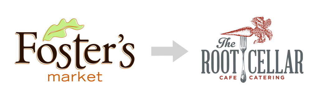
Aside from the illustration itself, The Root Cellar’s logo conveys a commitment to scratch-made food through its vintage style and color scheme. The fine line sketch is reminiscent of an engraving or woodcut printing technique, which leaves an organic or natural impression. The main typeface, which appears to be a condensed version of Abraham Lincoln, also contributes to the vintage style. As for coloring, reddish brown colors are often associated with autumn, when farmers harvest their fresh produce.

The concept and execution of this logo fulfill how Cuni and White sought to portray their new brand – a cafe rooted in its commitment to serving local and organic food.


BUILDING SIGNAGE

The building signage bridges the gap between the old and the new. All exterior signs of course say “The Root Cellar,” but those familiar white letters are here to stay. Below is a photo of the old signage just before being taken down.


Changing the final sign! #rootcellarchapelhill #changeisgood

A photo posted by @rootcellarchapelhill on


While this lettering is inconsistent with typefaces used in the logo, online and on menus, I appreciate its nod to the former brand. I can also imagine that the choice was made to maintain consistency with the signs of other stores in the mini plaza. The old “Foster’s” letters are now displayed inside the cafe. Below is the new setup.


To new beginnings! #rootcellarchapelhill #chapelhill #newbeginings

A photo posted by @rootcellarchapelhill on


The new logo is printed in white on the entrance, a treatment that really lets the fine lines of the illustration shine.


A photo posted by @rootcellarchapelhill on


WEB DESIGN

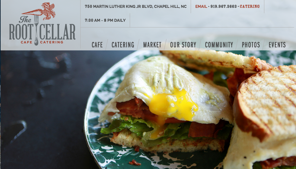
The Root Cellar’s website is modern and easy to read, highlighting the logo and red-grey color scheme. Photos are of high quality and are well-framed.


websiteroot


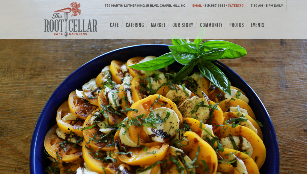
The website is responsive to different browser widths and therefore looks great on a computer or a phone, though at certain browser sizes, the menu becomes awkward. Overall though, the website contributes to a uniform image.


If your browser width is smaller but not small enough to trigger a tablet or mobile layout, the organization of information at the top creates an awkward space between it and the navigation links.
If your browser width is smaller but not small enough to trigger a tablet or mobile layout, the information at the top creates an awkward space between it and the navigation links.


Aside from the clean and professional style, the site also makes clear the history of The Root Cellar. It includes “Formerly Foster’s Market” in its web title, which is useful for when someone searches for Foster’s Market on Google. At the bottom of every page, the website links to an explanation of the rebranding with the following verbiage: “The Root Cellar was formerly Foster’s Market Chapel Hill. Read more about our name change →.”


SOCIAL MEDIA

Facebook – 1,856 likes
Twitter – 207 followers
Instagram – 409 followers

The Root Cellar has significantly more likes on Facebook than it does followers on Twitter and Instagram because the Twitter and Instagram accounts needed to be created from scratch. The Root Cellar’s social media efforts consist largely of publicizing food specials and farm events, a monthly occasion in which the cafe partners with a farm to put on a meal made with tasty local ingredients. In other posts, The Root Cellar will highlight a specific fresh or local ingredient it uses or sells. Although the cafe is still working on gaining followers on Twitter and Instagram, its frequent and consistent messaging aligns with its mission of providing fresh and organic food.


COMMUNITY RELATIONS

Cuni and White aren’t just interested in selling fresh and local food. They also believe it’s important to give back to the community, and their interests lie specifically in ending child hunger and supporting LGBT rights. Some of the organizations The Root Cellar partners with include TABLE, the Arc of Orange County, Extraordinary Ventures and the LGBT Senior Group of Chapel Hill.

While Cuni and White’s involvement in nonprofits is true and relevant to their trade, there is little news coverage regarding The Root Cellar’s investment in the community. Publicity may not be the main priority or reason for giving back, but perhaps The Root Cellar would benefit from reaching out to its nonprofit partners and asking them to issue news releases on their behalf. For example, The Root Cellar hosted a dinner and silent auction to benefit TABLE, but TABLE did not issue a news release to publicize the event (though the nonprofit did mention it on social media).


THE BOTTOM LINE

The Root Cellar’s rebranding efforts refocused and emphasized its farm-to-fork mission through strong visual branding, social media and community relations. Yet I still refer to the cafe as “Foster’s.” Do you call this restaurant by its former name? Or has the rebranding imprinted “The Root Cellar” into your brain? Comment below with your thoughts!

A taste of Al’s Burger Shack’s branding

Its burgers are so tasty they earned Yelp’s No. 1 rating in Chapel Hill. It’s committed to providing local and organic food. Its employees are charming and hospitable. It’s conveniently located at the crossroads of Chapel Hill and Carrboro. Al’s Burger Shack might claim any and all of these reasons to explain its wild success since opening in 2013. Does its branding contribute?

Al’s is my go-to restaurant when I’m craving a burger, and I’ll admit it has nothing to do with advertising. For me, the juicy burgers and unique flavors are what keeps me coming back. But I suspect that branding plays a part in getting people into the doors for the first time.


LOGO

A winged oval colored black with Carolina blue lettering comprises the logo for Al’s. It’s simple and easy to read, and its style seems to feel of a local burger joint. But there are a few minor details that irk me, like the logo’s use of what appears to be Myriad Pro (Adobe’s default typeface) and the overall treatment of the lettering. The curve of “Burger Shack” doesn’t seem to perfectly follow the curve of the oval. The upper wings aren’t vertically aligned, creating uneven spacing between the wings on either side.


alslogo


I’m unsure of the reasoning for the winged shape (and if you know, leave a comment with the explanation). Many carmakers use wings in their logos to express speed, so perhaps this logo alludes to Al’s quick-service restaurant model. Overall, the logo for Al’s is minimalist but a little rough around the edges. It isn’t particularly memorable for me, but it also doesn’t detract from the overall brand.


BUILDING SIGNAGE

Outside the shack hangs a sign that matches the logo but drops its wings and is squished vertically. The sign’s use of part of the logo ingrains that graphic into people’s minds as they walk by, though the different height-to-width ratio diminishes that consistent branding.


Photo courtesy of Al's Burger Shack
Photo courtesy of Al’s Burger Shack


Placing the sign perpendicular to the street puts it in plain sight, forcing passersby to sneak a peek. The sign’s Carolina blue lettering fits well into the sea of blue you’ll see walking down Franklin Street.


WEB DESIGN

Al’s Burger Shack’s website is simple and clean, placing all focus on crisp photos that capture the burgers and the culture.


Screen Shot 2016-01-30 at 3.39.16 PM


The web design is modern and responsive to different browser widths, allowing for easy viewing on mobile platforms.


Mobile version of Al's website
Mobile version of Al’s website


As for content, all the essentials are there: hours, contact information and the menu. But what gives the site more personality is its insight into “Shack Life,” describing Al’s commitment to sustainability and displaying videos like one created by a customer and one showing Al’s employees participating in the ALS Ice Bucket Challenge. What could be improved is the icon displayed on the browser tab, which when sized down becomes unreadable.


The lettering in the tab icon is unreadable when sized down.


SOCIAL MEDIA

Facebook: 2,638 likes
Twitter: 1,023 followers
Instagram: 1,014 followers

Al’s posts to its social media accounts frequently and with consistent content and style. On Twitter, Al’s posts once a day and sometimes more, often with links to Facebook posts featuring the daily burger special. Al’s also retweets news coverage and updates its followers with special hours. On Facebook and Instagram, posts contain similar content but offer more visuals. Each daily special post is accompanied by a well-framed photo of the delectable burger.

Along with consistent branding via similar images and posts across platforms, Al’s social media handles are the same and match its website domain name. Consistency on different media improves brand recall and avoids confusion.


THE BOTTOM LINE

Al’s visual branding is clean and fits the style of the atmosphere. What particularly stood out to me is the pristine photography and consistent social media upkeep. With Al’s being the No. 1 hit on Google when searching “burger Chapel Hill,” the shack has clearly proved success that takes more than crafting the perfect burger (though Al’s is pretty damn good at that).

Do you pay attention to its branding efforts, or is it all about the food quality? Leave a comment with your thoughts.

Visual branding and its impact on business

I’ve always been intrigued by the visual branding of businesses. Logos can make a big impact (either positive or negative) on brand recognition and attitude. Some studies even suggest that a good logo can lead to better company performance. Certain colors of a logo often evoke unique emotions in viewers, and rebranding can also affect consumer perceptions.

We’ve all probably read an article or five about the evolution of famous logos like Starbucks and Apple. Some even predict the future of logos (albeit in a satirical manner). I’m not here to discuss those same over-analyzed brands, though I do love to poke fun at Gap’s failed rebranding.


Starbucks' logo evolution is often cited in articles regarding the minimalism trend.
Starbucks’ logo evolution is often cited in articles about the spread of minimalism.


Instead, I will be commenting on the visual branding of local businesses in Chapel Hill, primarily those located on Franklin Street. My commentary will extend beyond logos into external building signs. Over the summer, I visited a typography museum in Berlin, which aims to preserve unique signage in an era of globalization that standardizes many building signs. It made me appreciate the branding of small businesses here in Chapel Hill.

I will also be observing the websites of local businesses. In an era where web design is constantly modernizing, I suspect (but haven’t yet confirmed) that it is tough for smaller companies to keep up.

Taking all of these facets of visual branding together, I plan to analyze the non-visual aspects of a business’s strategic communication: slogans, social media, events and more. How do the visual and non-visual fit together? Do they complement each other, or is there a disconnect?

With such high turnover of businesses on Franklin Street, what are the successful ones doing right? I look forward to investigating these local gems and examining the effect of branding on business performance.

If you have a favorite local business that you’d like me to discuss, feel free to comment with suggestions below.

Resources for further reading:

My story: From equine to design to fine storytelling

You’ll likely be surprised to learn that my passion for graphic design and communications began with horses. Though I never rode horses, I took interest in them because two of my childhood friends did. Together we discovered an online community and virtual game called Horseland (very popular in the mid-2000s, I like to think), where players bred and showed virtual horses. Anyone who appreciates the evolution of web design, by the way, can enjoy its old-school look here.


Screen Shot 2016-01-20 at 2.52.48 AM


Having joined circa 2005, I first enjoyed Horseland for its online gaming aspect (just like I enjoyed Neopets, Club Penguin and others that I have trouble remembering… come on, you played them too). When I discovered that players were able to add their own photos to accompany their virtual horses, my interests began evolving into something much more meaningful and long lasting. Many players posted what I later learned were photomanipulations, where horses were placed into surreal landscapes, and Photoshop filters painted fantastical pictures.

My mom, a former freelance web designer, taught me the basics of Adobe Photoshop, and I slowly moved away from virtual gaming toward a young graphic design community. By 2009, I had established what I thought to be a respectable gallery of photomanipuations, which can still be viewed on deviantart today here. I reflect on this work occasionally and reminisce about my juvenile interests, which consisted of horses and Twilight. But I like to think that the not-so-juvenile work ethic, drive and creativity that I continue developing today originated from this crazy community of horse-obsessed preteens.


horsemanipulation


Several months into high school, I decided to leave the online world behind in favor of getting more involved in extracurricular activities. I began writing for my school’s newspaper, which introduced me to journalism and allowed me to explore the art of storytelling and effective written communication. I collaborated with a team of other driven communicators to provide our school with monthly publications, which included hard news, opinions, features, arts and culture pieces and sports articles. I also learned how to navigate Adobe InDesign and became invested in establishing visual appeal. It dawned on me then that graphic design coincided with and even enriched my newfound interest in communications.

I entered college knowing I wanted to pursue a degree that related to communicating, and by the end of my first year, I was set on public relations (though I managed to sneak in three design classes). I learned in an introductory course about the nuances of public relations and advertising, and the idea of earned versus paid media. In high school, I gained a lot of respect for reporters and the media’s agenda setting ability. In my early years of college, I decided I wanted to leverage that power and get into the business of earning positive media coverage for clients.

Now I realize that there is so much more to this field of strategic communication. I have learned that advertising, marketing and PR will often blend together, and I hope to bring graphic design into the mix. Although I recognize that my career path will likely favor one passion over the other, I will always have a spot in my heart for both PR and graphic design.

In this blog, I hope to satisfy both interests by using my past experiences and my (hopefully well-informed) opinions to comment on the visual branding of local businesses in Chapel Hill and examine consistency with overall branding, communication and social media strategies.

But more on that later. In the meantime, follow me on Twitter and check back in a few days for my next post. And if you have a weird story like mine that helped you discover your professional interests, share below in the comments.